Cellular Respiration Diagram: Glycolysis to ATP
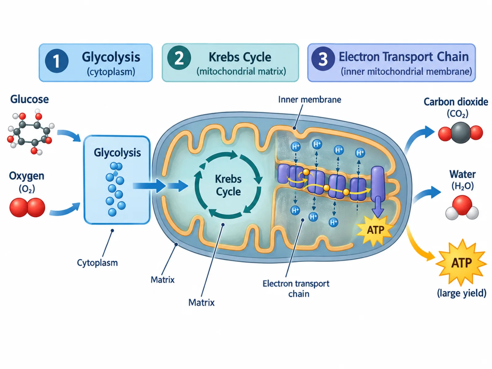
A cellular respiration diagram is a stage-by-stage illustration of how a cell breaks down glucose to release usable chemical energy in the form of ATP. Because this process happens inside the cell at a molecular scale and unfolds across three distinct locations, a cellular respiration diagram typically uses a linear or looping flowchart layout to track glucose as it moves from the cytoplasm into the mitochondria, being progressively broken down and yielding energy carriers along the way. A clear cellular respiration diagram makes it obvious which stage produces which output, and just as importantly, which stage produces the bulk of the cell's usable energy.
What the Cellular Respiration Diagram Shows
The diagram represents the complete breakdown of glucose into carbon dioxide and water, capturing energy at each step in molecules that the cell can use directly or convert into ATP. It is organized around three sequential stages that occur in three different physical locations within the cell: the cytoplasm, the mitochondrial matrix, and the inner mitochondrial membrane. Each stage hands off its products to the next — glycolysis produces pyruvate that feeds the Krebs cycle, and the Krebs cycle produces electron carriers that feed the electron transport chain — so the diagram should visually connect the three stages as a continuous pathway rather than three unrelated boxes.
The Three Stages and What Happens in Each
- Glycolysis — takes place in the cytoplasm, splitting one 6-carbon glucose molecule into two 3-carbon pyruvate molecules, with a net yield of 2 ATP and 2 NADH; it does not require oxygen.
- Pyruvate oxidation — each pyruvate is converted into acetyl-CoA in the mitochondria, releasing carbon dioxide as a byproduct before entering the next stage.
- Krebs cycle (citric acid cycle) — takes place in the mitochondrial matrix, producing more carbon dioxide along with NADH, FADH2, and a small amount of ATP.
- Electron transport chain — located across the inner mitochondrial membrane, where NADH and FADH2 donate electrons to a chain of proteins that pumps protons and builds an electrochemical gradient.
- ATP synthase — uses the proton gradient generated by the electron transport chain to produce the majority of the cell's ATP through oxidative phosphorylation.
- Oxygen (final electron acceptor) — combines with electrons and protons at the end of the electron transport chain to form water, allowing the chain to keep running.
How to Interpret the Cellular Respiration Diagram: Following the Energy Yield
A cellular respiration diagram should be read left to right or top to bottom, following glucose through glycolysis first, then pyruvate oxidation, then the Krebs cycle, and finally the electron transport chain, since each stage depends on the products of the one before it. Pay close attention to where each stage is physically located, since this detail explains why certain molecules must cross the mitochondrial membrane to continue the process: glycolysis happens outside the mitochondria in the cytoplasm, while the remaining stages happen inside. The diagram's arrows for NADH and FADH2 should be interpreted as carrying electrons from the earlier stages to the electron transport chain, not as literal physical objects moving — they represent electron and energy transfer. Proportionally, the ATP totals should reflect that the electron transport chain generates far more ATP than glycolysis and the Krebs cycle combined, so a diagram that visually emphasizes glycolysis's small ATP output over the electron transport chain's much larger output misrepresents where the cell's energy actually comes from.
Common Mistakes When Reading or Drawing a Cellular Respiration Diagram
A frequent mistake is assuming glycolysis produces most of a cell's ATP, likely because it is the first and most commonly memorized stage; in reality, the electron transport chain produces the large majority of the total ATP yield, roughly 34 out of a total of about 36-38 ATP per glucose molecule. A second common mistake is assuming oxygen is required throughout the whole process, when it is in fact only directly required at the electron transport chain step, not during glycolysis or the Krebs cycle. A third mistake is confusing cellular respiration with photosynthesis: cellular respiration breaks glucose down using oxygen to release usable energy as ATP, occurring in the mitochondria of nearly all cells, while photosynthesis is essentially the reverse process, using light energy, water, and carbon dioxide to build glucose, and occurs only in the chloroplasts of plants and algae.
Cellular Respiration Diagram vs. Respiratory System Diagram
Despite sharing the word "respiration," a cellular respiration diagram and a respiratory system diagram describe entirely different things. Cellular respiration is the biochemical, cell-level process of extracting energy from glucose through glycolysis, the Krebs cycle, and the electron transport chain, occurring inside the mitochondria of individual cells throughout the body. A respiratory system diagram, by contrast, shows the organ-level anatomy — the lungs, trachea, and alveoli — that physically brings oxygen into the bloodstream and removes carbon dioxide from it at the level of the whole organism. The shared terminology is the source of most confusion between the two, but one is a description of metabolism happening inside cells, and the other is a description of anatomy that supplies the raw materials those cells need.