

Paste your paper abstract. Get a graphical abstract draft in about a minute — a starting layout you refine, not a finished submission file.
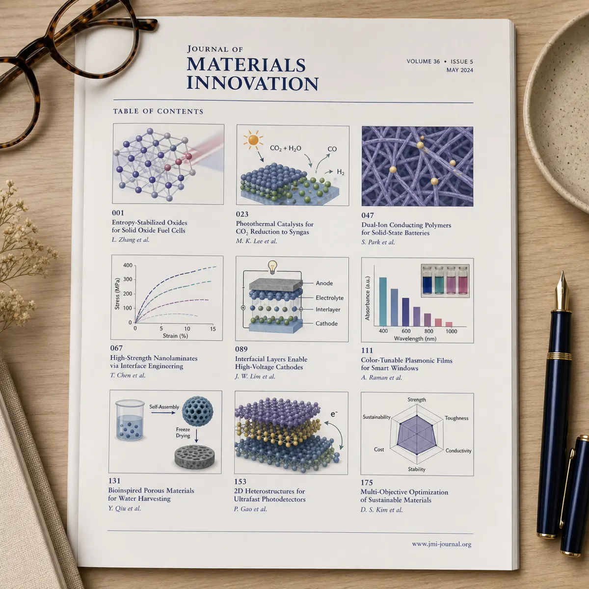
Six layouts pulled from real submission categories — swap in your own figures and labels.
Compound structure on the left, target protein interaction in the center, and a therapeutic outcome icon on the right — the standard three-panel flow for medicinal chemistry submissions.
Patient cohort, intervention arm, and primary outcome laid out left to right, matching how Elsevier's clinical journals expect trial results to read at a glance.
Input dataset, model architecture block, and a performance metric callout — built for ML and computer-vision papers where the pipeline itself is the finding.
Tissue sample, expression heatmap, and pathway diagram in sequence, sized for a single-column journal figure.
Pollutant source, transport pathway, and measured environmental impact, a layout common in Elsevier's environmental-science journals.
Search-to-synthesis funnel condensed into one panel — a compact companion to a full PRISMA flow diagram in the supplementary materials.
Every publisher sets its own graphical abstract rules — treat these as a starting point and confirm against the target journal's guide for authors before final submission.
Applies across most ScienceDirect journals unless a specific journal states otherwise
Each publisher's size and format rules differ and do change over time
A graphical abstract is a single image, submitted with the text abstract, that summarizes a paper's main finding at a glance. Journals show it in the table of contents, the article page, and social-media previews — often the only part a reader sees before opening the PDF.
Unlike a figure from your results section, it is built for readers outside your subfield: the input, the method, and the headline result as icons and short labels. Journals judge it separately and set their own size and format rules.
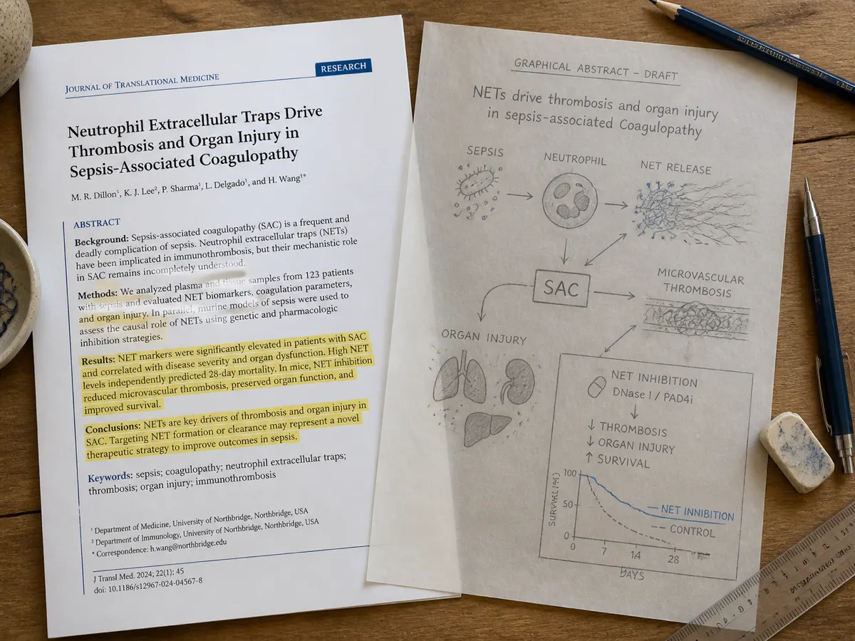
Paste the abstract you already wrote. The graphical abstract generator reads it, identifies the input, method, and result, and drafts a full layout without you touching a canvas.
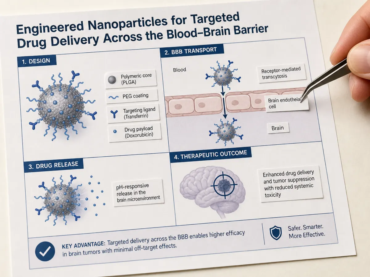
Seeing a wrong layout is faster than starting from nothing: you know within seconds which stage is missing and which one is taking up too much room. The draft comes back as a single flat image, so treat it as a first pass and rebuild the file you submit in an illustration tool.
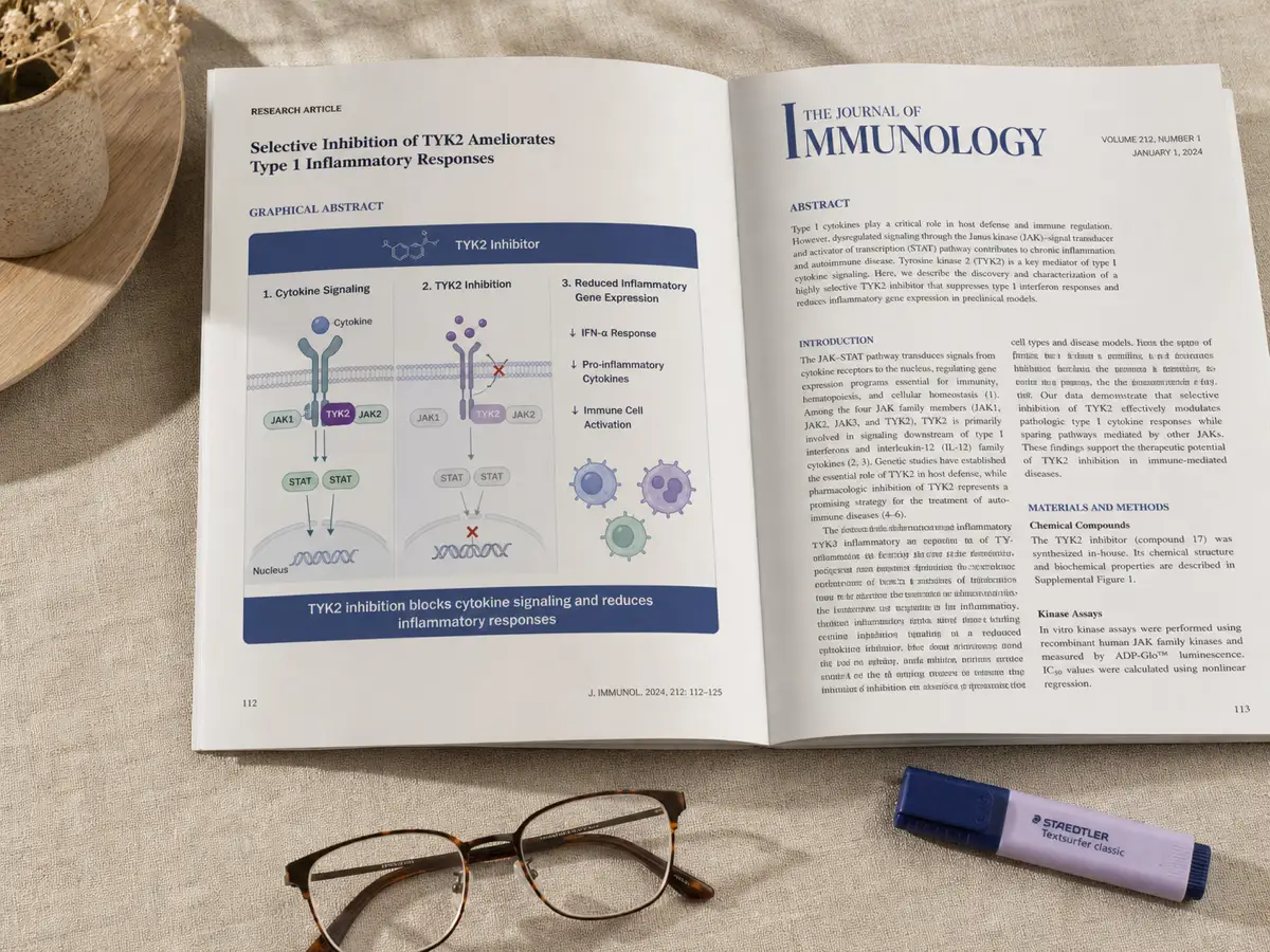
Pick the Elsevier banner or the MDPI landscape preset before you generate. Publishers disagree on this — Cell Press wants a square, Elsevier wants 2.5:1 — and a banner cannot be cropped into a square, so the ratio is worth settling before the layout is.
* Exports high-resolution PNG.
From a pasted abstract to a submission-ready file in three steps.
Copy the text abstract from your manuscript — 80 to 8,000 characters is enough for the generator to identify the input, method, and result.
Pick the preset that matches your target journal, then generate. The ratio is the one thing you cannot fix later by resizing.
Download the PNG, then check it against your journal’s size, resolution, font and file-format rules before you attach it to a submission.
* Exports high-resolution PNG.
A good graphical abstract tells the paper's story in the order a reader's eye naturally moves — left to right or top to bottom — without requiring the caption to explain what is happening. If a colleague outside your subfield cannot describe the finding after five seconds of looking, the abstract is carrying too much detail.
It also respects the journal's own rules: correct pixel dimensions, no citation numbers, no legend text, and a file format the submission system accepts. An abstract that looks perfect on your screen but gets rejected at upload for being the wrong size or format costs more time than making it right the first time.
Readers decide whether to open a paper long before they read the introduction. A table of contents, a search results feed, or a shared link on social media all show the graphical abstract before any text — it is often the only part of a submission a busy reader actually looks at.
Editors and reviewers see it too, during the initial screening that happens before a manuscript is sent out for full review. A graphical abstract that clearly maps the study's logic — inputs, method, and finding — signals a well-organized paper, while a confusing or overcrowded one raises doubts before the abstract text is even read.
Most major publishers — Elsevier, Cell Press, MDPI and others — now require or strongly recommend a graphical abstract at submission, and treat it as a standalone asset: pulled into journal websites, indexing databases, and the publisher's own social accounts long after the paper itself is behind a paywall.
Journal submission systems increasingly ask for a graphical abstract as a separate upload, distinct from the manuscript figures. Getting the dimensions and file format right the first time avoids a round of technical-check emails before the paper even reaches a handling editor.
The same figure doubles as the opening panel of a conference poster or the first slide of a talk. Attendees walking a poster hall decide which posters to stop at within seconds — a clear graphical abstract gives them the paper's core claim before they read a single caption.
Grant reviewers read dozens of proposals in a sitting. A single figure that walks through the hypothesis, method and expected outcome of a proposed study helps a preliminary-results or specific-aims section land in the few minutes a reviewer actually spends on it.
Universities, journals and authors post graphical abstracts on X, LinkedIn and Bluesky to promote new papers. A figure built to stand alone — no citation numbers, no dependence on the surrounding text — travels further than a caption-heavy screenshot of a results figure.
Submission-practical answers before you export.
* Exports high-resolution PNG.
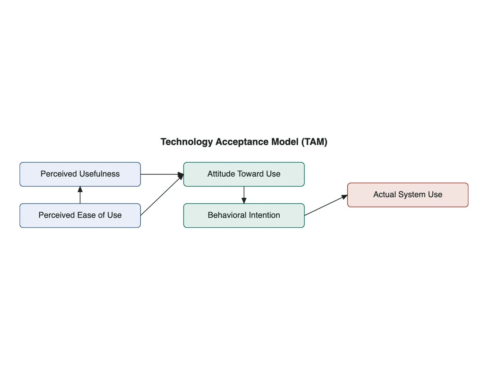
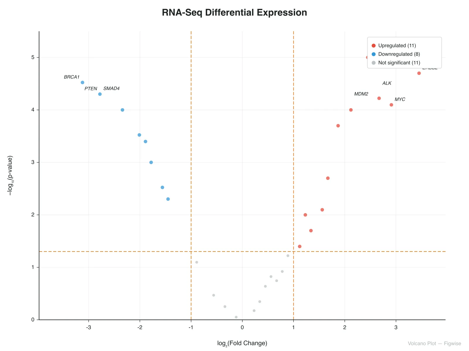
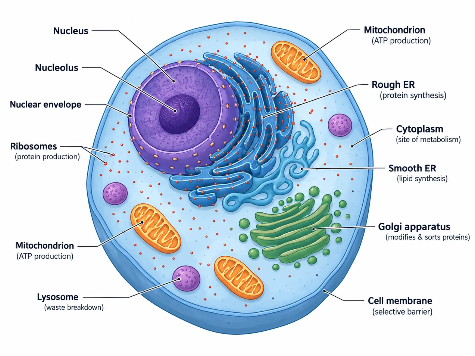
Paste your text abstract and get a journal-sized graphical abstract draft in about a minute. New accounts start with 85 credits — enough to try it a few times.