

Paste a list of source, target, value flows and get a proportionally banded Sankey diagram in your browser — free, no login, export as SVG or PNG.
The same source, target, value format drives every one of these — an energy mix, a budget, a signup funnel, and a factory's material balance. See how one Sankey diagram generator adapts its layout to each shape of data.
Coal, gas, wind, and solar feed a shared electricity pool, which then splits across residential, commercial, and industrial demand plus grid losses — the layout automatically merges four sources into one column before fanning back out into four destinations.
Total revenue splits into product lines, then each line's share moves on to engineering, marketing, and operations budgets — a Sankey chart makes it obvious at a glance which revenue stream is actually funding which department, something a pie chart per line can't show.
Visitors split into signup and bounce at the first step, signups split again into trial-to-paid, trial-to-churn, and still-trialing — a multi-stage funnel where a Sankey diagram maker shows both the size of each path and where the drop-off actually concentrates.
Raw material entering a production line splits into finished product, rework, and scrap at two separate stages — a mass-balance layout that lets a process engineer see cumulative yield loss across the whole line in one figure instead of stage-by-stage tables.
A Sankey diagram is a flow diagram where the width of each connecting band is drawn in direct proportion to the quantity it represents. Nodes are grouped into columns, and bands of varying thickness flow between them left to right, so a viewer can compare two flows by eye — the wider band always carries more.
That width-as-magnitude rule is what separates a Sankey diagram from an ordinary flow chart: a flow chart's arrows are uniform and encode sequence or logic, while a Sankey diagram's bands encode an actual measured quantity — energy, money, people, mass, whatever the source, target, value rows describe.
The name comes from Captain Matthew Riall Sankey's 1898 diagram of steam engine energy efficiency, and the same technique is still the standard way to show energy balances, budget flows, material flows, and multi-step conversion funnels wherever a reader needs to see where a quantity goes, not just that it goes somewhere.
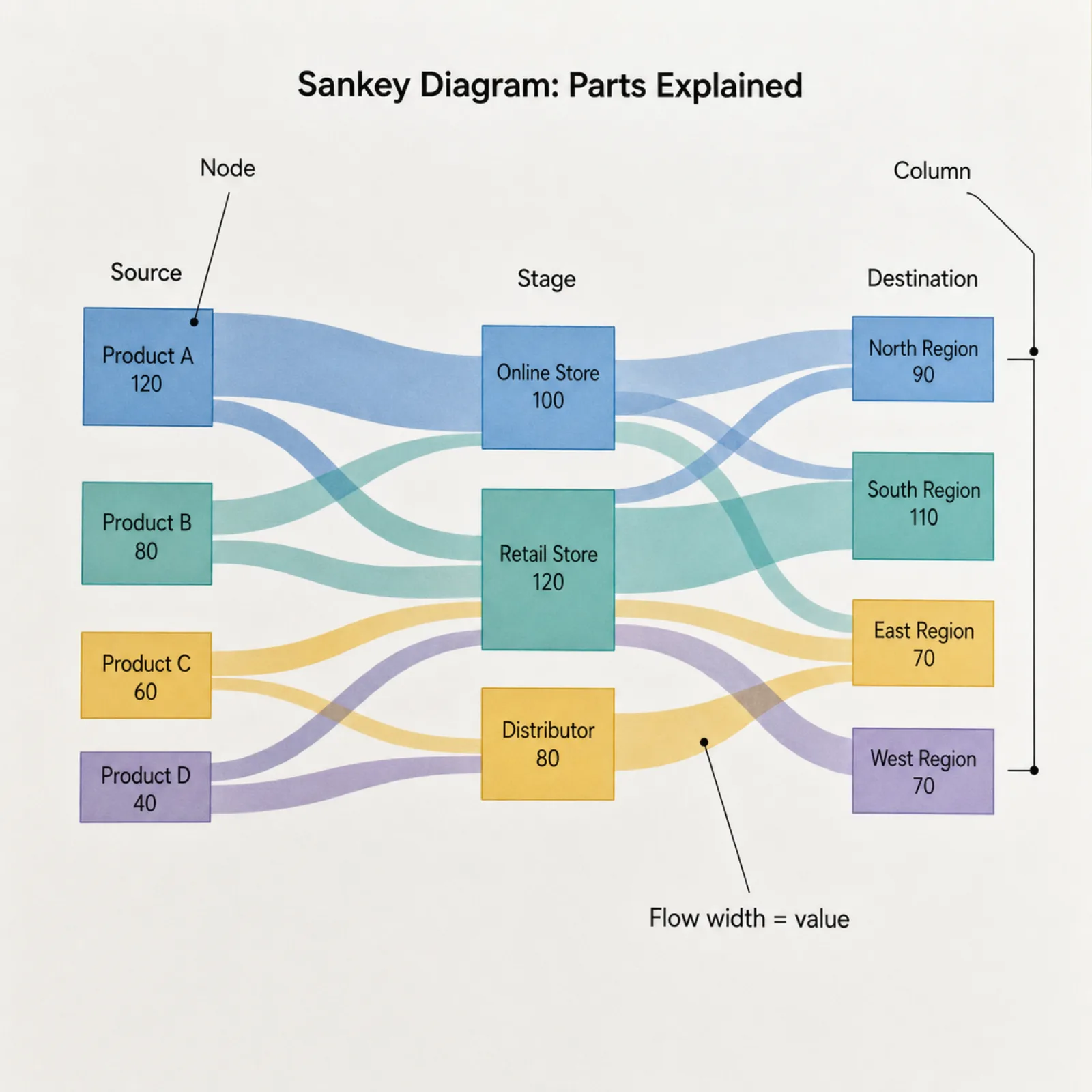
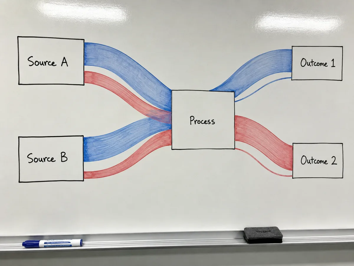
Drop in your rows and this Sankey diagram generator works out which node belongs in which column by tracing the flow direction through your data (a topological sort), then reorders nodes within each column to keep the bands from tangling into a knot. You never drag a single box into place.
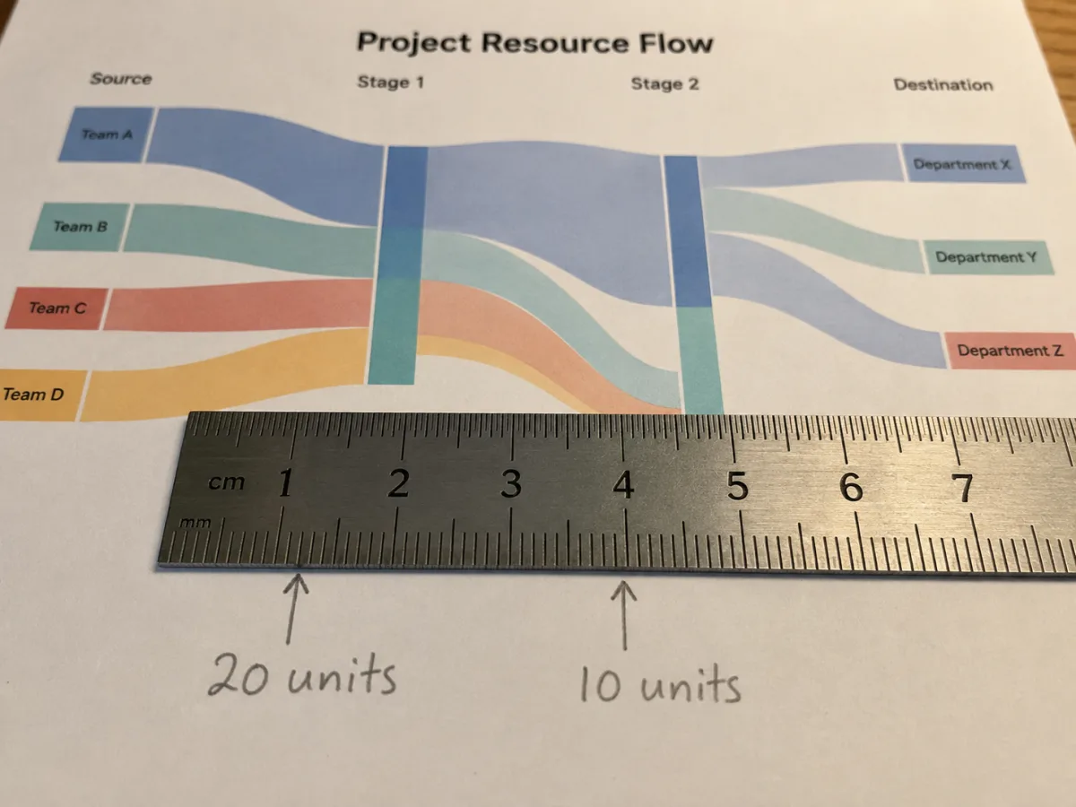
Every band's thickness is calculated from its value against the same scale used across the whole chart — a flow twice the size is drawn exactly twice as wide, in every column, not just within its own node. That consistency is what makes a Sankey chart generator trustworthy instead of merely pretty.
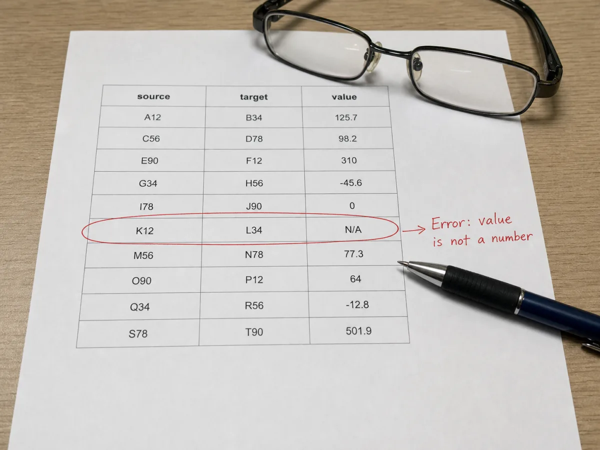
Type or paste "source,target,value" rows — the format used across most Sankey diagram maker tools, so existing data ports over without reformatting. Bad rows don't just vanish: a malformed line, a non-numeric value, a self-referencing node, or a flow that loops back on itself is flagged with the line number, so you can fix the source data instead of guessing why a node disappeared.
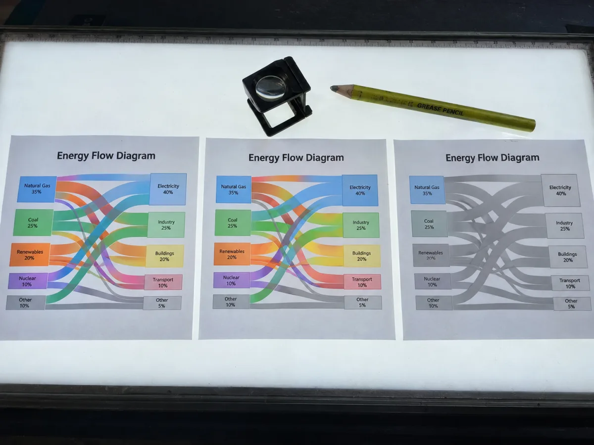
This Sankey diagram generator lets you switch band color between by-source, by-target, or a single flat color depending on what the chart needs to emphasize, tune node width and vertical spacing for a denser or airier layout, and set the exact canvas size before exporting — a publication figure and a slide deck rarely want the same proportions.
All three are a flow diagram of boxes connected by lines, and people reach for the wrong one often enough that it's worth spelling out the one boundary that actually matters: what the width or thickness of a connector is allowed to mean.
This Sankey diagram generator reads the same three-column format most Sankey diagram maker tools use, so data built for one usually pastes straight into another without reformatting.
| Field | Example | Notes |
|---|---|---|
| Source | Coal | Case-sensitive node name. First appearance sets its position in the diagram. |
| Target | Electricity | Must differ from the source on the same row — a node can't flow into itself. |
| Value | 38 | Any positive number, decimals allowed. Sets the band's width relative to every other flow on the chart. |
| Property | Value |
|---|---|
| Vector format | SVG — editable text and paths, sized exactly to your canvas settings |
| Raster format | PNG — rendered at 2x resolution for sharp text on slides and documents |
| Default canvas | 960 × 600 px, adjustable before export |
| Color modes | By source node, by target node, or a single flat color |
What people ask before pasting their first set of flows into a Sankey diagram generator.

Paste your source, target, value rows into this Sankey diagram maker and export a proportionally banded Sankey diagram as SVG or PNG — free, no signup.