

Paste values for each group to draw a box plot with automatic outlier detection, mean markers, and a horizontal or vertical layout — free, no signup.
22 values loaded
22 values loaded
22 values loaded
Box and whisker plots generated with Figwise, from a three-group teaching comparison to a five-group clinical panel.
A three-group box plot comparing quiz scores across teaching methods, with each group's median, quartile box, whiskers, and outliers plotted side by side.
The same generator rotated to a horizontal orientation, a layout that keeps long group labels readable when comparing several categories at once.
One group's distribution shown with both a median line and a mean diamond, useful when the two summary statistics tell different stories about skew.
One biomarker tracked across five disease-stage cohorts, from healthy controls to stage IV, a common way to present lab distributions in a clinical research figure.
Here is how this box plot maker turns pasted numbers into a publication-ready box and whisker chart.
Create one group per category you want to compare and name it the way it should appear on the axis. Colors are assigned automatically and can be adjusted.
Drop a batch of numbers into each group's box, separated by commas, spaces, or line breaks — values pasted straight from a spreadsheet column work fine.
Switch the chart between vertical and horizontal layout, and turn on the diamond mean marker or value labels if your figure needs them.
The chart redraws as you type, recalculating quartiles and outliers on the fly. When it looks right, download the finished figure as SVG or PNG.
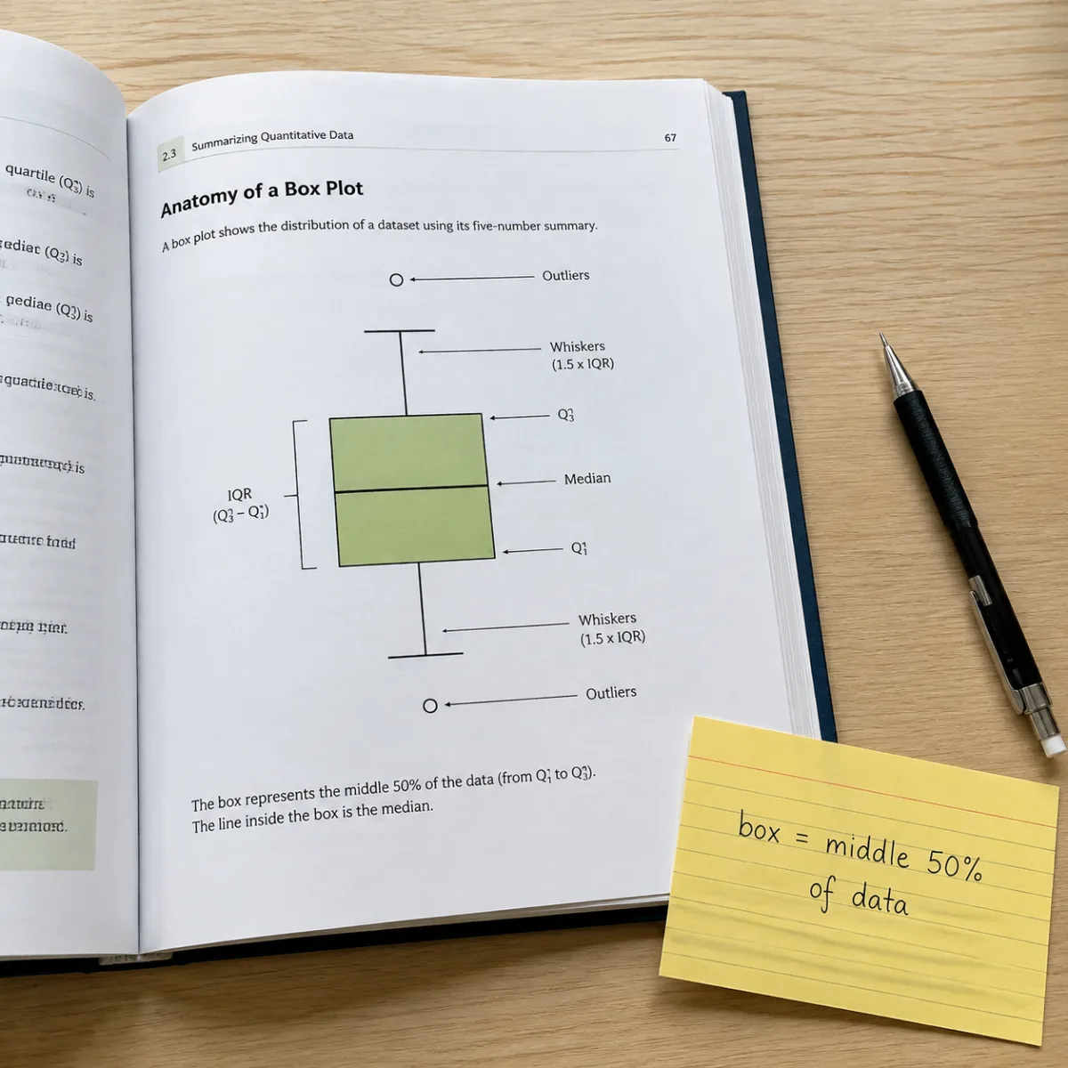
A box plot, also called a box and whisker plot or boxplot, summarizes a set of numbers using five values: the minimum, the first quartile, the median, the third quartile, and the maximum. The box spans the middle 50 percent of the data — from Q1 to Q3 — and the line inside it marks the median.
Lines called whiskers extend from each end of the box to the most extreme values that still fall within 1.5 times the interquartile range (IQR) of the box edges. Any point beyond that range is drawn as an individual dot, an outlier, rather than stretching the whisker to reach it.
Reading one means comparing the position and height of these boxes across groups: a higher box means higher typical values, a taller box means more spread, and a long whisker or a cluster of outliers signals skew or unusual cases worth a second look.
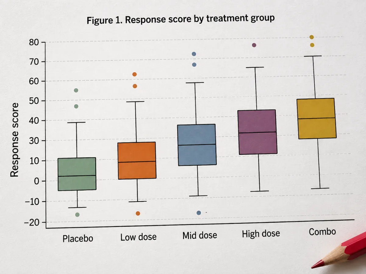
Compare as many categories as your data needs — teaching methods, treatment arms, product batches — by adding groups to this generator. Each group gets its own color, and the chart redraws instantly as you edit any group's values.
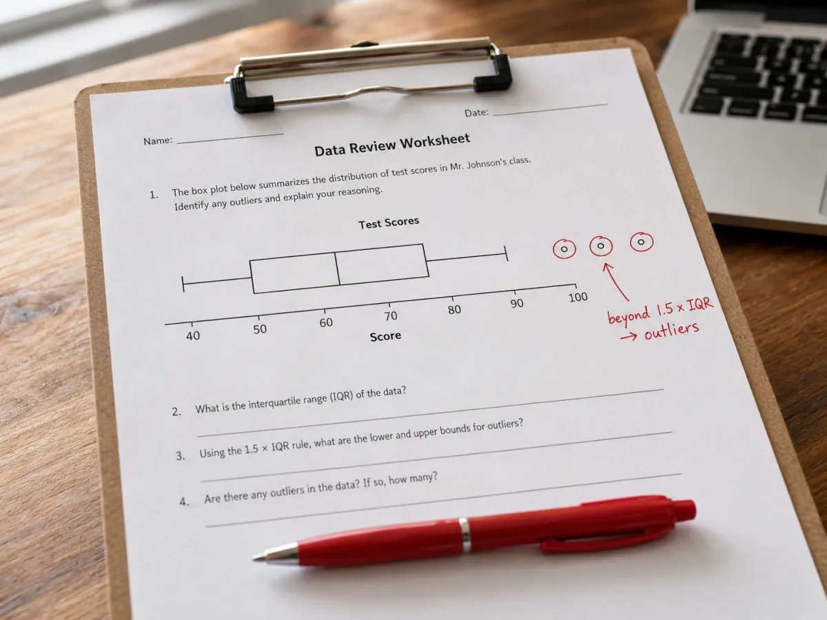
Every group's outliers are flagged automatically using the standard 1.5 times the interquartile range rule, the same convention most statistical software uses, so your whiskers and outlier points match what a reviewer expects to see.
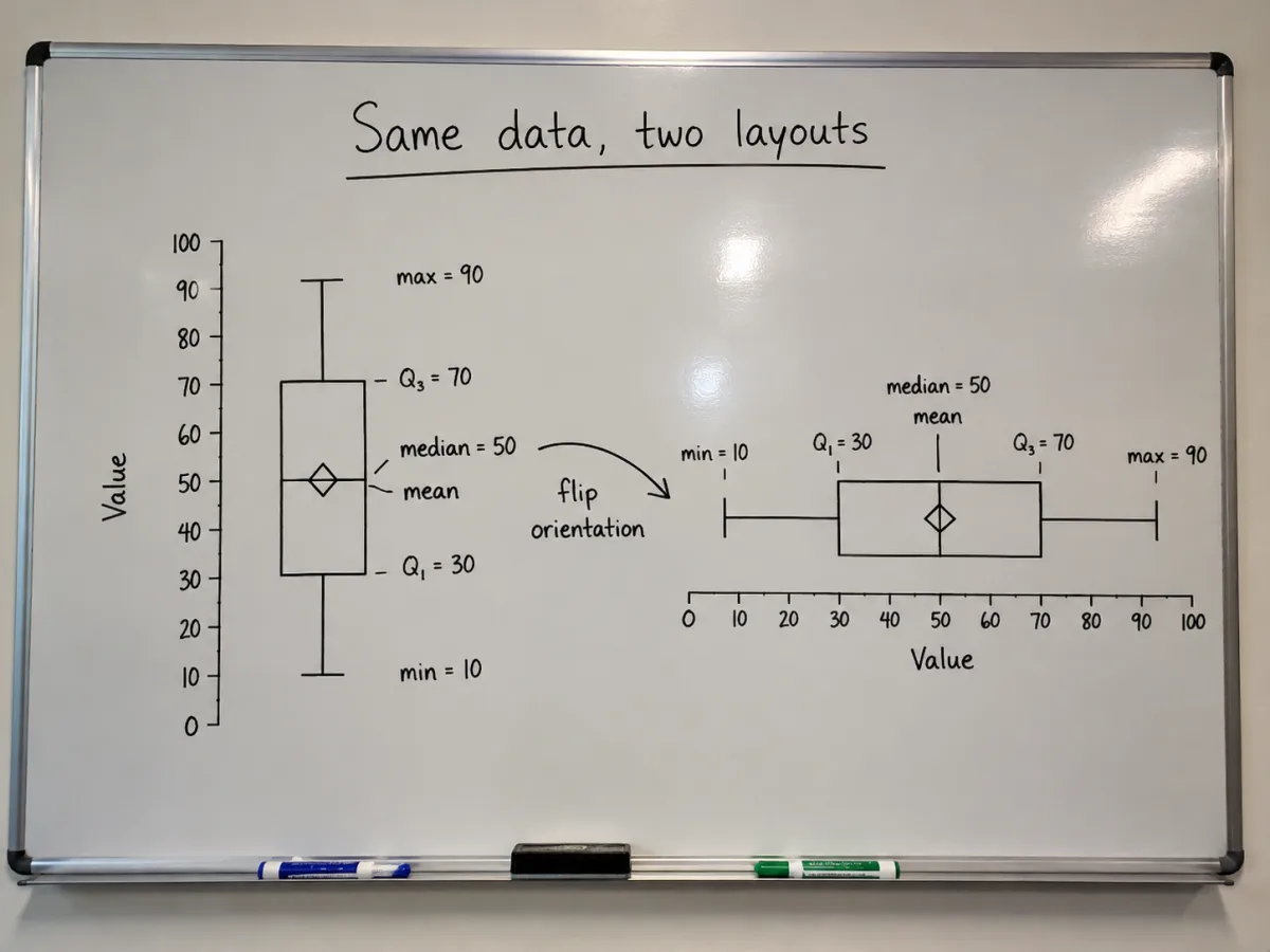
Add a diamond mean marker alongside the median line when the two diverge, and switch the whole chart between vertical and horizontal orientation to fit long group labels or a wide set of categories.
Answers to the questions people most often ask about reading and building box plots.
Paste your values, pick an orientation, and download a publication-ready chart — all in your browser.