

Paste each group's survival times and event indicators to draw publication-ready Kaplan-Meier survival curves — with censoring marks, a number-at-risk table, and a log-rank test built in.
30 observations loaded
30 observations loaded
A Kaplan-Meier curve tracks the probability that patients in a study remain event-free over time. It starts at 1.0, and every time a death or other event occurs the curve steps down by an amount that reflects how many patients were still being followed at that moment.
Small vertical ticks along each survival curve mark censored patients — people who left the study or reached its end without the event. Censoring removes them from the at-risk pool without forcing a step down, which is what makes the Kaplan-Meier estimator different from simply plotting raw percentages.
The number-at-risk table under the plot reports how many patients each group still has under observation at each time point. Reviewers rely on it to judge how trustworthy the tail of the curve is, since a Kaplan-Meier plot based on a handful of remaining patients can swing wildly.
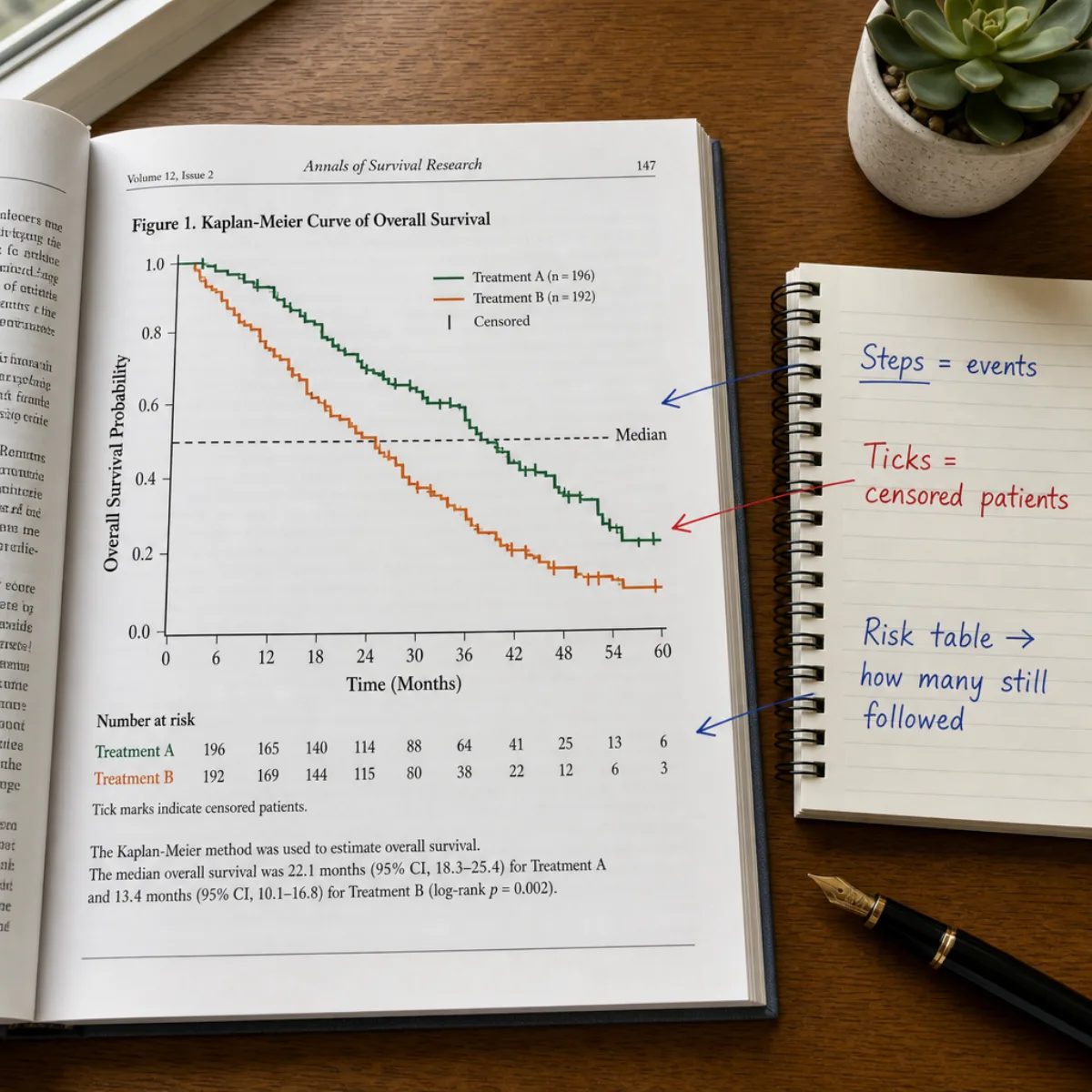
Survival curves generated with Figwise, from a classic two-arm trial to multi-group biomarker comparisons.
A treatment-versus-control Kaplan-Meier plot for overall survival, with censoring ticks, a number-at-risk table, and the log-rank p-value annotated on the chart.
Survival curves for high, intermediate, and low biomarker expression, showing how a Kaplan-Meier plot separates prognostic groups at a glance.
One cohort followed over five years — the simplest Kaplan-Meier curve, useful for reporting natural history or a single-arm phase II study.
Disease-free survival for two regimens with dashed guides marking median survival, the point where each curve first crosses 50 percent.
From raw follow-up data to a submission-ready survival curve, here is the whole workflow.
Create one group per treatment arm or stratum and name it the way it should appear in the legend. Colors are assigned automatically and can be adjusted.
Enter one observation per line as time and event status, where 1 means the event occurred and 0 means the patient was censored at that time.
Switch on the number-at-risk table and censoring ticks for a journal-style figure, and add the log-rank p-value or median survival guides when comparing groups.
The Kaplan-Meier plot redraws as you type. When the steps, ticks, and table look right, download the figure as SVG or PNG.
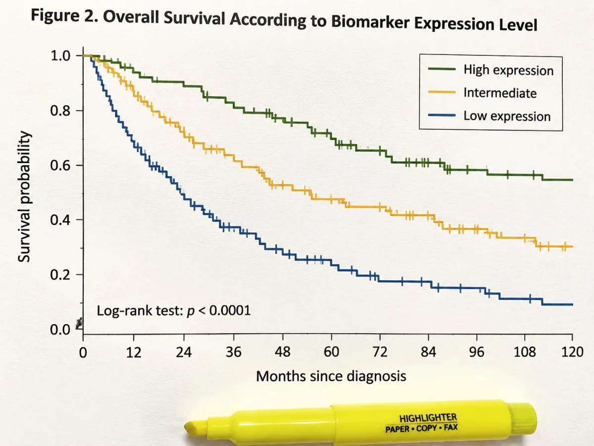
Compare treatment arms, biomarker strata, or risk groups by adding as many groups as your study needs. Each group gets its own colored step curve, and the legend, risk table, and log-rank test update together as you edit the data.
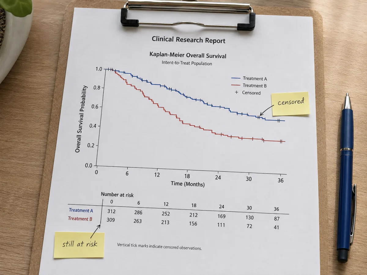
Mark any observation as censored and the survival curve places the tick and adjusts the at-risk pool automatically. The number-at-risk table journals expect under a Kaplan-Meier figure is generated from the same data, aligned to the x-axis ticks.
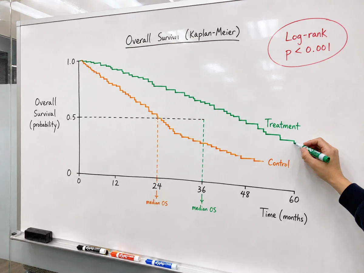
The maker runs a log-rank test across your groups and annotates the p-value directly on the plot, alongside optional dashed lines marking each group's median survival time. No detour through R or SPSS just to finish one figure.
Answers to the questions researchers most often ask about reading and building Kaplan-Meier survival curves.
Paste your follow-up times, flip on the risk table, and download a journal-ready Kaplan-Meier curve — all in your browser.