

Describe the structure or process you want to explain, and get a labeled scientific illustration back. Start from one of the examples below and adjust it to your own topic instead of writing a description from nothing.
Every image below is a real result from the description shown, not a mockup. Click any example to fill the generator with it, then edit the details to match your own structure.
Nucleus, mitochondria, endoplasmic reticulum and every major organelle labeled for an introductory biology figure.
The MAPK/ERK cascade from receptor to nucleus, with each kinase relay step labeled and connected by directional arrows.
A human heart in cross-section, chambers and valves labeled, blood flow direction shown in two colors.
The terrestrial nitrogen cycle as a labeled circular process, from fixation to denitrification.
A fiber-reinforced composite cross-section with fiber, matrix, interface and a crack defect all labeled.
An oceanic-continental subduction zone in cross-section, plates, trench and volcanic arc labeled.
A scientific illustration is a visual explanation of a structure, mechanism or process — a cell, an organ, a signaling pathway, a geological cross-section — built to teach or communicate rather than to plot numbers. It favors clarity of anatomy and topology over photographic detail.
It differs from a data chart. A bar chart, scatter plot or heatmap encodes numeric values collected from an experiment; a scientific illustration encodes structure and process instead — what connects to what, what happens in what order — usually with little or no numeric axis.
Journals, textbooks, grant figures and course slides all use this kind of image where the point is to show how something works rather than what was measured, which is why it sits alongside your data charts rather than replacing them.
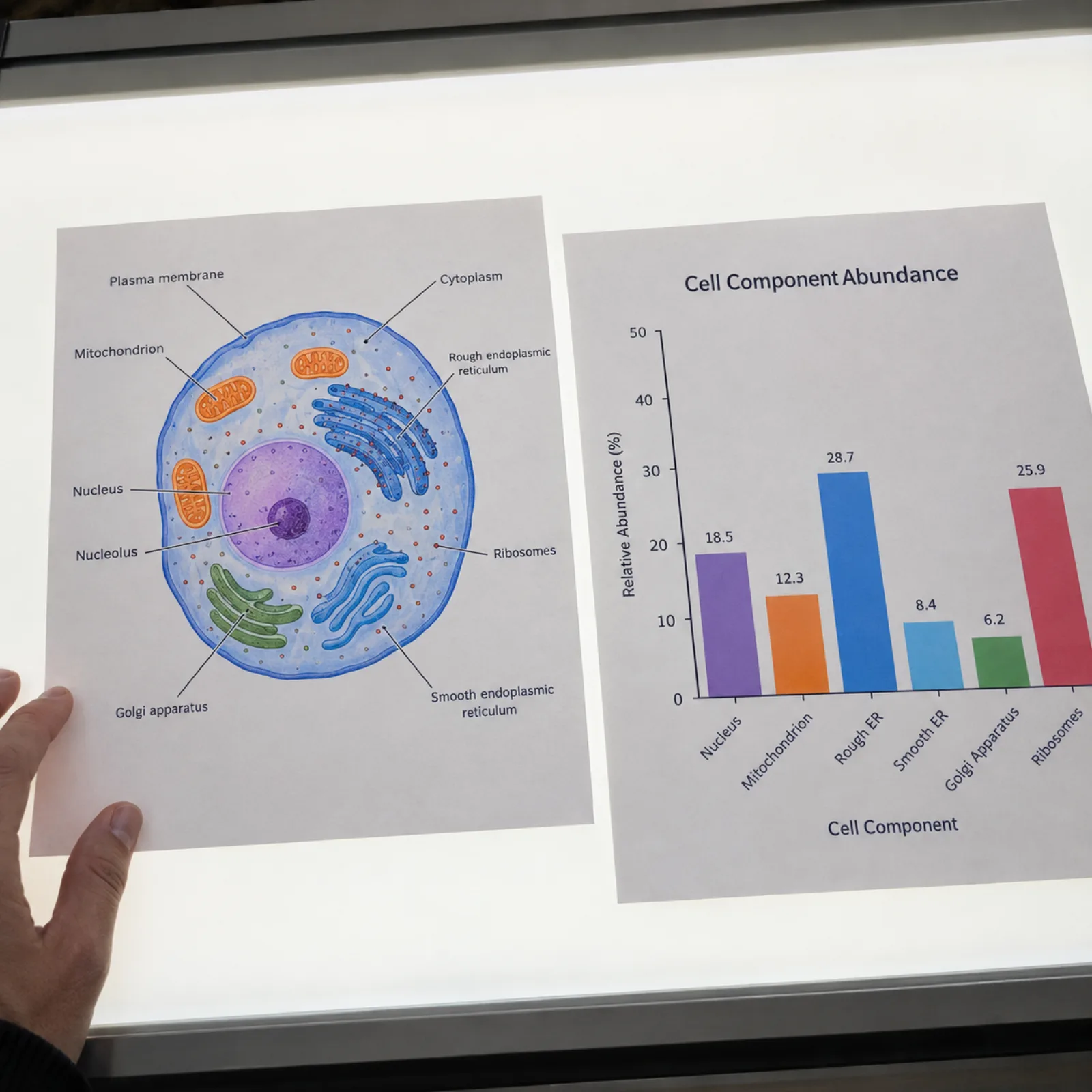
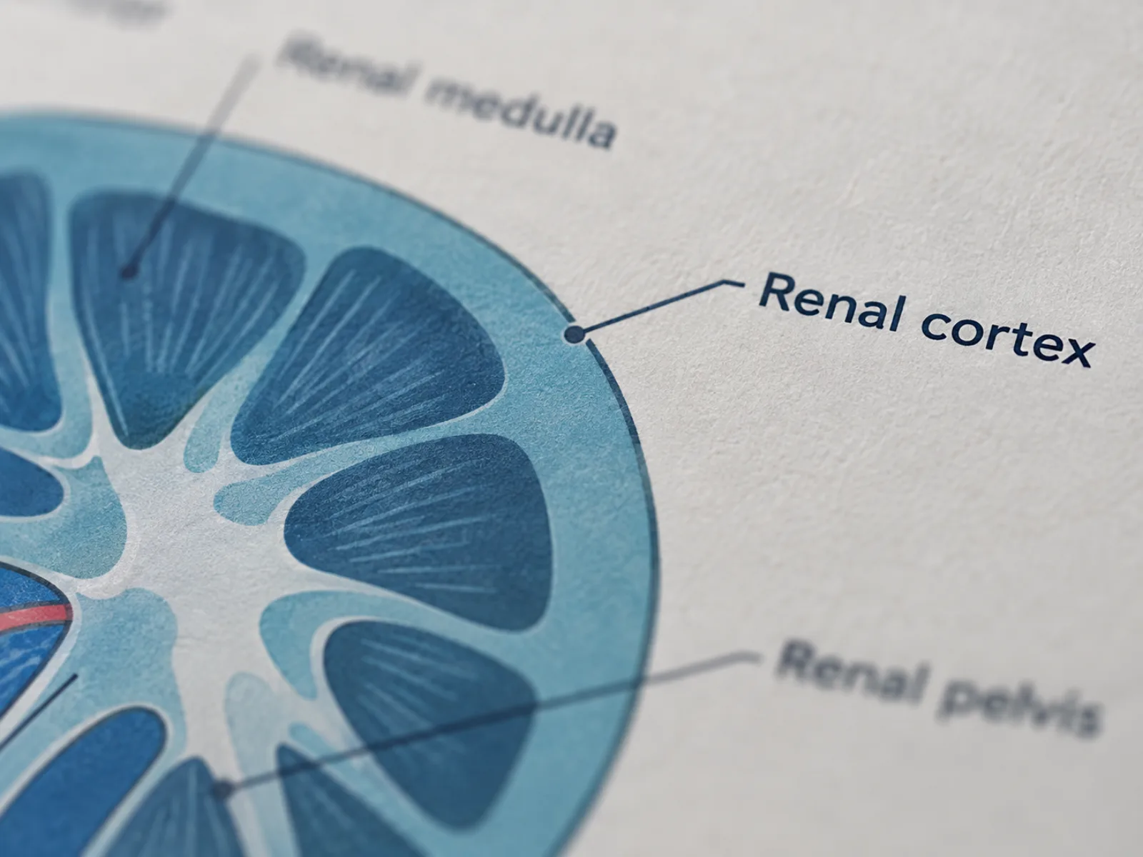
Every image renders as a flat, publication-style vector illustration on a white background with a muted scientific palette, and each major structure gets a short English label connected by a thin leader line — the visual language used in textbook and journal figures.
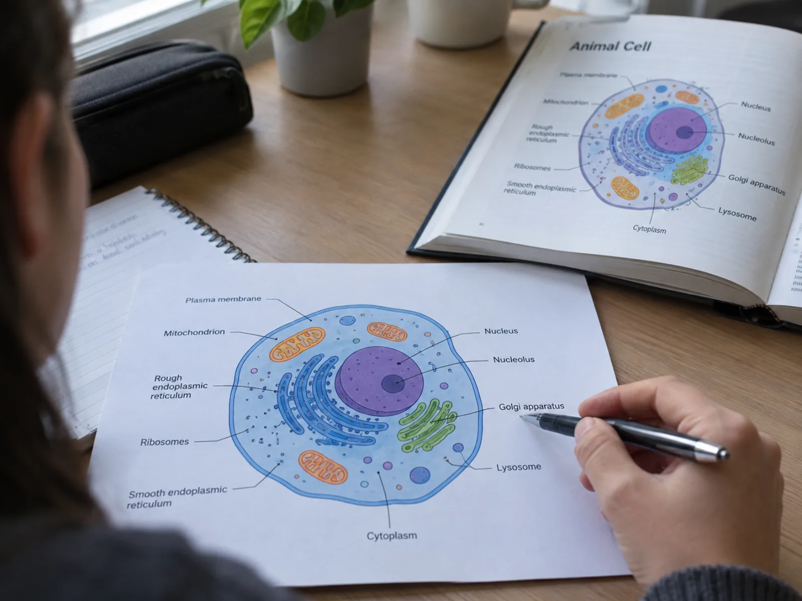
Describe the structure or process the way you would explain it to a colleague — the parts, their spatial relationships, the order of a process — and the model keeps proportions and topology consistent with the real system instead of decorating a scene with unrelated detail.
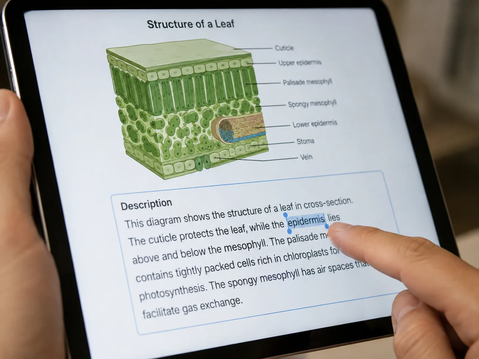
Every example above is a real illustration this tool produced. Pick the one closest to your topic, edit the description to match your own structure, and regenerate — faster than writing a description from nothing.
From a written description to a labeled illustration, without a drawing tool.
Write what needs to appear — the parts, how they connect, the order of a process — the way you would explain it out loud.
Choose the layout that fits where the illustration will go: a slide, a manuscript figure, or a poster panel.
The model renders a labeled, flat vector illustration in a muted scientific color palette.
Review every label against your source material, then download the image for your slides, manuscript or poster.
* Exports high-resolution PNG.
This generator covers labeled illustrations of structures and processes. For other figure types in a paper or presentation, these tools cover the rest of the toolkit.
Policies vary by publisher, but the pattern is consistent: if any part of a figure was AI-generated, say so — usually in the methods section or a dedicated disclosure statement — and expect that disclosure to be checked at submission.
Several major journals go further and restrict AI-generated images specifically where they would stand in for real data — a gel, a blot, a microscopy field, a chart — while reviewing explanatory illustrations like these case by case. Nature Portfolio's AI policy and the Science journals' editorial policy are two current examples worth reading before you submit.
What researchers ask before using an AI-generated illustration in their work.
* Exports high-resolution PNG.
Describe the structure, pick a ratio, and get a publication-ready illustration back — no drawing required.