

Describe your groups, treatments, timeline and outcome measures — get a clean experimental design diagram without sketching it by hand. Free to download.
Four real outputs from the generator — an animal study, a field trial, a behavioral experiment, and a preclinical crossover.
Control, vehicle, low-dose, and high-dose groups (n=10 each) with sample size under every box and measurement points across four time points.
Three fertilizer rates assigned within four blocks, each block controlling for a soil gradient across the field.
A single cohort measured before an intervention, immediately after, and at a follow-up point to check whether the change holds.
Twelve subjects receive both formulations in two periods separated by a washout, so each subject serves as its own control.
An experimental design diagram is a visual summary of how a study is structured: which groups exist, what treatment or intervention each one receives, when measurements happen, and how many subjects are in each arm. It turns a paragraph of methods text into boxes, arrows, and a timeline a reviewer can check at a glance.
It differs from a results chart — it shows the plan, not the data. Journals and grant reviewers look for it in the Methods or Study Design section, because it is the fastest way to confirm the comparison groups, randomization, and timing match what the hypothesis requires.
The diagram is study-specific: a two-arm clinical pilot and a four-arm animal experiment need different boxes and different timelines, even when both test a similar hypothesis. Building it from your own group counts and time points, rather than from a generic template, is what makes it hold up under review.
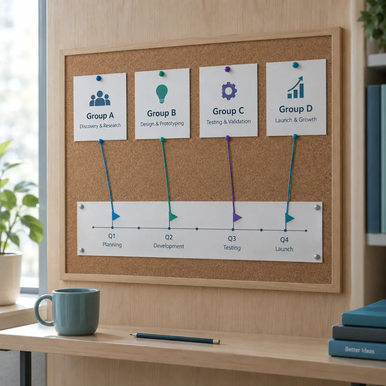
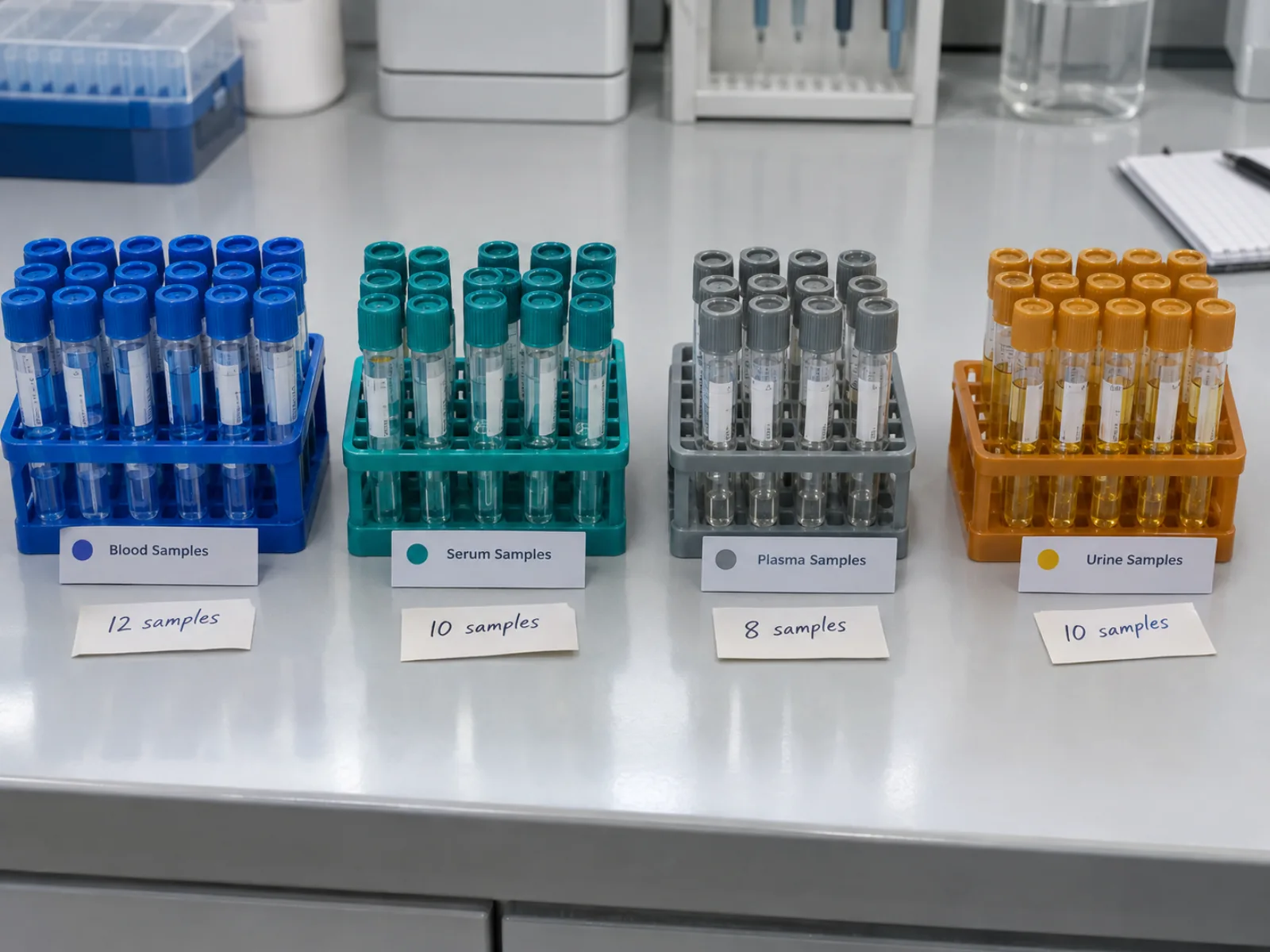
Describe your study once and the generator places each arm as a labeled box, connects it to its treatment with a directional arrow, and prints n= under every group — no separate labeling pass needed.
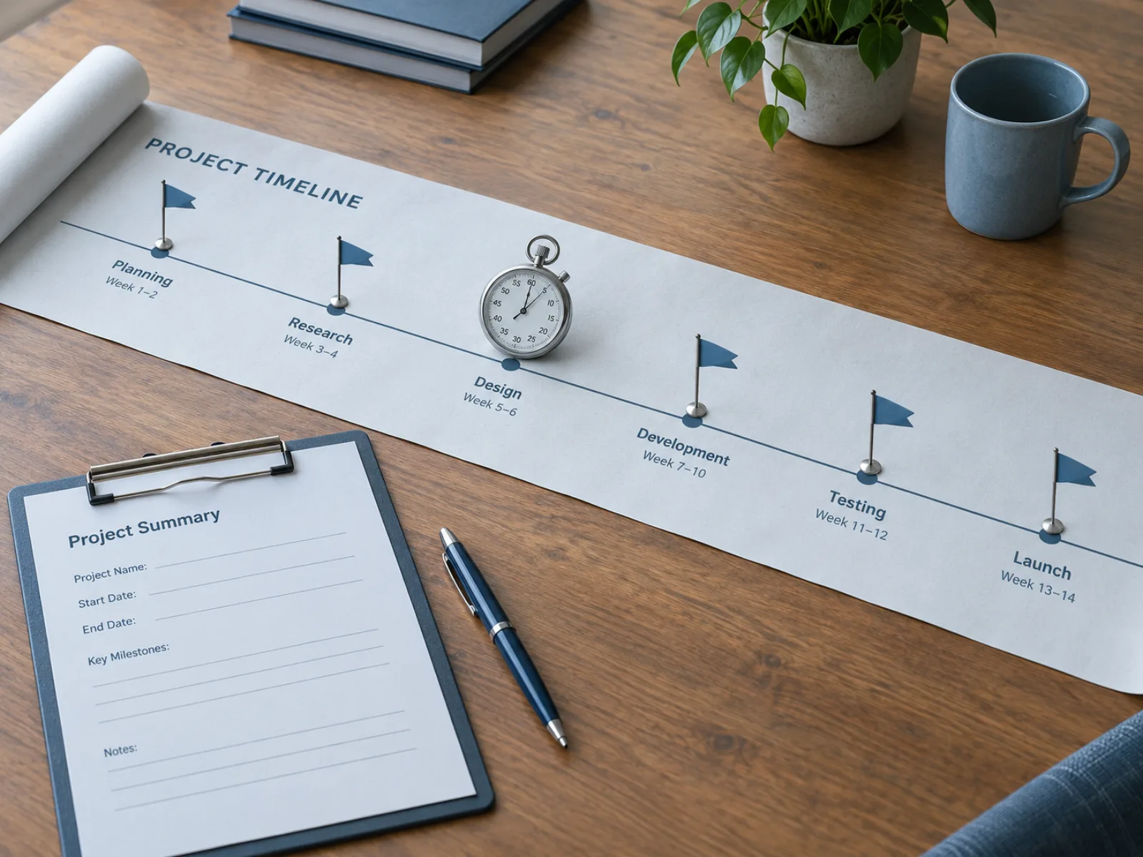
Baseline, follow-up, and endpoint time points are placed on a horizontal timeline with small icons marking where outcomes are measured, so the diagram shows not just who was treated but when they were assessed.
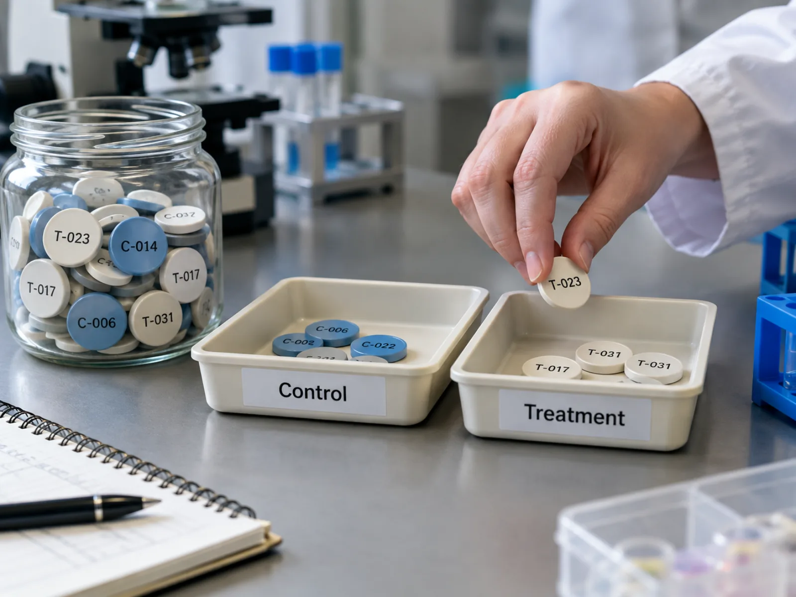
When your description implies random assignment, the generator draws a single pool splitting into arms and marks untreated or vehicle groups distinctly from treatment groups, matching how reviewers expect a controlled design to read.
Four steps from a study description to an exportable diagram.
Name each group or arm, what treatment or intervention it receives, and the sample size — the same details you would write in a Methods paragraph.
Mention when measurements happen — baseline, follow-up, endpoint — and what you measure at each point, so the generator can place them on the timeline.
The experimental design diagram generator classifies groups, treatments, and time points, then lays out boxes, arrows, and the timeline in one pass.
Confirm every arrow direction and sample size matches your protocol, then download the diagram as a high-resolution PNG for your Methods section or grant proposal.
* Exports high-resolution PNG.
Six structures cover most study designs — knowing which one your study follows makes it easier to describe it to the generator.
Every subject is assigned to a treatment group purely at random, with no blocking or matching. It suits homogeneous samples — lab animals from the same strain, or manufactured units — where no known nuisance variable needs to be balanced across groups.
Subjects are first grouped into blocks that share a known source of variation, such as a field's soil gradient or a batch of animals born the same week, then randomized to treatment within each block. Blocking removes that variation from the treatment comparison instead of leaving it as noise.
Two or more treatment factors are combined so every level of one factor appears with every level of the other, letting a single experiment estimate each factor's effect and any interaction between them. A 2×2 factorial testing dose against diet needs four groups instead of two separate experiments.
Each subject receives every treatment in sequence, separated by a washout period, so each subject acts as its own control and between-subject variability drops out of the comparison. It fits treatments with reversible, short-lived effects, not ones that cause lasting change.
A single group is measured before and after an intervention, sometimes with a follow-up to check whether the change persists. It shows within-group change over time but, without a separate control group, cannot rule out that something other than the intervention caused the difference.
One group or unit is measured repeatedly before and after an intervention introduced partway through, tracing the outcome's trajectory rather than comparing only two points. It suits settings where randomizing a control group isn't feasible, such as a policy change rolled out to an entire population.
Methodology questions answered before you write your own.
Describe your groups, treatments, and timeline once and get a publication-ready diagram — sign up for free starter credits and try it.