

Paste a data summary, a study finding, or a few key numbers and get a clean scientific infographic — a headline, a handful of info blocks, and the numbers that matter, laid out for a feed or a wall.
A scientific infographic is a single-page visual that turns one finding, dataset, or study into a headline plus a handful of labeled blocks — an icon, a short phrase, and often one key number per block. It is built to be read in a glance, not studied like a figure in a paper.
It differs from a raw chart or a data table in one way: it leads with the takeaway, not the method. A bar chart shows values; a scientific infographic tells a reader who isn't a specialist what those values mean and why they matter, using icons and short labels instead of axis labels and legends.
It's the format that carries research past the people who already read papers — onto a lab's social feed, a course slide, a museum wall panel, or the lay summary section of a grant report, where the reader has seconds, not minutes, to decide whether to keep reading.

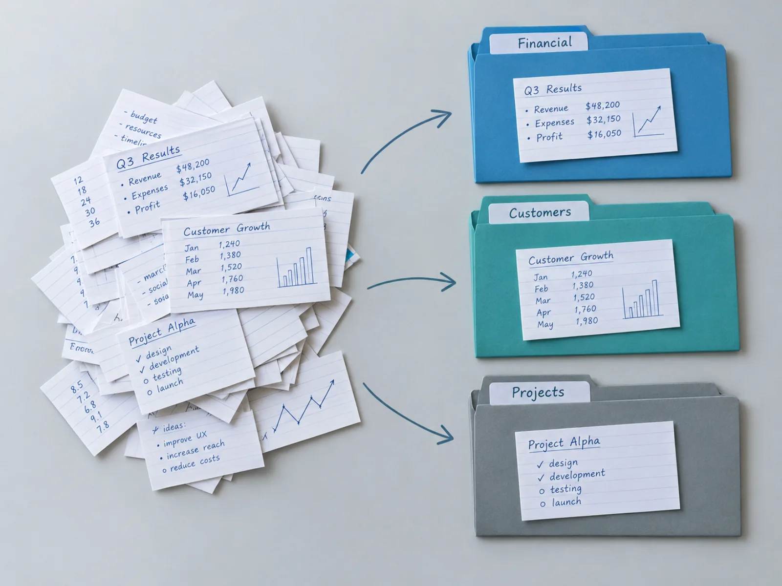
Paste a study finding, a survey result, or a short data summary and the generator identifies the headline claim and breaks out three to five supporting points, each rendered as its own block with a simple icon and a short label — the structure a reader scans before they read a word of running text.
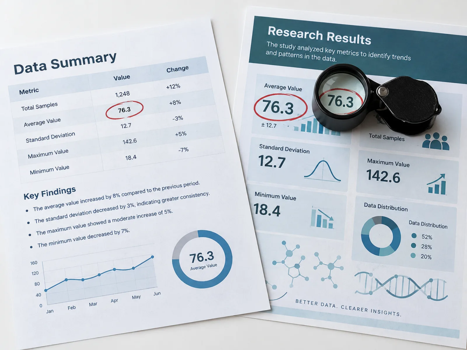
General-purpose AI infographic generator tools will happily illustrate a claim with a number that sounds right but isn't in your source text. This one only surfaces figures, percentages, and statistics that appear in the summary you paste in — if a block needs a number and your text doesn't have one, it stays a label, not a guess.
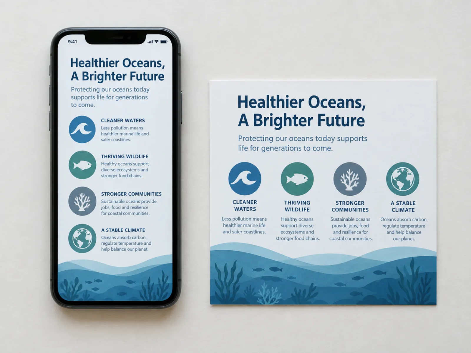
The default output is a tall 9:16 panel sized for a phone screen or a printed handout, because most scientific infographics now get read scrolling, not framed on a wall. Switch to 1:1 for a square social post, or pick another ratio when a poster board or slide needs something wider.
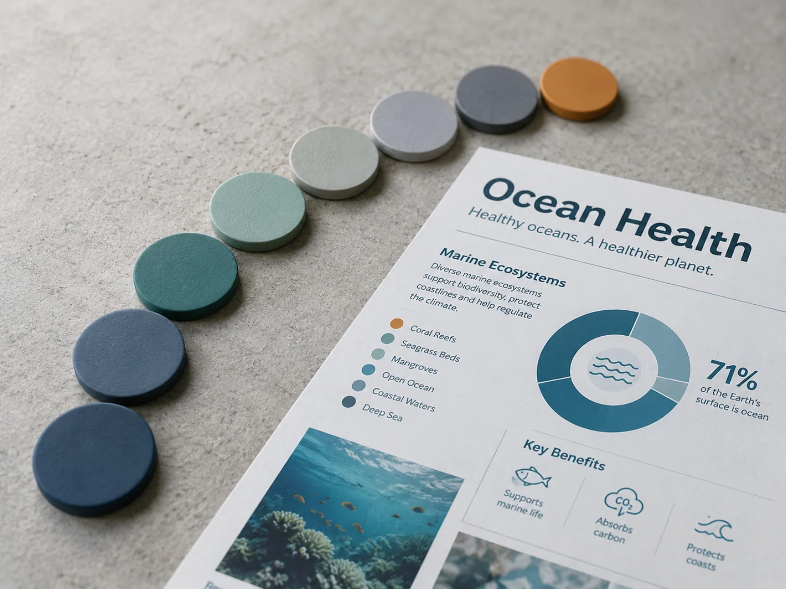
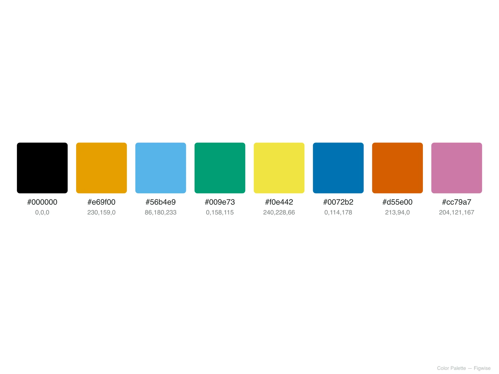
Blocks are rendered in a restrained blue-teal-gray palette with a single accent color, matching the visual register of a journal figure rather than a marketing flyer — so the infographic still reads as science communication, not an ad.
Four data summaries, four fields, two aspect ratios — the same block-and-headline structure adapting to what the finding actually needs.
A five-season survey finding turned into a headline statistic, a regional breakdown block, and an age-group callout — the shape most health-data infographics take.
A decades-long satellite trend condensed into a headline decline rate, one supporting block on ice composition, and a projection block — built for a course slide or a science communication post.
A sleep-lab finding rendered as a 1:1 square infographic, sized for a social feed, with the memory-recall percentage as the headline number and two supporting blocks on mechanism.
An energy-density figure and a cycle-life figure become the two headline numbers, with the manufacturing trade-off kept as its own honest block rather than smoothed over.
All three visualize the same research, but they're built for different readers and different amounts of a reader's attention.
| Comparison dimension | Scientific infographic | Graphical abstract | Science communication poster |
|---|---|---|---|
| Purpose | Make one finding understandable to a non-specialist in seconds | Summarize a paper's methods and findings for other researchers | Present a full study, in narrative order, to a walk-by audience |
| Length / format | Single vertical or square panel, a headline plus a few blocks | Single panel sized to a journal's submission preset | Large printed sheet with multiple sections (intro, methods, results) |
| Audience | General public, students, social media followers | Journal reviewers and researchers in the same field | Conference attendees browsing between sessions |
| Information density | Low — a few key numbers, plain-language labels | High — field-specific terms and methods assumed familiar | High, but spread across a full narrative rather than a few blocks |
From a data summary to a downloadable infographic.
Write or paste the finding, statistic, or study summary you want to communicate — a paragraph is enough, the same length you'd use in an abstract or a report.
Choose the default 9:16 vertical layout for a feed or handout, or 1:1 for a square social post; other ratios suit a poster panel or slide.
The generator picks out the headline claim and three to five supporting points, then renders each as a labeled block with an icon and, where your text supports it, a key number.
Confirm every figure on the image matches your source text, then download the high-resolution image for your slide deck, social post, or printed handout.
* Exports high-resolution PNG.
Questions worth answering before you build your own.
* Exports high-resolution PNG.
Paste a finding once and get a publication-style infographic — free to try, no design software required.