

 Figwise Team
You wrote a review. The journal wants a graphical abstract. Every guide you open tells you to show your key finding, and you do not have one.
The advice is not wrong. It was written for a different kind of paper. Cell Press, whose rules most other guides copy, tells authors to "emphasize the new findings from the current paper without including excess details from previous literature." A review is nothing but details from previous literature.
So draw the synthesis instead: what you searched, how it fits together, and what you now claim. The shape of that picture depends on which review you wrote, and the three types look nothing alike. One warning up front, because it is the most common mistake in this genre: if you wrote a systematic review, your PRISMA flow diagram is not your graphical abstract.
This page is only about the review case. For the basics, see what a graphical abstract is. For the general build process, see how to make a graphical abstract.
The rules everyone copies were written for original research
Three of the most repeated rules in this field break the moment your paper is a review. They come from the Cell Press graphical abstract guidelines, and they get copied almost word for word on design blogs, including Mind the Graph's.
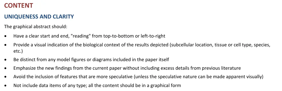
The "Uniqueness and clarity" rules from the Cell Press graphical abstract guidelines. Source: crosstalk.cell.com, retrieved 24 August 2026.
Read them as a review author:
| Cell Press rule | What it does to a review |
|---|---|
| "Emphasize the new findings from the current paper without including excess details from previous literature" | Leaves you with an empty frame |
| "Be distinct from any model figures or diagrams included in the paper itself" | Rules out the framework figure that is often the point of the review |
| "Not include data items of any type; all the content should be in a graphical form" | Removes the pooled effect, which is the one real result a meta-analysis has |
Elsevier's instruction is friendlier. It asks authors to "provide an original image that clearly represents the work described in the paper." For a review, the work described is the synthesis. That is what belongs in the frame.
What a review can put in the frame
A review has three things worth showing, and none of them is a new finding.
- Scope. What body of work you looked at, and how much of it.
- Synthesis. How the pieces relate: a mechanism, a hierarchy, a set of competing accounts, a pooled number.
- The claim. What you now assert that a reader could not have assembled alone.
Scope is the part people skip, and it is what sets a review's graphical abstract apart from a textbook diagram. A reader who cannot tell how much evidence sits behind your picture has no reason to trust it.
Pick the skeleton that matches your review type
The review type you wrote sets the layout before you draw anything.
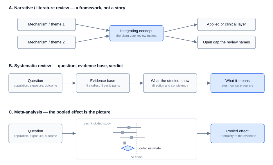
Three skeletons, one per review type. Schematic drawn for this article.
Narrative or literature review: draw the framework
Your output is a way of ordering a field, so draw that order. A hub with themes feeding into it works when your claim ties strands together. A stack of layers works when your review moves between scales. Either way, the arrows carry the argument, and the centre holds the claim.
This is the one review type where the graphical abstract and a main figure often want to be the same picture. Cell Press forbids that; Elsevier allows it, and says outright that "some authors may use a concluding figure from the article." Check your journal before you draw twice. If you are building the framework itself, our conceptual framework generator lays out that kind of diagram.
Systematic review: question, evidence base, verdict
Four bands, read left to right:
- The question.
- The evidence base, as a number.
- What the studies showed.
- What it means, and how sure you are.
The evidence base band is where authors overreach. It needs one or two numbers, not a screening history. How many studies, how many participants. That is the whole job.
Meta-analysis: the pooled effect is the picture
A meta-analysis is the only review with a genuine original result, so show it. A small forest plot with a handful of study rows and a pooled diamond reads fast and says more than any icon.
Two cautions. Cell Press bans data items in graphical abstracts outright, so check whether your target journal does too. And a stripped-down plot still has to be honest: keep the line of no effect, and keep some sign of how uncertain the estimate is. If you need the full figure, our forest plot maker builds it from your effect sizes.
Biology reviews: choose one scale and stay there
Life-science reviews fail visually when they mix scales. A molecule, a cell and an organism in one frame with arrows between them reads as clutter, not as a mechanism. Pick the level your claim lives at. If your review really does cross scales, make the crossing the structure: a vertical stack, top to bottom, one level per band.
Use the icon conventions your subfield already reads. Invented symbols cost the reader the seconds you were trying to save.
Your graphical abstract is not your PRISMA flow diagram
A common online claim — that a systematic review's graphical abstract should hold the PRISMA flow, PICO blocks and key findings — falls apart against what PRISMA actually says.
What PRISMA asks for
PRISMA 2020 puts the flow diagram in the main report, at checklist item 16a:
"Describe the results of the search and selection process, from the number of records identified in the search to the number of studies included in the review, ideally using a flow diagram."
The abstract is covered by a separate list, PRISMA 2020 for Abstracts. It runs to twelve items, covering:
- title, objective and eligibility criteria
- information sources, risk-of-bias methods and synthesis methods
- included studies, synthesised results and limitations
- interpretation, funding and registration
Not one of the twelve asks for a figure.
So these are two documents doing two jobs. The flow diagram is a methods record that shows your screening was honest. The graphical abstract is a summary that tells a browsing reader what you found. Our PRISMA flow diagram generator makes the first one; it is not a substitute for the second.
Why pasting the flow diagram in backfires
The flow diagram spends all its space on records you threw away. Drop it into a graphical abstract and the loudest thing on the page becomes your exclusion bookkeeping, not your conclusion. A reader scanning a table of contents learns that you screened with care, and nothing about what you found.
Look at how Cochrane US did it:
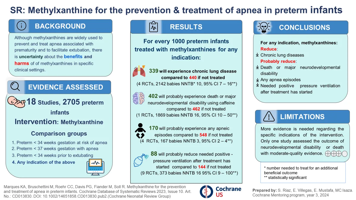
Cochrane US visual abstract for a review of methylxanthine for apnea in preterm infants. Prepared by S. Riaz, E. Villegas, E. Mustafa and MC Isaza, Cochrane US Health Equity Mentoring Program. Source: us.cochrane.org, retrieved 24 August 2026. Underlying review: Marques et al., Cochrane Database of Systematic Reviews 2023, CD013830.
There is no flow diagram in it. The entire screening process is compressed into one line, "18 Studies, 2705 preterm infants," and the space that buys goes to outcomes and conclusions.
Borrow the abstract checklist instead
That Cochrane image is close to a panel-by-panel version of PRISMA 2020 for Abstracts:
| Panel in the image | PRISMA 2020 for Abstracts item |
|---|---|
| Title starting "SR:" | Identify the report as a systematic review |
| Background | Objectives |
| Evidence assessed | Included studies; eligibility criteria |
| Results, with studies and participants per outcome | Synthesis of results |
| Conclusions | Interpretation |
| Limitations, with certainty ratings | Limitations of evidence |
Use the twelve items as your content list. They tell you what a reader needs; the layout is then just a matter of fitting them.
Do not let the picture replace the paper
RIVA-C, a reporting checklist for this exact risk, was published in BMJ Evidence-Based Medicine in 2024. It opens with the problem:
"People often use infographics (also called visual or graphical abstracts) as a substitute for reading the full text of an article."
Most of those infographics do not carry enough for that to be safe. RIVA-C runs to ten items, aimed at people making infographics of comparative health studies.
You do not need to work through it to benefit from its premise. Assume some readers will only ever see the image, then check whether your image would mislead them on its own.
Reusing figures from the papers you reviewed
Your raw material belongs to other people. That is a problem unique to reviews, and it has one safe default: redraw.
A redrawn schematic is an original image, which is what publishers ask for. It also lets you strip a borrowed figure down to the one relationship your review cares about.
If you do reuse, get permission. Elsevier's wording is blunt:
"Please ensure that you have obtained the necessary permission to include any third party-owned material in a graphical abstracts."
Citing a figure in your text does not cover putting it in your graphical abstract. An open licence may cover it. Read the licence rather than assume.
Mistakes that only happen in review graphical abstracts
- The field map. Everything you covered, at equal weight, with no claim. A review's graphical abstract needs a point, not an index.
- The flow diagram transplant. Covered above.
- Reference numbers in the frame. They are unreadable at the size the image is displayed and they signal that you are still writing the paper, not summing it up.
- Copying an RCT visual abstract. JAMA Network's visual abstracts cover randomized clinical trials, and their slots assume one trial with two arms. A review has neither.
- Sentences. Labels, not prose. If a panel needs a sentence, the panel is doing too much.
Before you submit
Only now check the specs. Size, resolution, file type and font rules vary by publisher, and they decide whether your file is accepted. We keep them in one place on the graphical abstract requirements page.
One note on tools, ours included. The graphical abstract maker on this site sends your text to a general image model, and returns a flat PNG with no editable labels. That puts it on the wrong side of Elsevier's rule against general-purpose AI image tools for graphical abstracts. Use it to test whether a skeleton reads, then rebuild the submitted file in an illustration tool.
We wrote up how publishers word their AI figure rules if you want the exact wording.
Questions authors ask
Can I cite a graphical abstract in a review paper?
Cite the article, not the image. A graphical abstract is part of a published paper rather than a separate work, so it carries that paper's citation.
The reverse case is the one that trips up review authors: putting reference numbers inside your own graphical abstract. Most journals do not allow references in an abstract, and the numbers are illegible at the size the image is shown. Reviews attract this mistake because every element in the frame came from somewhere.
Do scoping reviews use the same layout as systematic reviews?
Mostly, with one change. A scoping review maps what exists rather than answering a narrow question. So the third band is coverage, not effect: what kinds of studies turned up, where the work clusters, where it thins out. The gap is often the finding, so give it real space.
Where can I find sample graphical abstracts for review papers?
Go to the table of contents of the journal you are submitting to and scan its review articles. That gives you examples an editor already accepted, at the size readers see them. Cochrane publishes visual abstracts for its reviews, and open-access reviews indexed in PubMed Central usually show theirs. Generic template galleries are the weakest source, because almost all of their examples are original research.
Are a graphical abstract, a visual abstract and an infographic the same thing?
Close enough to swap for submission, but the habits differ. "Visual abstract" is the term in clinical and evidence work, and those tend to be text-heavy panels full of numbers, like the Cochrane example above. "Graphical abstract" is the term in the basic sciences, and those lean on drawn mechanisms with few words.
Reviews get pulled toward the first style. Journals in cell and molecular biology expect the second.
The short version
Draw your synthesis, not a finding you do not have. Let the review type pick the layout: a framework for a narrative review, four bands for a systematic review, a pooled effect for a meta-analysis. Keep the screening story out of it, and keep one number in it so readers know how much evidence is behind the claim.