

Turn a table of study effect sizes and confidence intervals into a weighted forest plot with a pooled-effect diamond — no spreadsheet macros, no software to install.
| Study | Effect size | Lower CI | Upper CI | Weight % | Subgroup | Remove study |
|---|---|---|---|---|---|---|
Forest plots generated with Figwise, covering different effect types and subgroup layouts.
A classic forest plot showing odds ratios for drug efficacy across high-dose and low-dose subgroups, with inverse-variance weighting and a pooled diamond.
Blood pressure reduction measured as mean difference in mmHg. Uses a linear x-axis with the null-effect line at zero.
Overall survival hazard ratios from landmark immunotherapy trials, displayed on a log scale with automatic inverse-variance weighting.
Vaccine efficacy against hospitalization, stratified by adult and pediatric populations, using risk ratio as the effect measure.
A forest plot lines up results from every study in a meta-analysis, one row each. A square marks the point estimate — the study's odds ratio, risk ratio, hazard ratio, or mean difference — and the horizontal line through it is the 95% confidence interval.
A dashed null line sits at 1.0 for ratio measures such as OR, RR, and HR, or at 0 for difference measures such as MD and SMD. If a study's confidence interval crosses that line, its result alone is not statistically significant. Square size reflects the study's weight in the pooled estimate.
The diamond at the bottom is the pooled effect across all studies, its width equal to the pooled confidence interval — this is what most forest plot interpretation questions ultimately come down to reading correctly.
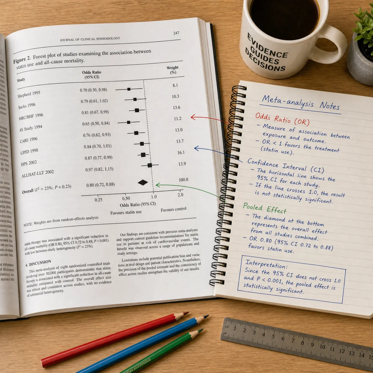
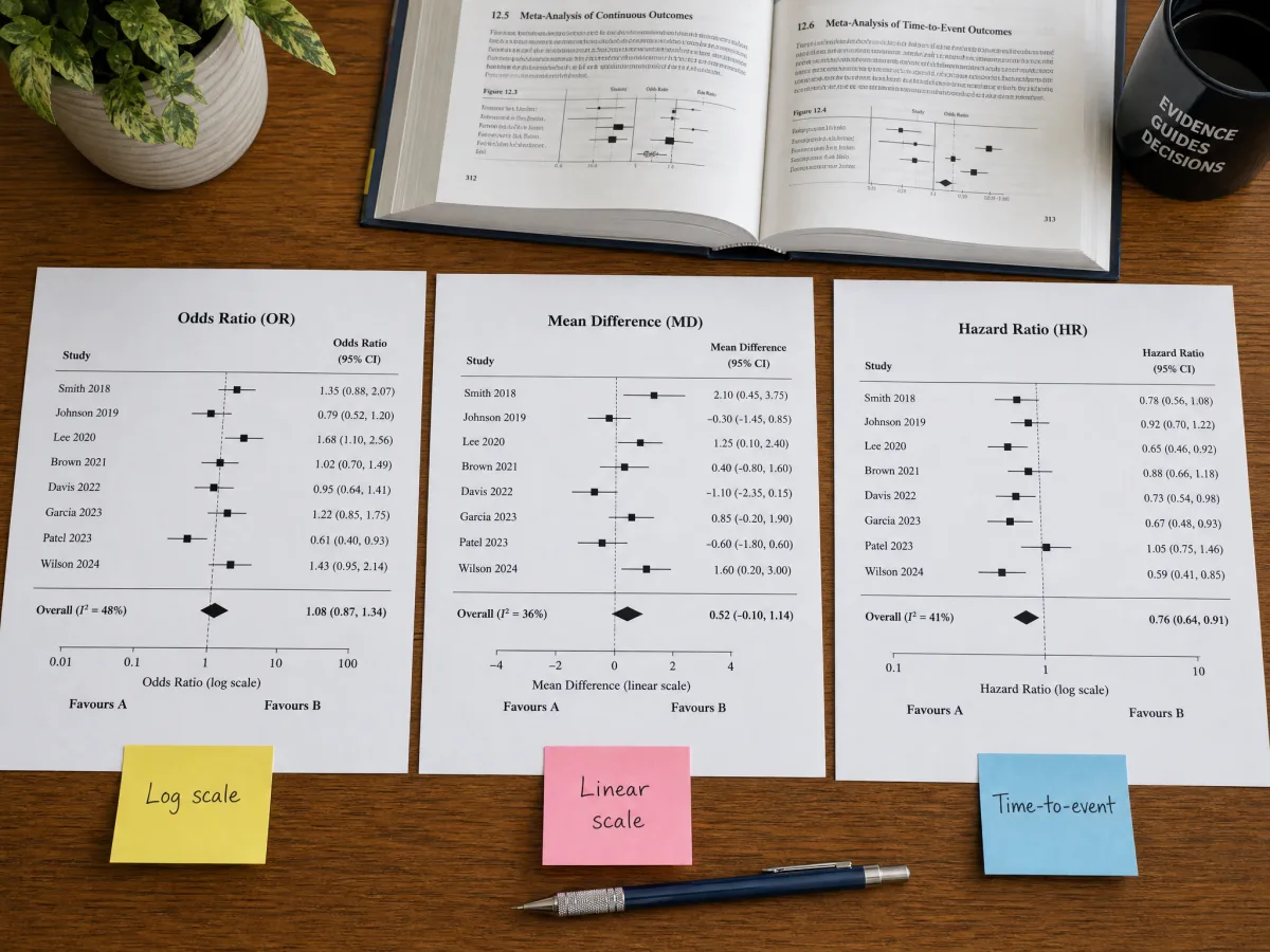
Switch between OR, RR, HR, MD, and SMD from a single dropdown. The forest plot generator automatically chooses a logarithmic axis with the null line at 1.0 for ratio measures, or a linear axis with the null line at 0 for difference measures.
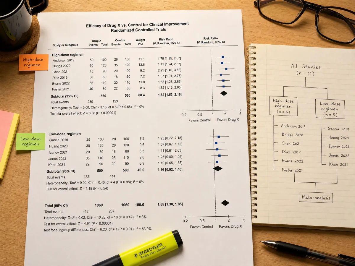
Tag each study with a subgroup label and the generator clusters related trials under a shared heading automatically — useful for comparing dose levels, follow-up length, or study design within one chart.

Leave the weight field blank and this forest plot maker derives it using inverse-variance weighting from each study's CI width, then scales every square so its area reflects that study's share of the pooled result.
Here is how to make a forest plot from a list of study effect sizes, from picking the right scale to exporting the final chart.
Add one row per study with its name, then choose OR, RR, HR, MD, or SMD from the effect-type menu — this decides whether the chart uses a log or linear scale and where the null line sits.
Type the point estimate plus the lower and upper bound of its 95% CI for every study. Leave the weight column blank and the generator derives it from CI width automatically.
Tag studies with a subgroup label to cluster related trials under one heading, then fill in the overall effect size and CI so the pooled diamond renders at the bottom of the chart.
The forest plot redraws as you type. Once the squares, confidence intervals, and diamond line up the way you expect, download the chart as SVG for further editing or PNG for direct submission.
Answers to the questions researchers most often ask about reading and building forest plots.
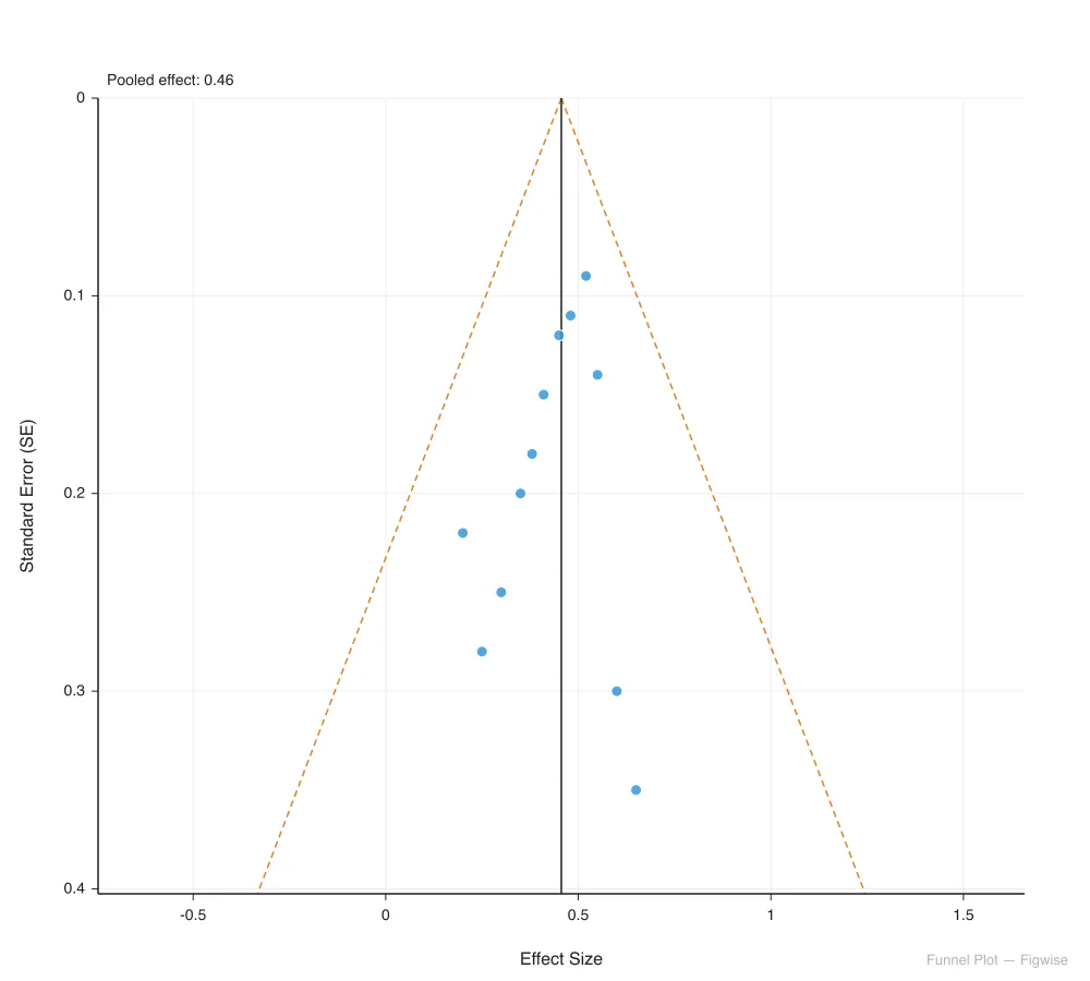
Enter your study data, review the weighted chart, and download a submission-ready figure — all in your browser.