

 Figwise Team
Most guides show you pretty pictures. None of them tell you that Elsevier wants a wide 2.5:1 banner and Cell Press wants a square. One file cannot be both.
So start with the rules, then copy a layout that already passed peer review. Below are the exact specs from three publishers, four published graphical abstracts taken apart panel by panel, and the mistakes you can check against a written rule instead of a vibe.
One more thing, near the end: the "graphical abstracts double your views" line traces back to an editorial, and two later studies point the other way.
The publisher's spec picks your layout for you
Draw first and you may have to redraw. The shape, the font size and the file type are all set before you start, and they differ a lot between publishers.
| Spec | Elsevier | Cell Press | Wiley (J Intern Med) |
|---|---|---|---|
| Size | min. 1328 × 531 px (w × h) | 5.5 in square | 5 × 5 in |
| Ratio | 2.5:1 wide | 1:1 square | 1:1 square |
| Resolution | min. 300 dpi | 300 dpi | 300 dpi |
| Pixels at that dpi | 1328 × 531 | 1650 × 1650 | 1500 × 1500 |
| Font | Times, Arial, Courier or Symbol | Arial, 12–16 pt | Arial or Myriad Pro, 10–14 pt |
| File types | TIFF, EPS, PDF, MS Office | TIFF, PDF, JPG | JPEG, TIFF, EPS, PDF |
| Panels | not stated | one single panel | single visual summary |
Specs as published on each source page, checked 22 August 2026. Sources: Elsevier's graphical abstract page, the Cell Press Graphical Abstract Guidelines and the Journal of Internal Medicine graphical abstract guidelines. Numbers vary by journal even inside one publisher, so read your target journal's guide for authors too.
Design for the size the reader sees, not the size you upload
This is the number nobody quotes. Elsevier scales your image down to a small box on ScienceDirect:
"Please note that your image will be scaled proportionally to fit in the available window on ScienceDirect: a 500 by 200-pixel rectangle."
Two hundred pixels high. That is the real canvas. Elsevier's font rule says the same thing in other words:
"Font: please use Times, Arial, Courier or Symbol with a large enough font size as the image will be reduced in size for the table of contents to fit a window 200 pixels high."
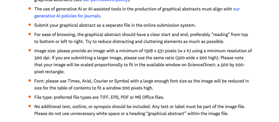
Elsevier's graphical abstract instructions. Source: elsevier.com, captured 22 August 2026.
Shrink your own draft to 500 × 200 px and look at it. If a label goes fuzzy, it is too small.
Four published graphical abstracts, taken apart
Each one below is open access. Follow the link and look at the figure yourself, then read the notes.
A banded pipeline: four rows, one per stage
Circulating cell-free mtDNA fragmentomics for early detection of gastric cancer (Cell Reports Medicine, 2026, doi:10.1016/j.xcrm.2026.102825).
Four pale blue bands stack down the square. Each band has its own title, so the reader gets a table of contents inside the picture:
- Sample collection and sequencing
- ccf-mtDNA fragmentomic feature analysis
- GC detection model construction
- GD model's performance evaluation
Band one carries the study's weight in one line: five group icons under the heading "Eight cohorts", then "No. of participants = 1,951".
Band two shows where the drawing effort went. Five features are listed, and only three get a sketch. A bell curve stands in for fragment size, a jagged trace for the fragmentation profile, and two colour bars for the 5′ end motif. The other two stay plain bullets, because the 5′ end base preference and the motif diversity score have no obvious shape.
The last band is where it slips. It holds two box plots and two ROC panels, with AUC values set so small you have to zoom in to read them. Cell Press guidance says a graphical abstract should "not include data items of any type." That row is data items.
A side-by-side comparison: two tinted columns
Divergent strigolactones or karrikins signaling is mediated by preferred AtD14/KAI2-MAX2-SMXL complex targeting specific SMXL domains (iScience, 2026, doi:10.1016/j.isci.2026.116062).
One vertical line splits the square in two. The left half sits on pale blue, the right on pale green, and each half has a heading. Colour does the sorting, so no arrow has to explain it.
Three moves do all the work:
- Each half stacks two block diagrams of the same protein complex, with only the swapped parts recoloured. The headings name the split: "Hormone-preferred SMXL degradations" on the left, "Domain-chimeric SMXL degradations" on the right.
- Each column runs top to bottom and lands on a sentence in plain type. Left: "Activation of SL signaling," then "Activation of KAR signaling." Right: "Activation of SMXL-repressed signaling."
- Nothing else is on the canvas. Four diagrams, three written conclusions, not one chart or table.
This is the cleanest fit to the Cell Press rules of the four. Labels like SMXL7 and SMXLχ171 put plenty of digits on screen. Every digit names a protein, though, never a measurement. So the zero-data-item test still passes, and each column holds one reading direction.
A radial hub: everything points at the middle
Multipurpose trees on farms can improve nutrition in Malawi (One Earth, 2025, doi:10.1016/j.oneear.2024.12.001).
A map of Malawi sits in the centre of a soft green circle, with the north and south study sites labelled on it. Six small circles ring the map, one per covariate, each tied to the centre by a thin dashed line:
Education · Living standards · Household size · Crop count · Livestock · Farm size
Two cream circles sit in the same ring, at about twice the width of the covariate ones, and a thick black arrow links each to the map. The left arrow comes in from types of on-farm trees, drawn as a small Venn of fuel, income and food. The right arrow goes out to two stacked labels, micronutrient adequacy and food sourcing patterns, each with its own icon. Line weight, not text, tells you which link is the finding.
The paper's title is set across the top of the image itself. Elsevier allows that, since "any text or label must be part of the image file." What Elsevier bans is a heading that reads "graphical abstract."
Numbers as the visual: percentages doing the work
Patient-derived organoids from metastatic colorectal cancer mirror tumor heterogeneity (Cell Reports Medicine, 2026, doi:10.1016/j.xcrm.2026.102840).
The top half splits in two. Left: a body diagram with the liver and colon marked, two arrows out to tumour samples, and the line "Sampling of 346 tumors from 132 patients." Right: two pie charts, 62% lesion-wise and 77% patient-wise, sliced green for successful and orange for failure, then two triangles for better and poor survival.
The bottom half lists the profiling in three short lines, each next to its own icon:
- DNA — mutations in 20 genes
- RNA — HTA2.0 microarrays, RNAseq
- Protein — in situ expression, 14 proteins
Around that column sit 213 organoids from 102 patients, 41–47 drugs screened, and two organoid shapes, cystic and solid, each tagged with its markers.
More than ten numbers in one square, and it still reads fast. That works because each number sits next to the icon it belongs to, not in a table.
Four skeletons you can reuse
The four above are not four styles. They are four ways to move a reader's eye, and each suits a different kind of study.
| Skeleton | Reads | Best for |
|---|---|---|
| Banded pipeline | top to bottom, 3–4 rows | multi-stage methods: cohort, assay, model, validation |
| Left-to-right chain | one row, arrows between blocks | cause and effect, before and after, a mechanism |
| Side-by-side compare | two columns, each top to bottom | two conditions, two treatments, two genotypes |
| Radial hub | outside in, conclusion in the centre | many inputs, one outcome; surveys and field studies |
Two rules from the publishers apply to all four. Cell Press asks for "a clear start and end, 'reading' from top-to-bottom or left-to-right," and Elsevier repeats it almost word for word. Pick one direction and hold it.
Wide 2.5:1 formats push you toward the left-to-right chain. Square formats give the banded pipeline and the radial hub room to breathe. Which ratio you get is set by the journal, and the publishers do not agree with each other.
Reviews are the exception. With no single experiment to narrate, none of these four skeletons fits — what to draw when the paper is a review covers the shapes that do.
Mistakes you can check against a written rule
"Don't make it cluttered" is not a check. These are, because each one comes from a publisher's own page.
- Data items in the picture. Cell Press: "Not include data items of any type; all the content should be in a graphical form." Wiley's J Intern Med guide: "Avoid tables, raw primary data or distracting components." One published example breaks both. The graphical abstract for Climate-adaptive and low-carbon multi-objective water resources optimization (iScience, 2026, doi:10.1016/j.isci.2026.116081) packs in four line charts, a stacked bar chart, three 3D scatter plots, three flow diagrams and two numeric tables. In the 664 px version PMC serves, the table figures land near 6 px tall.
- Type below the floor. Cell Press sets Arial 12–16 pt and adds in red that "smaller fonts will not be legible online." The same guide, revising a real example, flags text at 6.5 pt as too small. Wiley's floor is 10 pt.
- No type hierarchy at all. The J Intern Med guide marks up a dummy abstract with three sizes: headline 14 pt bold, labels 12 pt semibold, smallest allowed text 10 pt light. Three sizes give the eye an order to follow. One size gives it nothing.
- The wrong aspect ratio. A square built for Cell Press gets letterboxed inside Elsevier's 500 × 200 window, and most of your canvas turns into empty margin. Elsevier also says not to add "unnecessary white space."
- A heading inside the image. Elsevier: "Please do not use unnecessary white space or a heading 'graphical abstract' within the image file." Wiley says the same: "Do not write 'Graphical Abstract' within the image file."
- Red against green. Wiley's guide asks authors to "try to avoid green-red contrast with consideration of colour blind readers," and to prefer black text.
- Logos. J Intern Med will not run "business logotypes, organisation names and or imagery that can be viewed as adversitesment [sic]."
- Borrowed icons with no permission. Elsevier: "Please ensure that you have obtained the necessary permission to include any third party-owned material in a graphical abstracts [sic]." Wiley extends that to stock sites and image search results.
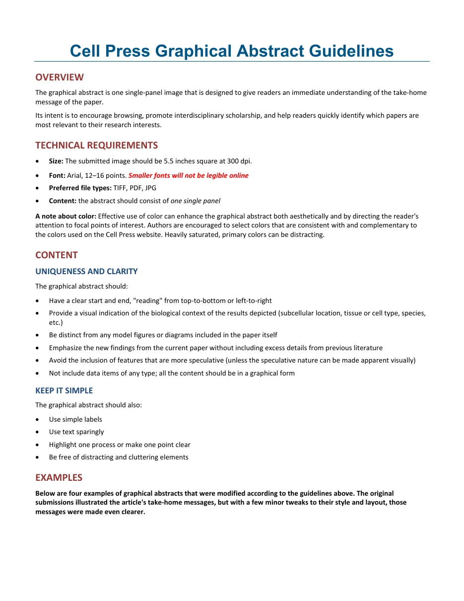
Page 1 of the Cell Press Graphical Abstract Guidelines. Source: crosstalk.cell.com, captured 22 August 2026.
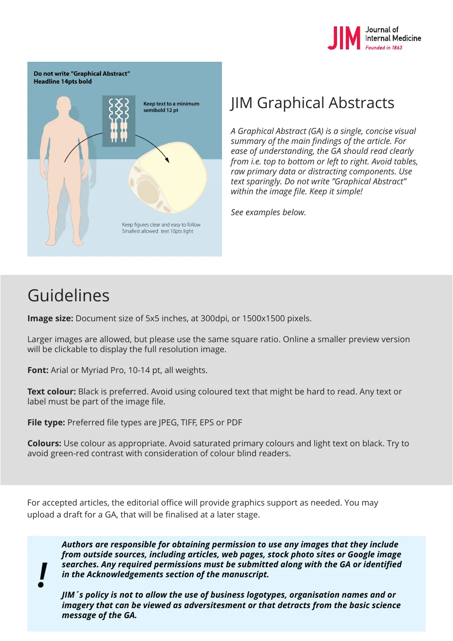
Page 1 of the Journal of Internal Medicine graphical abstract guidelines. Source: onlinelibrary.wiley.com, captured 22 August 2026.
What the evidence says about views and citations
A graphical abstract is a sharing tool. The studies that have measured it agree on that much and on little else: social reach goes up, views may go up, and not one of them shows citations moving. In the earliest, the papers without a graphical abstract did better on downloads and citations.
That is still a good reason to make one. It is a bad reason to spend a week on it. We trace the publisher's "usage is doubled" line back to its source and take the three studies apart in what a graphical abstract is, and whether your journal requires one.
Templates, and the AI rule that catches people out
Elsevier hands out a free visual abstract PowerPoint template from that same author page. Andrew Ibrahim's visual abstract primer is the other free file worth having, and Elsevier links to it too.
Now the trap. Elsevier's generative AI policy for journals singles out this one figure type:
"General-purpose generative AI image tools must not be used to create graphical abstracts."
The same policy points at what it wants instead:
"Authors are encouraged to use dedicated scientific illustration tools when preparing graphical abstracts."
Its summary table adds one duty whichever tool you pick: "Mention the tool used in the image caption." Write that line into the caption before you submit.
Be clear about where a tool sits in that split, including ours. The graphical abstract maker on this site sends your abstract to a general image model and returns a flat PNG, so for a submitted graphical abstract it falls on the side Elsevier rules out. Try a layout with it, then rebuild the file you submit in an illustration tool. Our step-by-step walkthrough covers which tool to commit to before you start, and why a free plan's licence can matter more than its features. We covered how six publishers word their AI figure rules, with each one quoted, if you want the full picture.
The same split applies to our conceptual framework generator. It is quick for sketching boxes and arrows, and it is a draft, not a submission file.
Questions authors ask
Is a graphical abstract required?
It is set per journal, not per publisher. Some require one, some ask for it at revision, and many leave it optional. How to find your journal's answer takes about a minute.
Can I reuse a figure from the paper?
You can, and Elsevier notes that some authors use a concluding figure. Cell Press asks for the opposite: the graphical abstract should "be distinct from any model figures or diagrams included in the paper itself." Follow the stricter of the two rules if you might submit to either.
How much text is too much?
Cell Press gives the shape of the answer rather than a word count: "use simple labels," "use text sparingly," "highlight one process or make one point clear." A practical test is the 500 × 200 px preview. Text you cannot read there is text the reader never sees.
Do I need permission for the icons I use?
Yes, for anything you did not make. Elsevier requires permission for third-party material inside a graphical abstract, and J Intern Med names stock photo sites and image searches as sources that still need clearing.
Should the take-home message be in words or pictures?
Both, in the examples above. Two of the four end in written conclusions. One closes each column with a line of plain type: "Activation of KAR signaling" on the left, "Activation of SMXL-repressed signaling" on the right. The other ends two arrows on one word each, "Progression" and "Response."
The picture carries the route. The words land the point.
Before you export
Three checks, in this order.
- Open your target journal's guide for authors and write down the ratio, the pixel size and the font floor.
- Shrink your draft to 500 × 200 px, or to a thumbnail, and read every label out loud.
- Delete every chart, table and axis. If the message survives, the layout was doing its job.