

 Figwise Team
Almost everyone writes the same prompt: "make a graphical abstract from this abstract," followed by the whole abstract. The image comes back crowded, with tiny paragraphs no reader can use and words that are not words.
The prompt asked for a summary of a summary and left every visual choice open, so the model filled the gaps.
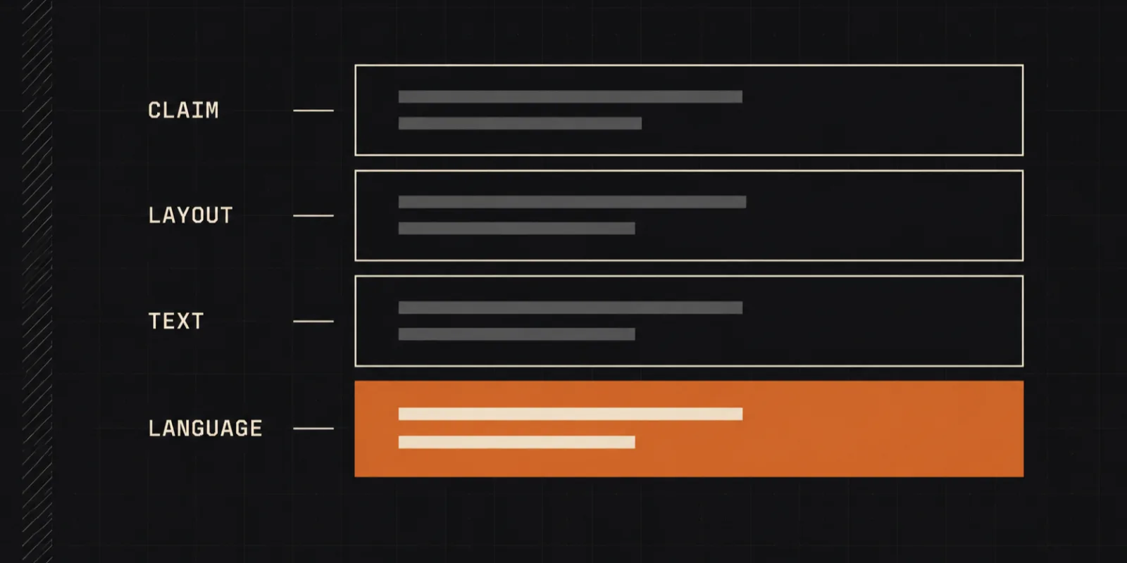
A prompt that works has four layers, in this order: the one sentence the figure must prove, the layout and reading direction, the exact text and color limits, and a lock on the language. Both example prompts below are written that way. Paste either one into the Gemini app or AI Studio, where Google's Nano Banana Pro image model runs, and swap in your own study.
One constraint on what that output is for, first.
The output is a draft, not your submission file
Two of the largest publishers say no, in writing, before you start.
Elsevier's generative AI policy for journals gives graphical abstracts their own section:
"General-purpose generative AI image tools must not be used to create graphical abstracts."
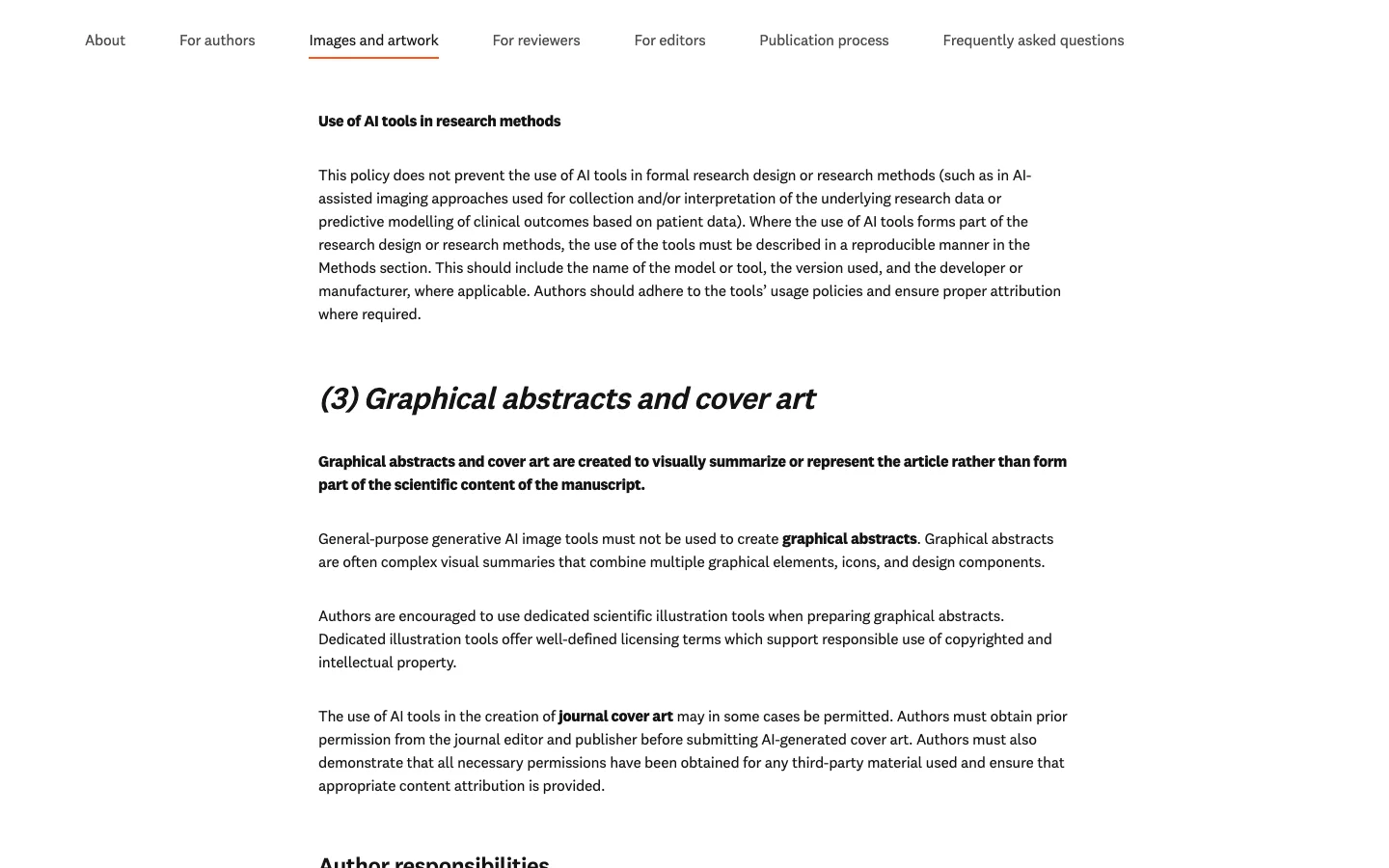
Elsevier's rule for graphical abstracts and cover art. Source: elsevier.com, captured 25 August 2026.
Springer Nature's guidance is broader and blunter: "Avoid generative AI images or figures. These are not permitted for publication unless they meet specific exceptions (legally sourced, directly about AI, or based on verifiable scientific data) and are clearly labelled as 'AI-generated.'"
So a prompt buys you a draft. Use it to test whether your take-home message fits in one picture, to show coauthors a shape they can argue with, or to make a slide. Then rebuild the file you submit in an illustration tool. We wrote up what six publishers actually allow and how the tool choice drives the rest of the job separately.
Why pasting the abstract fails
Your abstract is written for a reader who reads every word. A figure is read in a few seconds.
An abstract holds a dozen findings, three method details and two limitations. Hand the model all of it and it tries to draw all of it, because nothing in the prompt says what to leave out. You get eight panels where you needed four, and long sentences printed at a size nobody can read.
The second failure is text. Image models draw letter shapes, not words, unless the prompt says which words. Google's own prompt guide puts this under "Specific text integration": "Clearly state what text should appear and how it should look." If you do not, the model invents plausible-looking labels from the vocabulary of your field.
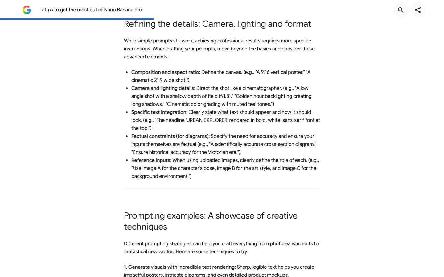
Google's advanced prompt elements, including the rule on text and the one on factual constraints for diagrams. Source: blog.google, captured 25 August 2026.
None of this means the abstract has no place in the prompt. Put it in as background after the four layers, with a line saying it is context and the panels come from the layout you specified.
The four layers of a working prompt
Write the layers in order. Each one closes a gap the model would otherwise fill for you.
Layer 1: the one sentence the figure has to prove
Before any visual word, state the finding in a single plain sentence.
Not the topic. The claim. "We studied time-restricted feeding in obese mice" is a topic, and it gives the model nothing to draw. "Eight weeks of time-restricted feeding lowered liver fat without changing total calories eaten" is a claim, and every panel can now be judged against it.
This is also the cheapest test of your own figure. If you cannot write the sentence, the problem is not the prompt.
Layer 2: the layout and the reading direction
Say how many panels, in what shape, and which way the eye moves.
Models default to a busy collage. Name the arrangement instead: a single row read left to right, or a column read top to bottom, or a hub with branches. Then describe each panel in one line, in reading order. Google's guide calls this step "Define the canvas," and its separate rule for diagrams is to "specify the need for accuracy" — a named structure is how you make accuracy checkable.
Pick the shape your journal wants before you write this layer, not after. Each publisher sets its own frame, and the graphical abstract requirements by journal page lists them. A prompt that produces a tall figure for a journal that wants a wide one is a rewrite, not a crop.
Layer 3: the exact text and the color limits
List every word you want in the image, spelled the way you want it, and forbid the rest.
A short title, one label per panel, nothing else. Write the labels out in quotes inside the prompt. Then add the negative half, which most prompt templates skip: no paragraphs, no axis numbers, no invented words. This is the difference between a figure with four readable labels and a figure with four labels plus fourteen pieces of decorative gibberish.
Color belongs here too, as a limit rather than a wish. Name two or three colors and one accent. "Muted blues and grays with one orange accent" holds; "professional color scheme" does not.
Layer 4: lock the language
Add one line naming the language of every word in the image.
This is the layer nobody writes, and it causes the strangest failures. With nothing in the prompt fixing the language, the model infers it from the study's setting or from names in the abstract, so an English abstract about a Chinese cohort can come back with labels in mixed scripts. Feed it a non-English abstract and it may translate half the labels and leave the other half. Our own graphical abstract maker carries this instruction in its built-in prompt for exactly that reason: write everything in English unless the abstract itself is clearly in another language, and never use a language the abstract does not contain.
One sentence covers it: "Write every word in the image in English. Use no other language and no invented characters."
Prompt 1: an experimental paper
Here is the whole thing. Paste it, then replace the study with yours, keeping the same layers.
A scientific graphical abstract for a journal article. Flat vector illustration,
clean white background, muted palette of blues and grays with one orange accent,
wide banner layout.

The one thing this figure must prove: in mice with diet-induced obesity, eight
weeks of time-restricted feeding lowered liver fat without changing total
calories eaten.

Layout: four panels in a single row, read left to right, joined by thin arrows.
Panel 1 - two matched groups of mice, one beside a clock marking a limited
feeding window, one beside food available all day.
Panel 2 - a feeding schedule bar for each group, both bars the same total length.
Panel 3 - two liver icons side by side, the time-restricted one with visibly
fewer fat droplets.
Panel 4 - a simple two-bar chart, the time-restricted bar clearly lower.

Text: render only the following words, spelled exactly as written.
Title across the top: "Time-restricted feeding cuts liver fat at equal calories"
One label under each panel, in order: "Two matched groups", "Same daily intake",
"Less liver fat", "Measured in both groups"
Use a clean sans-serif font. Put no other text anywhere in the image. No
paragraphs, no numbers on the axes, no invented words, no characters that are
not real English letters.

Style limits: no photorealism, no 3D rendering, no drop shadows, no gradients,
no decorative background. Scientifically accurate shapes only. Leave generous
white space between panels.
Read it back against the layers. Paragraph one is style and canvas. Paragraph two is the claim, and it is the only paragraph you must rewrite from scratch.
Paragraph three is layout and reading order. Paragraph four is the text lock, and it is the longest on purpose. Paragraph five kills the model's defaults, which run to glossy 3D and heavy shadows.
Prompt 2: a review paper
A review has no single experiment, so layer 1 changes shape: the claim is about the state of the field, not about one result.
A scientific graphical abstract for a review article. Flat vector illustration,
clean white background, muted palette of teals and grays with one amber accent,
wide banner layout.

The one thing this figure must prove: research on microplastics in freshwater
fish has grown quickly, but the three methods used to count particles disagree,
so results across studies cannot be pooled.

Layout: read top to bottom, with three parallel branches in the middle.
Top - a stack of journal papers with a rising trend line beside it, standing for
the growing literature.
Middle - three branches leaving the stack, one per detection method: sorting by
eye under a microscope, staining with a fluorescent dye, and spectroscopy.
Bottom - the three branches arrive at three separated dots on one axis, spaced
far apart so they clearly do not agree.
Right edge - one open box holding a question mark, set apart from the rest.

Text: render only the following words, spelled exactly as written.
Title across the top: "Three counting methods, three different answers"
One label per branch, in order: "Visual sorting", "Fluorescent staining",
"Spectroscopy"
Three section labels: "Growing literature", "Results do not agree",
"Open question: one shared protocol"
Use a clean sans-serif font. Put no other text anywhere in the image. No
paragraphs, no numbers on the axis, no invented words, no characters that are
not real English letters.

Style limits: no photorealism, no 3D rendering, no drop shadows, no gradients,
no decorative background. Keep generous white space between the branches.
Both prompts were written by applying the four layers to a made-up study, so treat the words as a shape to fill, not as tested magic. Which shape a review needs depends on the review type, and graphical abstracts for review papers sets those out.
Ask for the plan before you ask for the picture
If the layout layer is the part you cannot fill in, split the job in two.
Send the abstract to a text model first and ask it for a panel plan: how many panels, what each one shows, what its label says. Read the plan, fix it, and only then paste it into layer 2 of the image prompt. You are cheap at editing a list and slow at editing an image, so make the model argue with you where editing is cheap.
This also protects the claim. A plan written in words lets you see that panel 3 is showing your control condition as if it were a finding, which is invisible until the image comes back.
Fixing the second pass
Change one thing per round, and say what to change rather than restating the whole prompt.
Google's guide is direct about editing: "For modifying an existing image, be direct and specific." The three fixes that come up most:
- A label came back wrong or garbled. Repeat the exact string in quotes and say where it goes. Do not rephrase the label, or you will get a third spelling.
- Too much in the frame. Cut a panel from the layout layer instead of asking for "less clutter." The model cannot count clutter; it can drop a panel.
- Colors drifted. Restate the palette as a limit, and name what to remove: the gradient, the shadow, the second accent color.
If three rounds have not fixed it, the fault is usually in layer 1. A claim that needs two sentences needs two figures.
Where a purpose-built tool fits
A tool that only makes graphical abstracts writes these layers for you, which removes the prompt work and the choices with it.
Our graphical abstract maker takes the abstract and applies a fixed version of the four layers: panel count, reading direction, label length, palette and language are all set in advance. It returns a flat PNG with no editable labels, so it lands on exactly the side of the Elsevier rule quoted above. It is a draft you can react to, not a submission file.
It needs an account, and each run costs 30 credits. New accounts start with 85, so you get two runs before you pay anything.
Writing the prompt yourself is the better option when the layout is unusual, when your claim needs a shape no template has, or when you want to keep iterating on one panel. The tool is better when you want to see something in a minute and decide whether the figure is worth an afternoon.
Questions authors ask
What is the shortest prompt that still works?
The claim, the panel count with reading direction, the exact labels in quotes, and one line banning extra text. Roughly four sentences. Style and color can be left out; the text lock cannot, because that is where most failures start.
Does this work the same in ChatGPT, Gemini and other image models?
The four layers carry over, because they close gaps that every image model has. The wording of the style layer is what shifts between models, and text rendering quality varies most. Test with a claim you already know how to draw so you can tell a model problem from a prompt problem.
Can I use an AI-made graphical abstract for a conference poster or a talk?
Usually yes, and that is where these prompts pay off. The publisher rules quoted above apply to figures submitted with a manuscript. Poster and slide use falls under your conference's own rules, so check them, and say which tool made the image.
Before you paste
Work down the layers in order, and treat the result as a draft in every case — a fast way to see whether your one sentence survives being drawn. What you submit gets rebuilt somewhere else. Start with what a graphical abstract is meant to do if you are not sure yet what yours should prove.