

Paste your differential expression results, set significance thresholds, and download a publication-ready volcano plot. Runs entirely in your browser — your data never leaves your device.
A volcano plot is a scatter chart that maps statistical significance against biological effect size. The horizontal axis shows log₂ fold change, while the vertical axis shows −log₁₀ p-value. Points that land in the upper corners represent genes — or proteins, metabolites, or other features — that are both strongly changed and statistically significant, making them prime candidates for follow-up experiments.
Researchers across genomics, proteomics, and metabolomics rely on volcano plots to sift through thousands of comparisons at a glance. Instead of scanning a spreadsheet row by row, you can spot up-regulated and down-regulated features instantly by their position on the chart. Journals such as Nature Methods and Bioinformatics routinely publish figures in this format because it packs two critical dimensions — magnitude and confidence — into a single, intuitive view.
This volcano plot generator runs entirely in your browser. Paste a table of gene names, log₂ fold changes, and p-values; the tool parses CSV or TSV automatically, renders the chart in real time, and lets you export a vector SVG or high-resolution PNG suitable for journal submission. There is nothing to install, no account to create, and your data never leaves your machine.
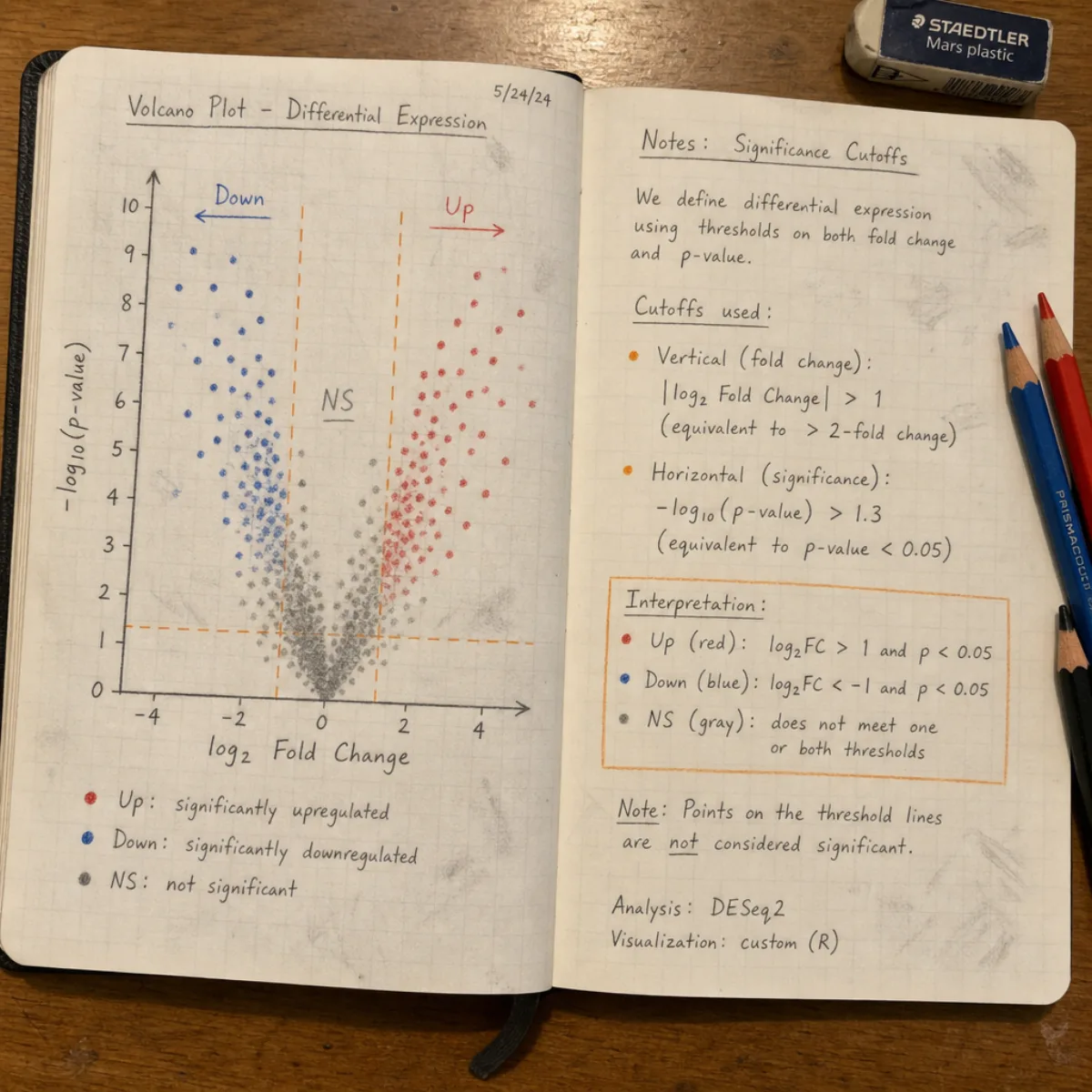
The same volcano plot generator handles data from RNA-seq, proteomics, metabolomics, and single-cell experiments. Each example below uses a different dataset to show how significance thresholds and labeling adapt to varied scales and distributions.
A classic bulk RNA-seq comparison between treatment and control groups, with DESeq2 output pasted directly into the volcano plot generator. Red and blue clusters highlight dozens of differentially expressed genes above the fold-change and p-value cutoffs.
Label-free quantitative proteomics data from a mass spectrometry experiment. Fewer total features than a transcriptome, but the volcano plot still separates significant hits from background noise at a glance.
Untargeted metabolomics comparison using adjusted p-values (FDR). The volcano plot generator accepts p_adj or FDR columns and renders threshold lines that match whichever metric you provide.
Marker genes from a single-cell RNA-seq cluster comparison run through the volcano plot generator. With thousands of features and very small p-values, the tool auto-scales the y-axis and labels only the most significant hits.
Four steps from raw differential expression data to a figure you can drop into your manuscript. The volcano plot generator handles column detection, scaling, and rendering automatically.
Copy a table from your analysis tool — DESeq2, limma, edgeR, or any pipeline that outputs gene names with log₂ fold changes and p-values. The volcano plot generator accepts TSV and CSV, and auto-detects common column headers such as gene, log2fc, padj, and fdr.
Adjust the fold-change cutoff (default |log₂FC| > 1, meaning a two-fold change) and the p-value cutoff (default 0.05). The dashed threshold lines update in real time so you can see exactly which features pass your criteria.
The chart renders instantly as you change thresholds or data. Upregulated features appear in red, downregulated in blue, and non-significant in gray. The generator labels the top genes by significance — adjust the label count to show more or fewer names.
Click Download SVG for a lossless vector file editable in Illustrator or Inkscape, or Download PNG for a 2× resolution raster ready for journal submission. Both formats preserve the exact layout you see on screen.
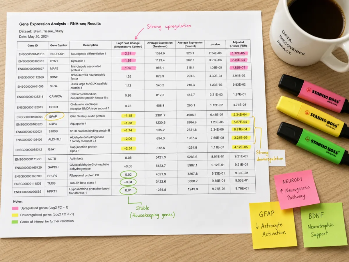
Paste output from DESeq2, limma, edgeR, or any differential expression pipeline. The volcano plot generator recognizes common column names — gene, log2FoldChange, padj, FDR — and maps them automatically, so you never need to reformat your data.
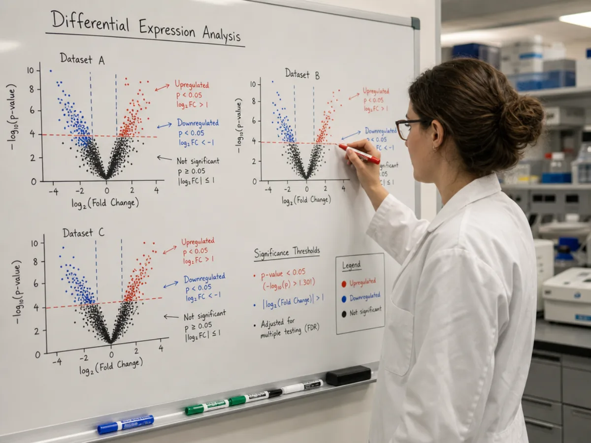
Drag the significance cutoffs and watch the volcano plot update in real time. Points shift between colored categories instantly, letting you explore different stringency levels without re-running your analysis pipeline.
Answers to the most common questions researchers ask about volcano plots and this generator tool.
Both volcano plots and MA plots visualize differential expression results, but they emphasize different aspects of the data. Choose the format that best matches what you want to communicate.
Combines effect size and statistical significance in one view
Shows fold change as a function of mean expression level
Paste your data, set your thresholds, and download a publication-ready figure — all in your browser.