

Chart how a number moves from a starting point to an ending point. Paste a list of gains and losses, and this waterfall chart maker floats each bar on the running total, lands subtotals on the axis, and exports a clean SVG or PNG.
Four line-item lists, four bridges — the same floating-bar logic reads a profit statement, a cash ledger, a stockroom count, or a study's enrollment funnel.
Revenue at the left, net income at the right, and every cost or gain in between drawn as a bar that floats on top of the running subtotal.
Opening cash on one end, closing cash on the other, with operating, investing, and financing activity as the floating bars that carry the balance between them.
Beginning stock count, then receipts, shipments, returns, and shrinkage each as a signed bar, landing on the ending count you can reconcile against a physical audit.
Enrolled participants at the start, then screen failures, dropouts, and exclusions peeling off as negative bars down to the final analyzed sample.
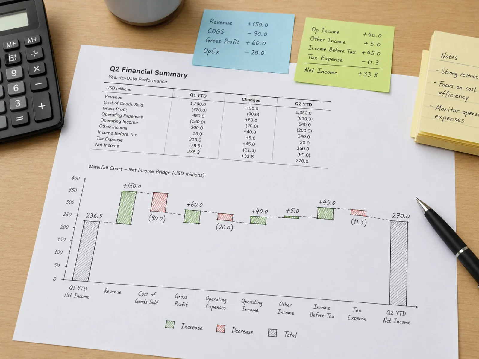
Every delta line — a gain or a loss — is drawn as a bar whose base sits at the cumulative total left behind by the row above it. That floating placement is the one thing that sets it apart from an ordinary bar chart: height still encodes magnitude, but position encodes where in the sequence the change happened.
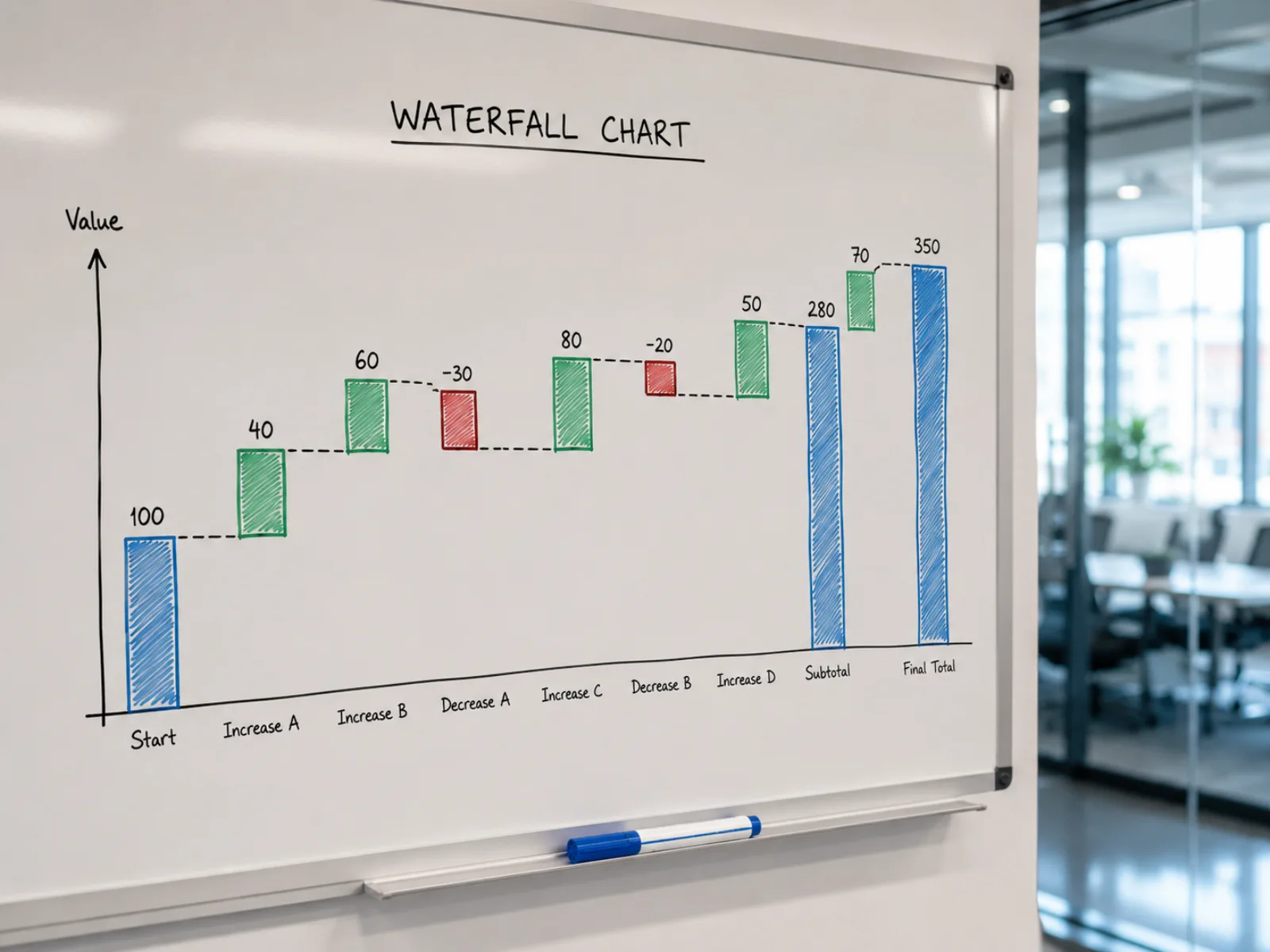
Mark any row "subtotal" or "total" and this waterfall chart generator drops that bar back to the axis, using the value you typed rather than the running sum. Everything after it keeps accumulating from that landed value — handy for checkpoints like gross margin that should match a number you already trust.
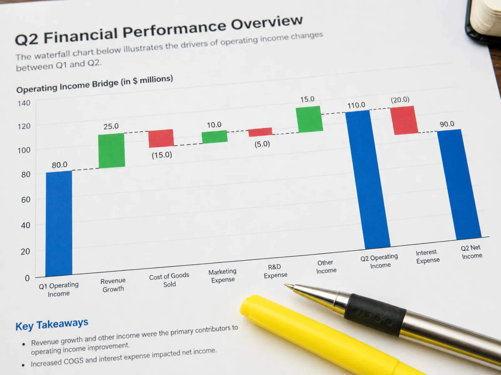
Dashed connector lines trace the step from one bar to the next so a reader's eye doesn't have to guess. Increase, decrease, and subtotal each carry their own color, and value labels can show a thousands separator and a leading plus sign on gains — or drop either for a plainer, denser chart.
Both stack rectangles, but they answer different questions — one about a running total's history, the other about a total's makeup at a single point in time.
Encodes the accumulation of change
Encodes the composition of a total
Four steps from a raw list of numbers to an exported bridge chart.
Type or paste one row per line as "label,value". Add a third column of "subtotal" or "total" wherever a row should land on the axis instead of floating on the running sum.
Bad rows are called out with a line number and a reason — a missing value, a non-numeric entry, or an unrecognized type token — so you can correct one line without losing the rest.
Name the auto-generated start and end bars, pick colors for increases, decreases, and totals, and decide whether connector lines, a thousands separator, and a leading plus sign should show.
Download the finished chart as an SVG for a report or slide deck, or as a PNG sized for a quick paste into an email or a slide.
What this generator assumes, and where those assumptions come from.
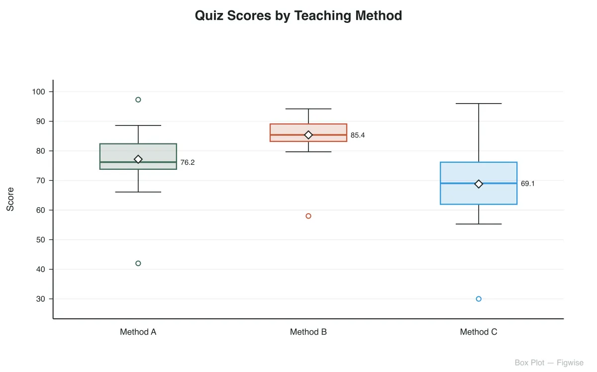
Paste your gains and losses, land a subtotal where you need one, and pull a publication-ready SVG or PNG straight out of the browser.