

Paste a matrix with row and column labels to draw a heatmap with sequential or diverging color scales, a colorbar, and optional value labels — free, no signup.
8 rows × 6 columns loaded
A heatmap turns a table of numbers into a grid of colored cells, so a pattern that would take minutes to spot in a spreadsheet becomes visible in seconds. Each cell's shade encodes the magnitude of its value, and the colorbar next to the grid is the legend that translates that shade back into a number.
A sequential color scale runs from light to dark and fits values that only move in one direction, like counts or expression levels that stay positive. A diverging scale runs from one hue through a neutral midpoint to a second hue, with zero centered in the middle — the right choice whenever a value can be positive or negative, such as fold changes or correlation coefficients.
Reading a heatmap means scanning for blocks of similar color rather than individual cells: a cluster of dark cells in one corner usually marks rows and columns that move together, and a correlation heatmap shows a solid diagonal of the strongest color because every variable correlates with itself. Row and column order is preserved from your input, so sort related rows next to each other before pasting to make those blocks easier to see.
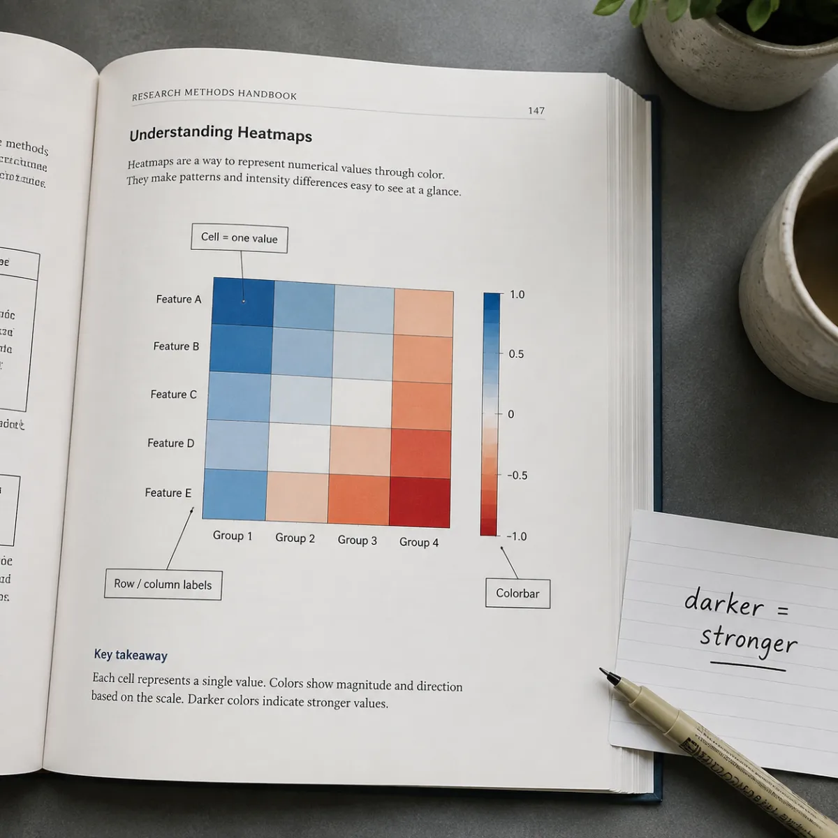
This online heatmap maker turns a raw matrix into a publication-ready chart — here is the whole four-step workflow.
Copy a table straight from a spreadsheet, with the first row holding column labels and the first column holding row labels, and drop it into the text box.
Choose a sequential blue or green scale for values that are always positive, or the diverging scale when your data crosses zero and you want that midpoint highlighted.
Turn on numeric labels inside each cell when readers need exact figures, not just relative color, and leave them off for a cleaner grid on a dense matrix.
The grid and colorbar redraw as you edit the matrix. Once the color scale and labels look right, download the finished chart as SVG or PNG.
Charts generated with Figwise, from gene expression panels to correlation matrices and monthly summaries.
A diverging heatmap of relative gene expression across control and treated samples, with red marking upregulated genes and blue marking downregulated ones around a zero-centered scale.
A correlation heatmap bounded between minus one and one, with each cell's coefficient printed on top of its color so readers get the exact number alongside the pattern.
A sequential heatmap tracking twelve months of sales across several product categories, a layout suited to any matrix where every value is a positive count or total.
A compact five-by-five matrix with value labels turned on for every cell, the format that works best when a chart needs to double as a lookup table.
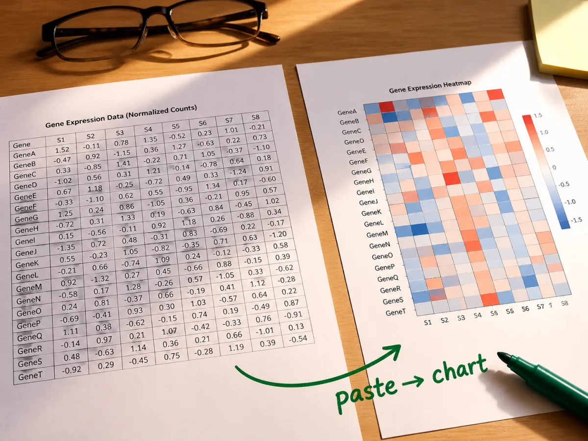
Copy a table out of a spreadsheet or a CSV export and paste it straight in — the first row and column become labels automatically, and the grid renders the moment you drop in a matrix of any size.
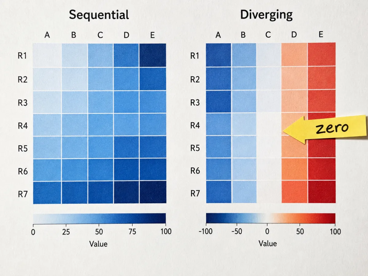
Switch between sequential blue, sequential green, and a diverging scale that centers on zero, the same convention correlation matrices and fold-change panels use in published figures.
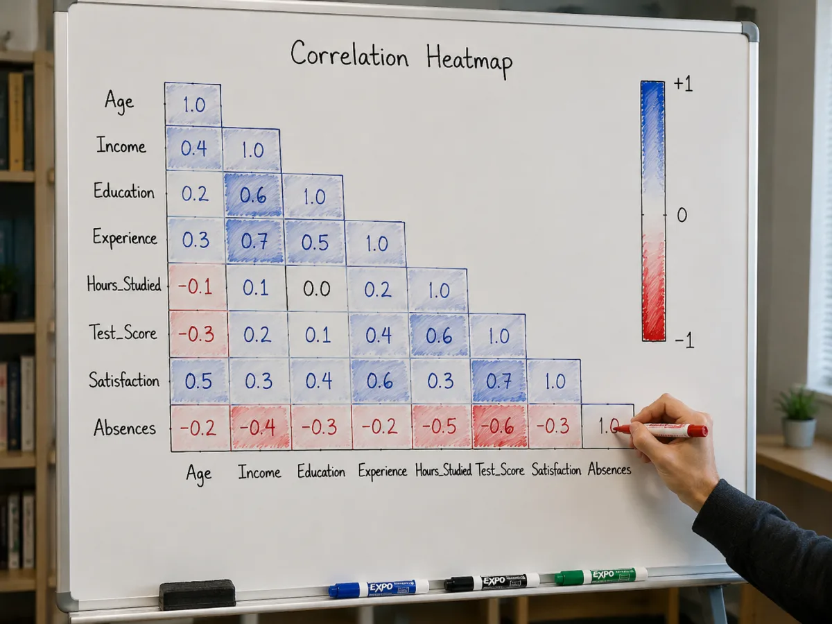
Every chart ships with a colorbar that marks its minimum and maximum, and an optional numeric label inside each cell that switches to white text automatically on a dark fill so it stays readable.
Answers to the questions people most often ask about reading and building this kind of chart.
Paste a matrix, flip between color scales until the pattern pops, and take the finished heatmap with you as SVG or PNG.