

Paste x,y pairs for one or more series and this scatter plot maker draws the points, fits a trendline, and reports R² instantly — no spreadsheet, no signup.
16 points loaded
12 points loaded
The same generator handles a single relationship, a dose series, a method comparison, and several labeled groups on one chart.
Study hours plotted against exam scores, with the trendline and R² shown together so you can judge, at a glance, whether the relationship is strong enough to mention in a write-up or just noise.
Response measurements across a range of doses, plotted without forcing a straight line onto data that may curve — a first look before fitting a proper dose-response model in dedicated software.
Paired readings from two instruments on the same samples, one series per instrument, to see whether the methods track each other closely or drift apart at the high or low end of the range.
Three labeled groups, each in its own color, plotted on the same pair of axes to check whether two measurements alone are enough to tell the groups apart before running a formal clustering method.
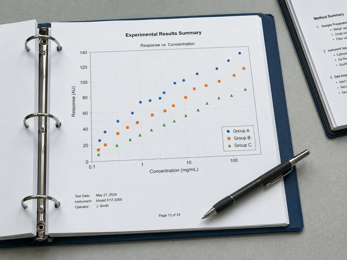
Add a series for every group, instrument, or condition you want to compare — each keeps its own color and label, and a legend appears automatically once there is more than one. Paste a fresh batch of x,y pairs into any series and the chart redraws immediately.
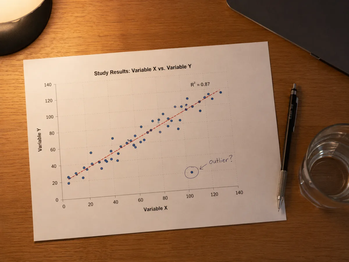
Turn on a least-squares trendline per series and its R² prints beside the line in matching color, so the strength of each relationship is visible without opening a separate calculator. Turn either off independently when a series doesn't call for a straight-line summary.

Switch markers between circles, squares, triangles, and diamonds, scale them up when a chart needs to read well at poster size, and write axis labels and a title that match your figure's caption — all without touching a design tool.
Four steps take a column of paired values to an exported chart, with no formulas to write.
Start with one series if you're looking at a single relationship, or add one per group, instrument, or condition you want to compare on the same axes.
Drop in values straight from a spreadsheet's two columns, one pair per line — commas, tabs, or plain spaces between x and y all work. A bad line is flagged by number instead of silently dropped.
Fit a straight line per series and show its R², or leave it off for data that clearly doesn't follow one. Pick a point shape and size and write your axis labels while you're here.
The scatter plot updates as you type. When the points, trendline, and labels look right, download it as SVG for editing later or PNG for dropping straight into a slide or document.
A scatter plot places every observation as a point on two axes, one variable on each, so a pattern in the cloud of points — rising, falling, curved, or scattered with no shape at all — is visible before you calculate anything. That visual first pass matters: a trendline and an R² computed on data that doesn't actually follow a straight line will still produce numbers, but numbers that describe the wrong thing.
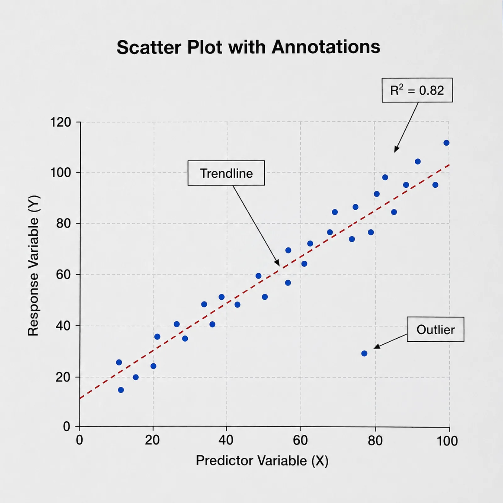
R², the coefficient of determination this generator prints beside each trendline, is the share of the variation in y that a straight line through x explains, on a scale from 0 to 1. An R² near 0.8 means the line accounts for most of the spread in y; near 0.2, most of that spread is coming from somewhere the line doesn't capture. It says nothing about whether the slope is large enough to matter in practice, and nothing about direction of cause.
A strong linear relationship between two variables is not evidence that one causes the other. Two variables can move together because a third factor drives both — ice cream sales and drowning incidents both rise in summer heat — or because the sample happens to pair them that way. Before treating a fitted line as a causal claim, ask whether the study design (a controlled experiment, not just paired observations) actually supports that jump.
A trendline is also the wrong summary in specific, checkable cases: fewer than five or six points per series, an obvious curve rather than a straight-line trend, one or two extreme values pulling the line toward them, or several visually separate clusters that a single line would average across. In any of those situations, this scatter plot maker still lets you view the raw points with the trendline switched off — sometimes the honest answer is that the points alone, not a fitted line, are the figure.
Straight answers to what people ask before and after plotting a scatter chart.
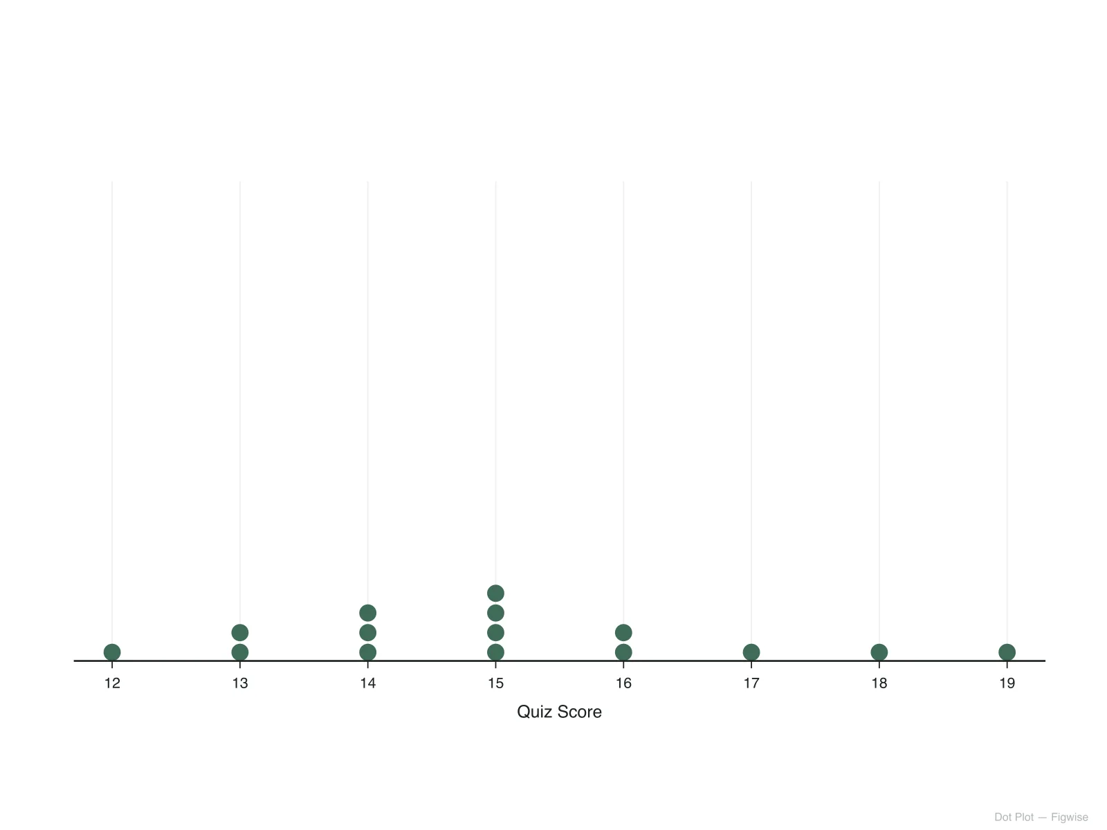
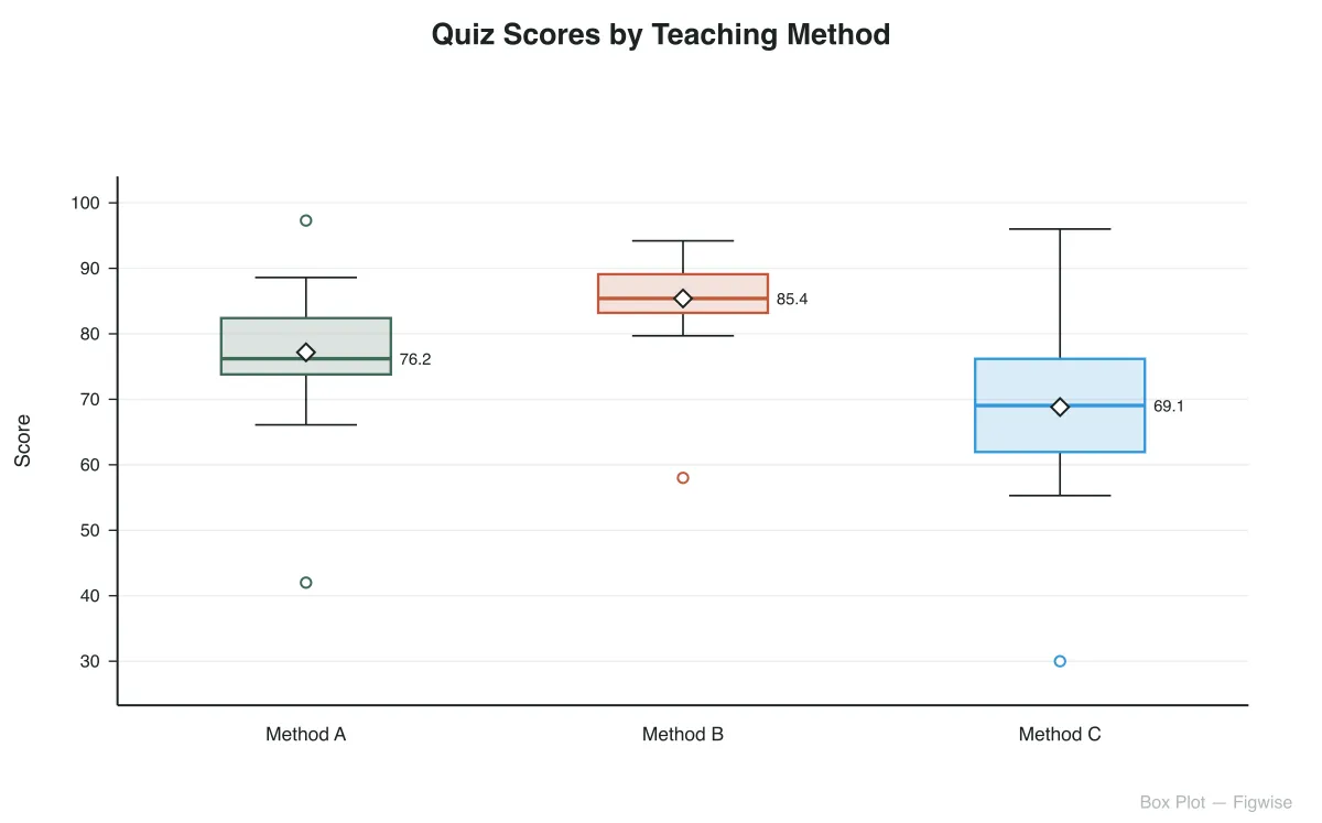
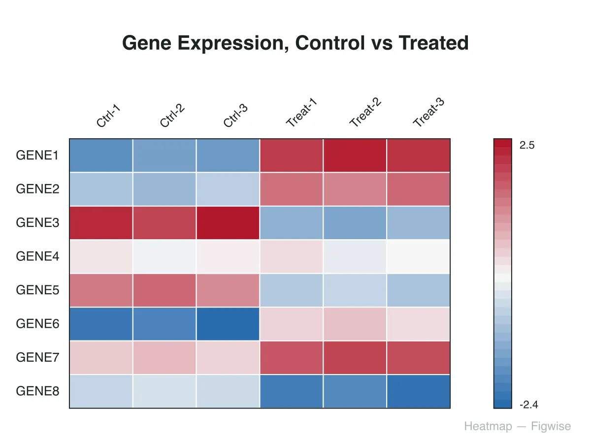
Every pair of numbers becomes a point the instant you paste it, and a trendline with R² appears the moment enough of them line up — export whenever the chart looks report-ready.