

A color palette for scientific figures shouldn't need a design degree to get right. Build categorical, sequential, or diverging sets from Okabe-Ito, viridis, cividis, and ColorBrewer, then check every color against deuteranopia and protanopia before it reaches a reviewer.
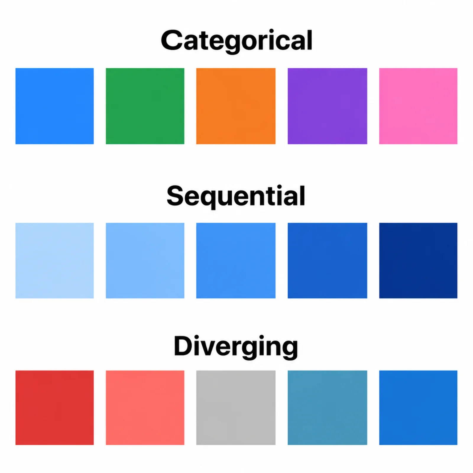
Categorical (qualitative) palettes assign a distinct hue to each group in your data — treatment arms, cell types, species, experimental conditions — where the goal is telling classes apart, not implying order or magnitude. A good categorical set stays visually distinct at a glance, even for a reader with red-green color vision deficiency, and still separates cleanly when a reviewer prints your manuscript in grayscale. Okabe-Ito, built specifically for color-universal design, and ColorBrewer's Set2 are the two categorical sets built into this scientific color palette generator — each one also works as a colorblind friendly palette on its own.
Sequential palettes encode one ordered quantity — expression level, p-value, concentration, elapsed time — as a smooth ramp from low to high, usually light to dark. They belong on heatmaps, density plots, and any figure where color stands in for magnitude alone. Viridis and cividis are perceptually uniform: equal steps in the data produce equal-looking steps in color, so a reader's eye doesn't misjudge where a gradient changes fastest. ColorBrewer Blues, a single-hue sequential set in this scientific color palette generator, does the same job with a simpler range.
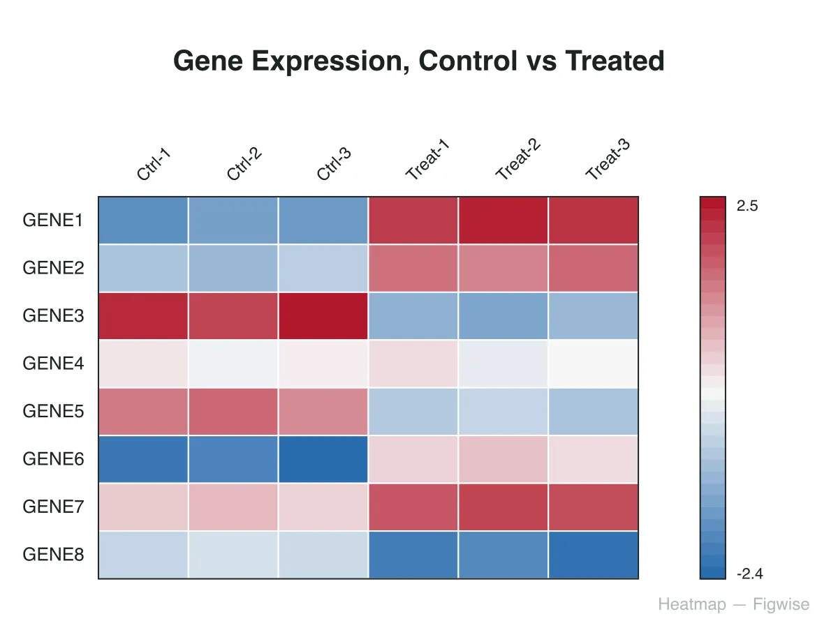
Diverging palettes are for data with a meaningful center — zero fold-change, a control baseline, no correlation — with two directions branching away from it. Log2 fold-change heatmaps, correlation matrices, and effect-size plots all call for a diverging scheme, so a reader separates "above baseline" from "below baseline" by hue instead of squinting at axis numbers. ColorBrewer's RdBu keeps red and blue at opposite poles around a neutral midpoint, which also survives grayscale printing better than a red-green pair.
Every card below is the exact SVG this scientific color palette generator produces at its default settings — not a mockup.
Eight color-universal hues that double as a colorblind friendly palette for treatment arms, cell lines, or species labels — distinct under deuteranopia and protanopia, and still separable printed in black and white.
A perceptually uniform ramp from dark purple to yellow, resampled at any step count from 2 to 12 for heatmaps and density plots where color encodes magnitude.
Red to blue with a neutral midpoint, for fold-change heatmaps and correlation matrices where readers need to see which values sit above or below a baseline.
The same palette rendered as it appears with typical vision, then transformed for deuteranopia and protanopia, so you catch a collision before a reviewer does.
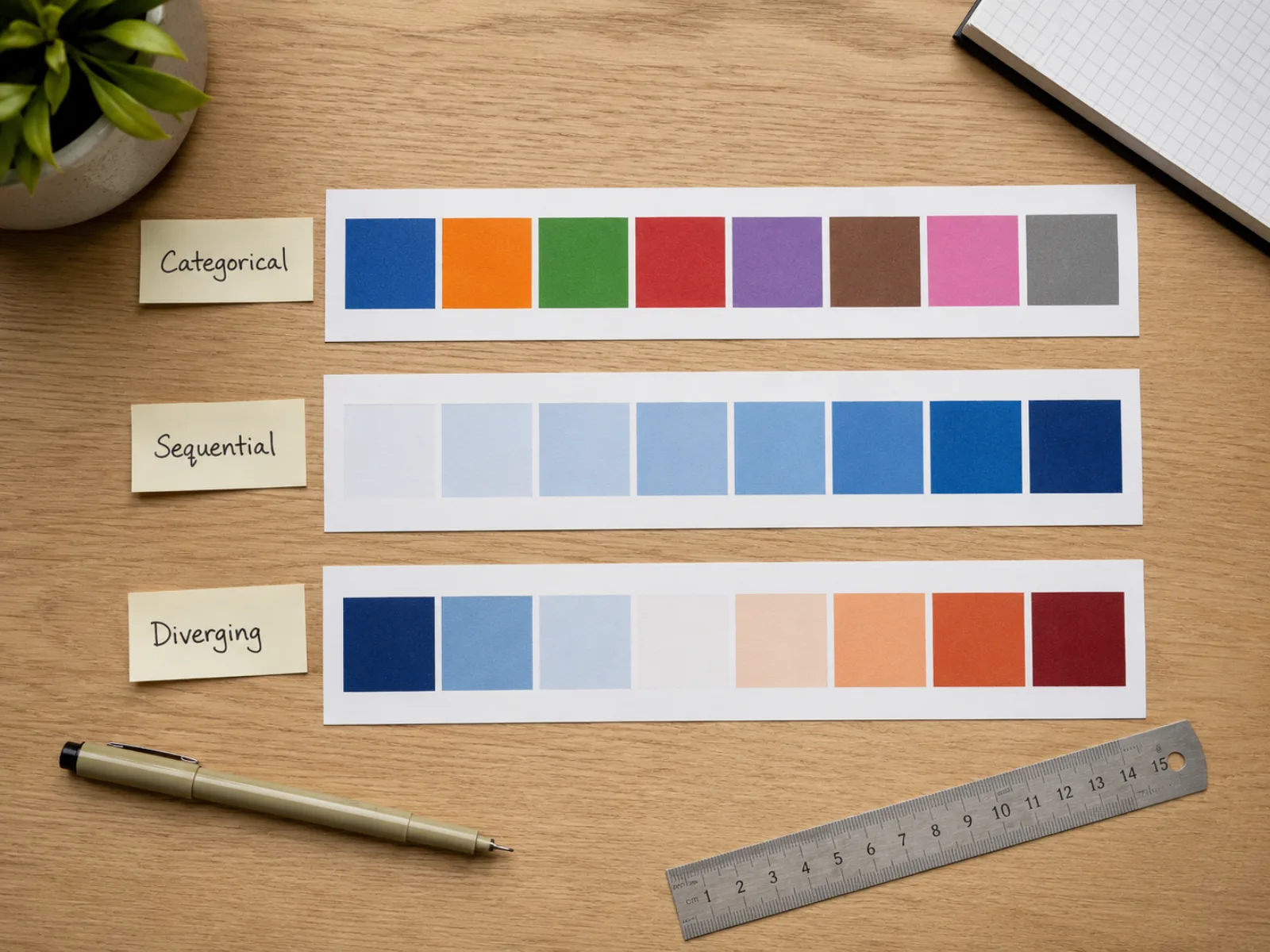
Switch between categorical, sequential, and diverging without leaving the page — pick the family that matches what your data actually means, then get a full set of research figure colors built around it.
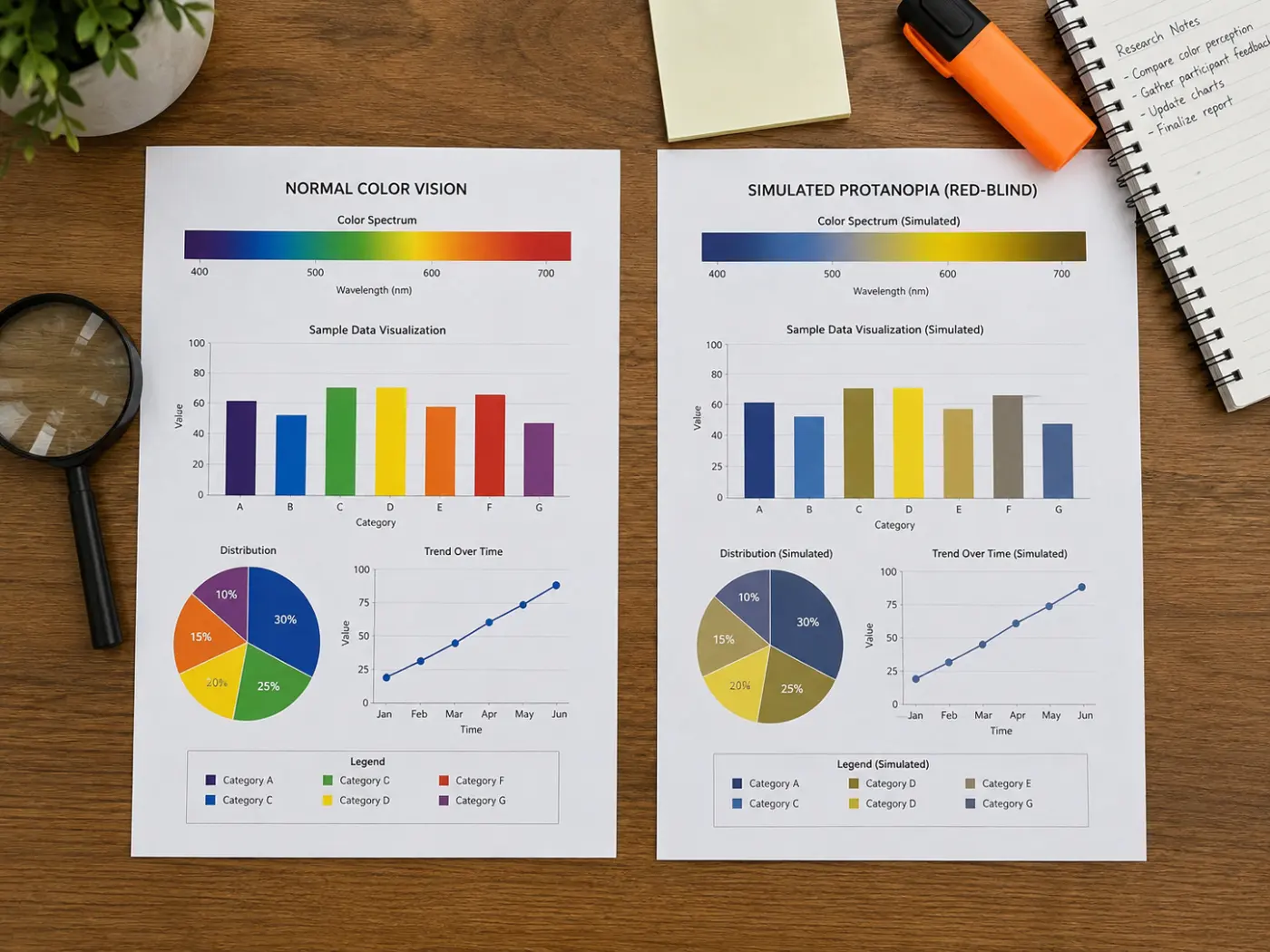
An estimated 1 in 12 men and roughly 1 in 200 women have some form of red-green color vision deficiency. This colorblind friendly palette check runs a real deuteranopia and protanopia transform on your chosen colors and shows all three versions side by side before you open your plotting software.
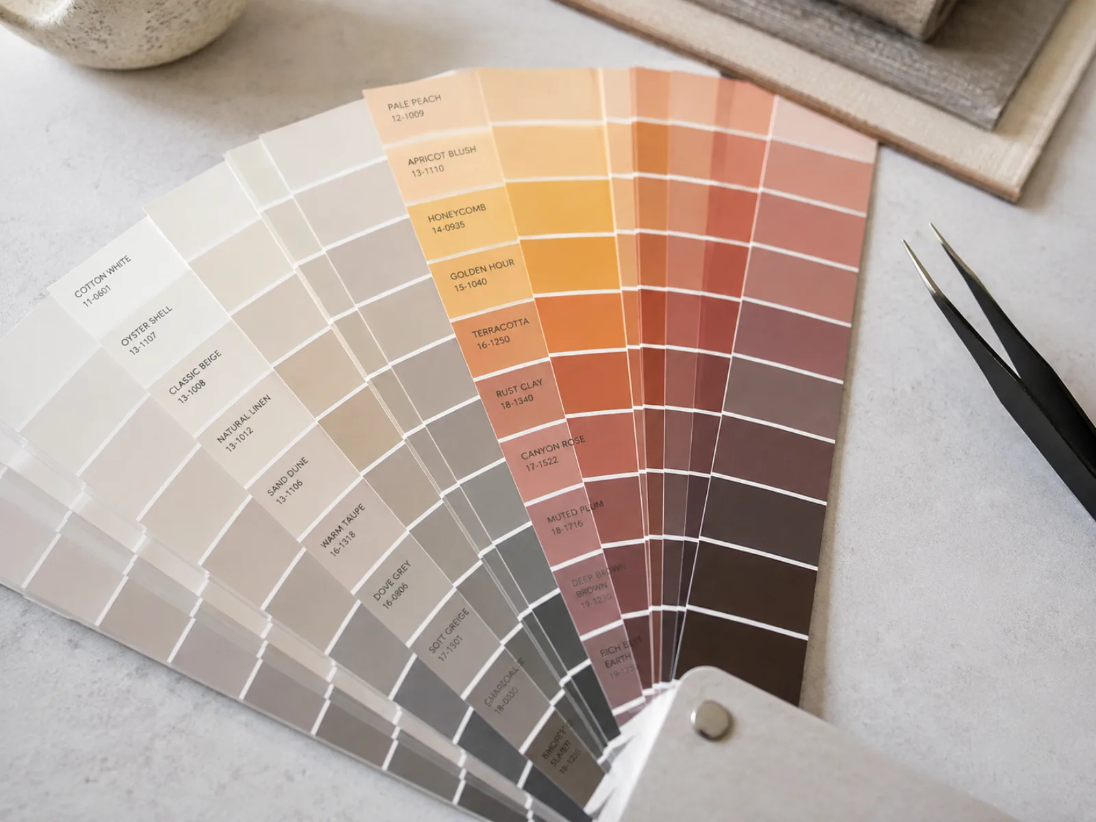
Drag from 2 to 12 colors and this scientific color palette generator resamples from each palette's reference points — categorical sets cycle through their fixed hues, sequential and diverging sets interpolate new steps — so you're never eyeballing a gradient by hand.
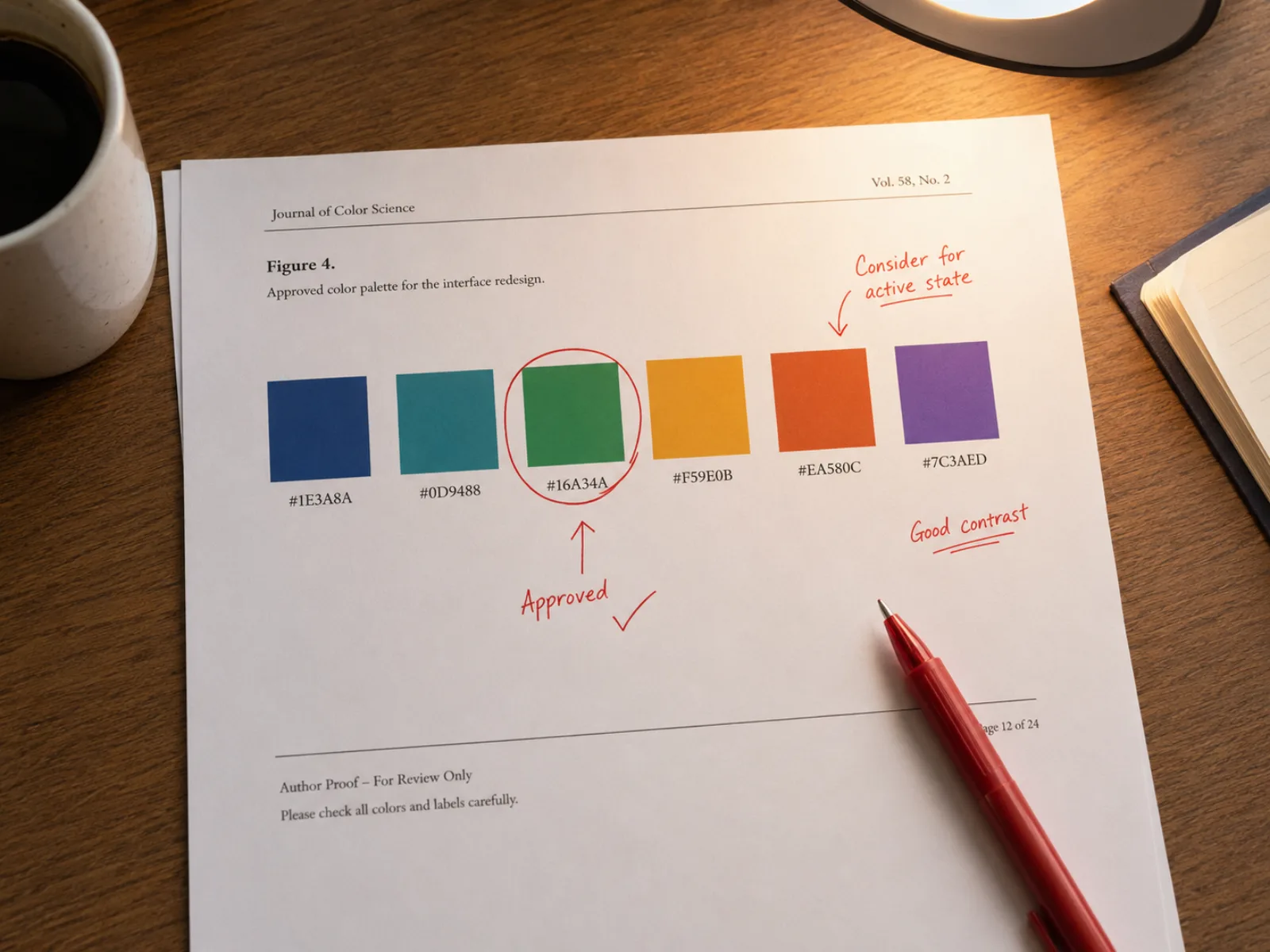
Download a labeled SVG or PNG for a figure legend, or click any swatch to copy its hex code and paste those research figure colors directly into matplotlib, ggplot2, or Prism — no separate color picker required.
The default rainbow or jet colormap in older plotting software still turns up in submitted manuscripts, and as a color palette for scientific figures it fails in two specific, well-documented ways.
Common questions from researchers preparing figures for journal submission.
Pick a palette family in this scientific color palette generator, check it against deuteranopia and protanopia, and copy the hex codes straight into your plotting script — building a colorblind friendly palette takes minutes, not another round of reviewer comments.