

Paste a list of numbers to draw a frequency dot plot — the statistics-class kind, not a gene-expression or Fed dot plot — with automatic binning, optional groups, and instant SVG or PNG export.
Frequency dot plots generated with this tool, from a small classroom sample to a two-group comparison.
Fifteen students' quiz scores plotted as individual dots stacked by value — small enough that a histogram would just show empty and single-count bars, while the dot plot still reads clearly.
A full class of exam scores binned into five-point intervals, showing where the class clustered and which scores sit apart from the main group.
Twenty repeated readings of the same lab measurement, dotted along the value axis to show instrument spread and any drift — a case a bar chart of averages would erase entirely.
The same quiz scored in two sections, plotted as side-by-side dot columns so the shift in typical score and the overlap between the two groups are both visible at once.
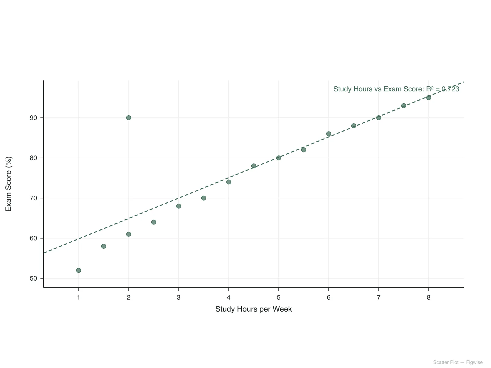
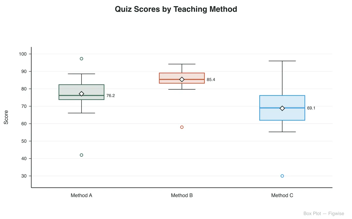
All three chart types plot numeric distributions, but they disagree on what to do with a small dataset — and that disagreement matters most below about 30 observations. One naming note: in Common Core standards (2.MD.9, 3.MD.4), "line plot" is simply the classroom name for the dot plot on the left; the chart type compared on the right is the connect-the-dots version, not that usage.
Every value gets its own dot — nothing is hidden.
Built for larger samples, not classroom-sized ones.
Here is how this dot plot maker turns a list of numbers into a labeled frequency chart.
Drop a batch of numbers into the data field, separated by commas, spaces, or line breaks. Whole numbers and decimals both work, and anything that is not a valid number is flagged rather than silently dropped.
A bin width is chosen automatically from your data's range, or set your own — narrower bins keep individual values distinct, wider bins group nearby values into the same column for a smoother shape.
Add a second or third group to plot several samples on one chart, either as side-by-side dot columns or as one column colored by group.
The chart redraws as you type, restacking dots and rebinning values on the fly. When the spread and clustering look right, download the finished figure as SVG or PNG.
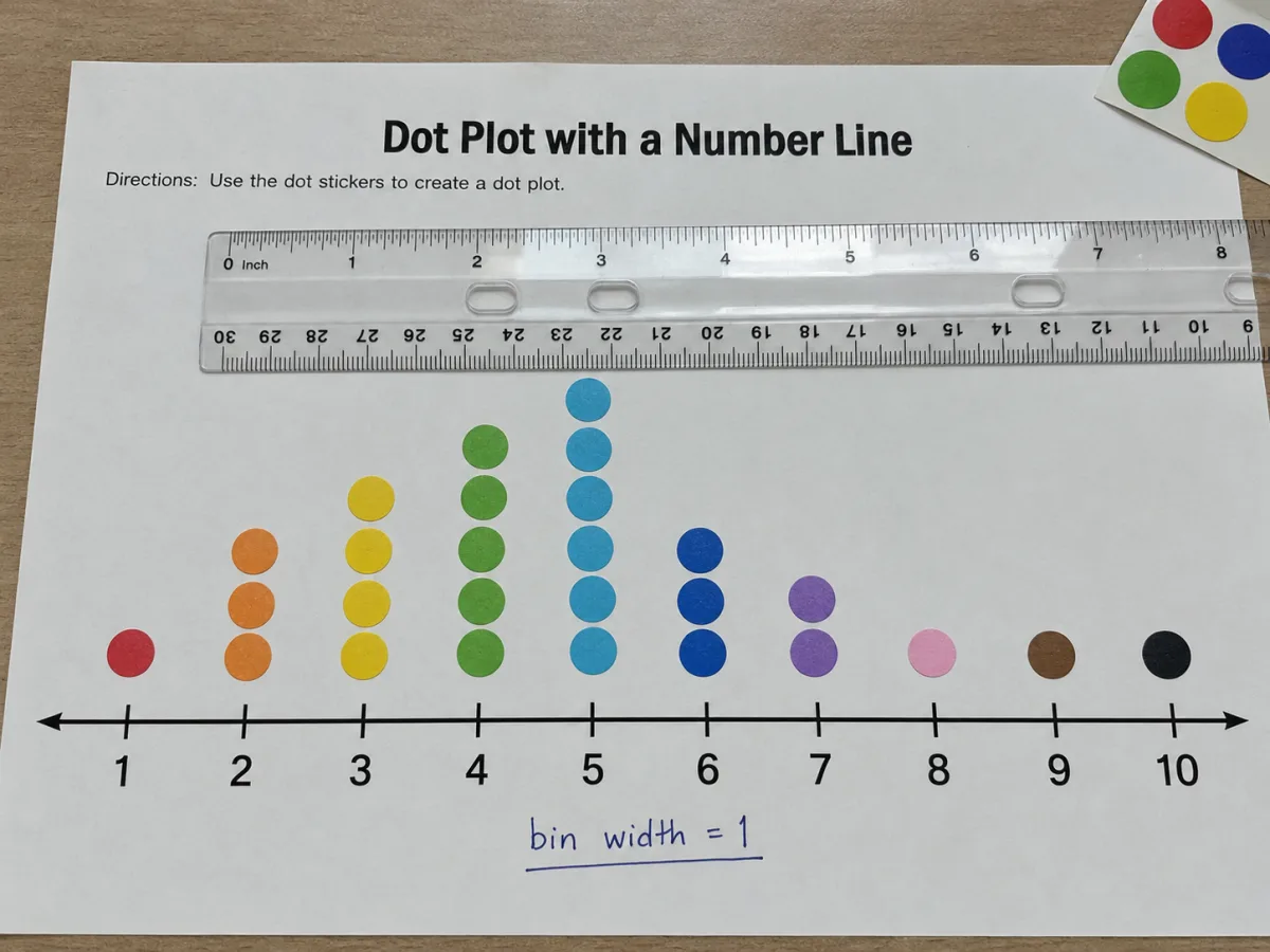
This generator picks a bin width from your data's range so values land in a readable number of columns by default, but every bin width and axis tick interval can be typed in by hand when your figure needs an exact interval, such as whole units or a fixed measurement increment.
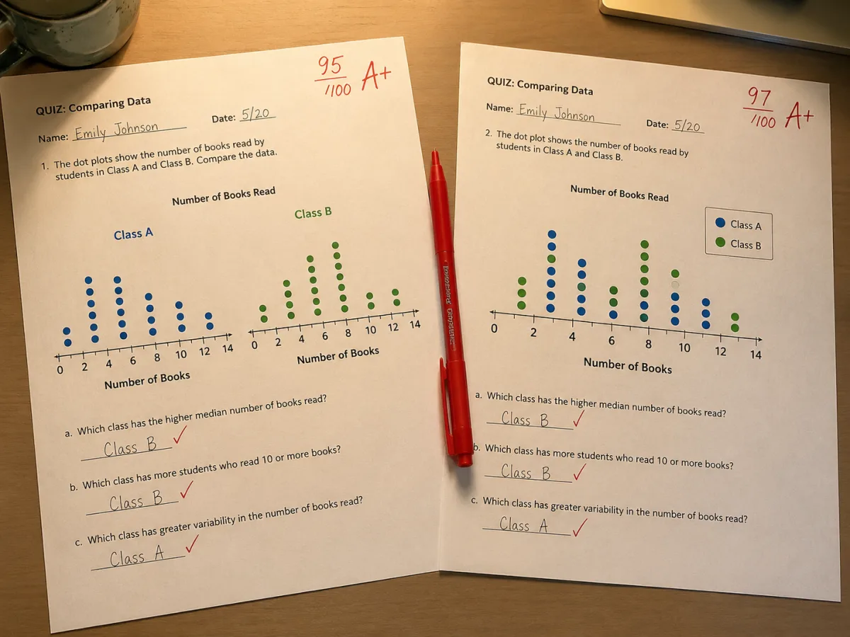
Add groups to plot several samples on one chart: a side-by-side layout gives each group its own set of dot columns for a direct visual comparison, while stacked color keeps every value on a shared axis with dots colored by group.
Answers to the questions people most often ask about reading and building dot plots.
Paste your values, set a bin width, and download a chart clean enough for a slide deck or a lab report.