

Turn a column of numbers into a binned frequency distribution chart right in your browser — automatic or custom bin width, a frequency or density axis, and instant SVG or PNG export.
This histogram maker applied to four datasets that behave nothing alike — a class of exam scores, repeated lab readings, a right-skewed wait-time sample, and a distribution hiding two separate peaks.
Thirty-three quiz scores binned automatically with the Freedman–Diaconis rule, showing a mild left skew where a handful of low scores pull the tail away from an otherwise clustered class.
Forty repeated readings of the same physical quantity, plotted with the normal curve overlay turned on, showing how instrument noise clusters symmetrically around a true value.
Call-center wait times, where most callers connect quickly but a long tail of delayed calls stretches the histogram to the right — the case where the mean sits noticeably above the median.
Commute times pooled from two shifts with different start times: a wide bin width smooths the two peaks into one hump, while narrowing it reveals the second population underneath.
From a list of numbers to a labeled, binned frequency chart — here is what this histogram maker does with your data at each step.
Drop a single column of numbers into the data field, separated by commas, spaces, or line breaks. Anything that is not a valid number is flagged inline instead of silently dropped.
By default, this histogram maker's bin width comes from the Freedman–Diaconis rule based on your data's spread and sample size. Type a specific width instead when your figure needs round, predictable intervals.
Switch between raw counts per bin and density, where bar height is count divided by bin width so the areas — not just the heights — are comparable. Add the normal curve, mean line, or median line if your analysis calls for them.
The histogram redraws as you edit values or bin width, recalculating every bin on the fly. Once the distribution's shape looks right, download it as SVG for editing or PNG for a slide.
A histogram, also called a frequency distribution chart, sorts continuous data into equal-width intervals called bins, then draws one bar per bin with height equal to how many values fall inside it. This tool follows the standard left-closed, right-open convention: a bin covering [10, 20) includes 10 but not 20, which goes into the next bin instead. Only the very last bin closes on both ends, so the dataset's maximum value always has somewhere to land. Getting this boundary rule right matters, because a value sitting exactly on an edge only has one correct bin, and disagreement here is a common source of off-by-one counting errors between tools.
Choosing a bin width is a real statistical decision, not a cosmetic one. This histogram maker defaults to the Freedman–Diaconis rule, h = 2 × IQR × n^(-1/3), which sizes bins from the interquartile range rather than the full range, so a single extreme outlier does not blow every bin up. An older alternative, Sturges' rule, sets bin count from log2(n) alone and assumes something close to a normal distribution — it tends to under-bin larger or skewed datasets, smoothing away real structure in the process. Both rules are starting points, and either can be overridden with a manual width.
The same data can look unimodal or bimodal, smooth or lumpy, purely depending on bin width — narrow bins reveal detail but amplify sampling noise into false little peaks, while wide bins smooth noise away but can also merge two genuinely separate groups into one broad hump. There is no single correct width for every purpose; the useful habit is trying a few widths on the same dataset and asking whether a bump that appears or disappears reflects the underlying process or just where the bin edges happened to fall.
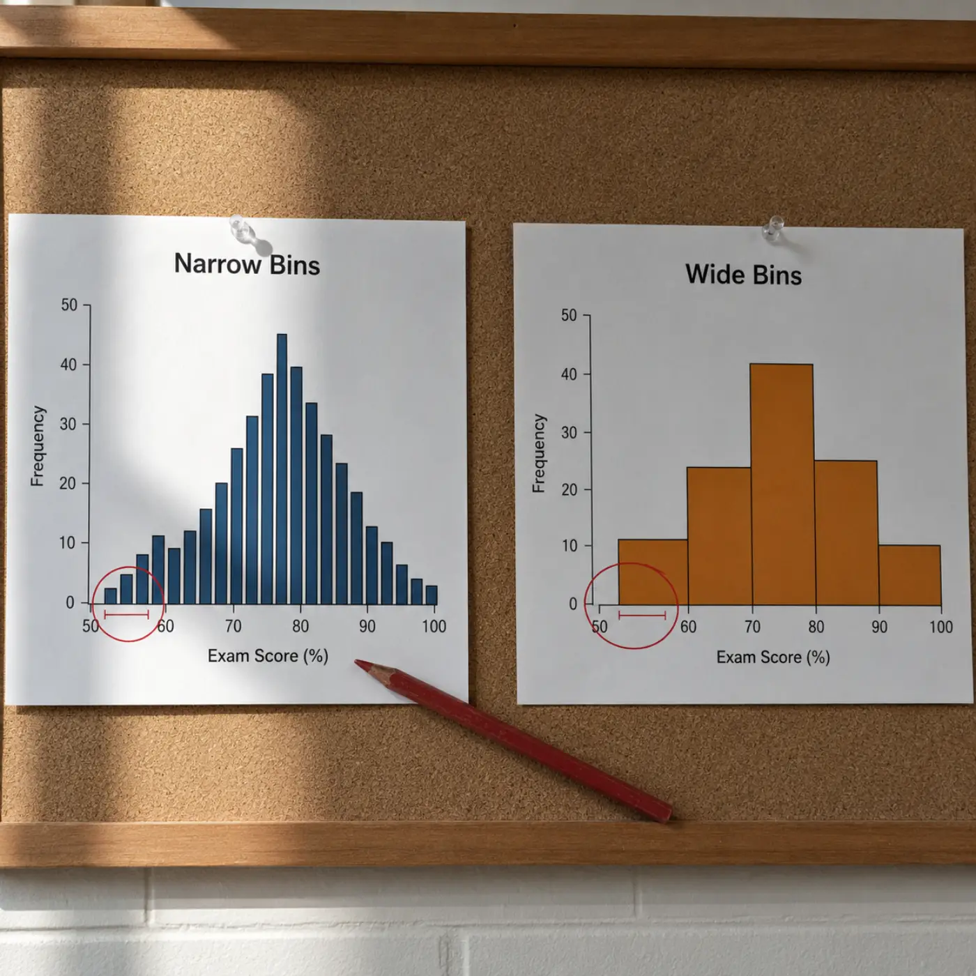
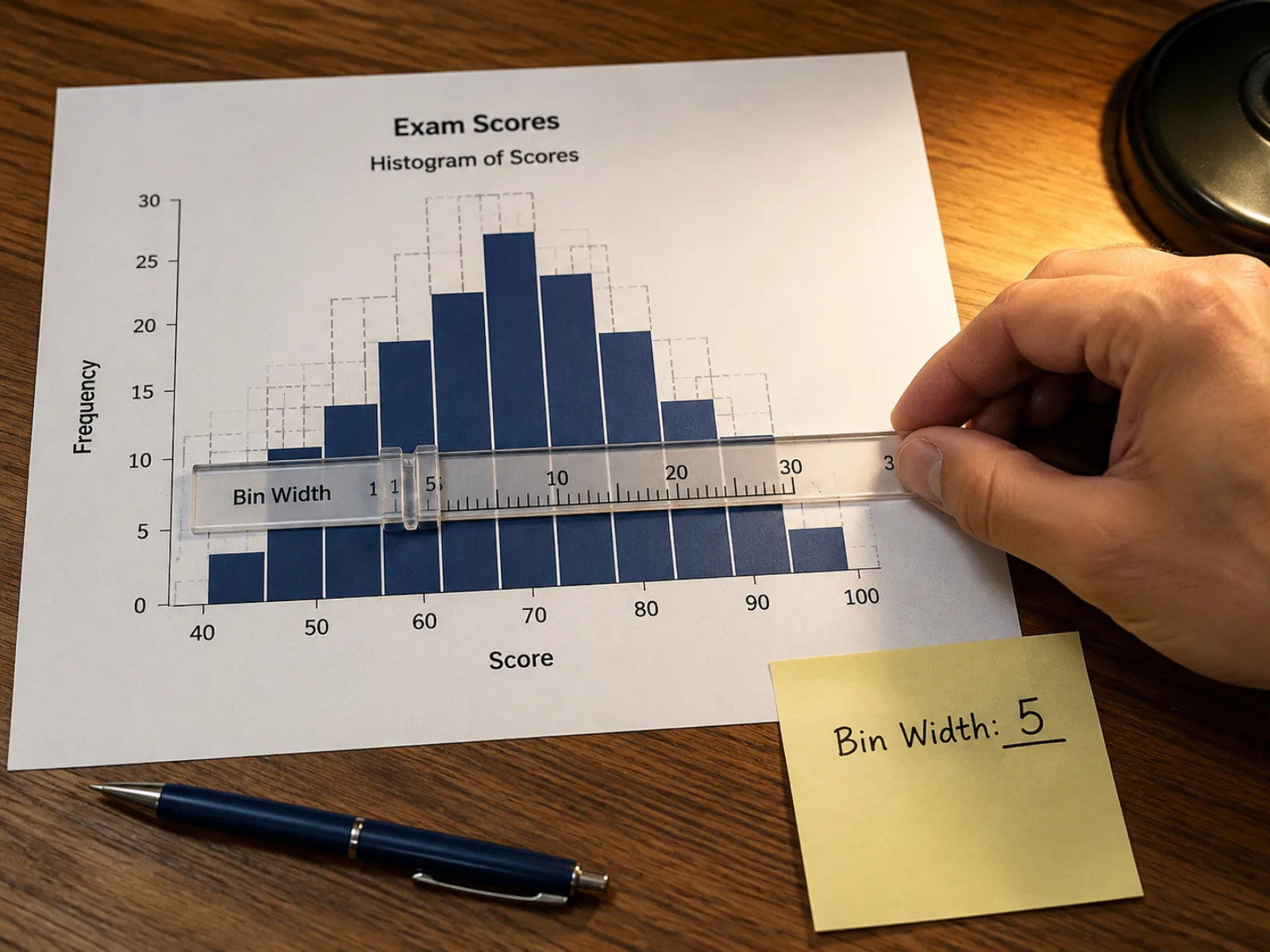
Automatic bin width comes from the Freedman–Diaconis rule, which scales with your sample size and uses the interquartile range so a stray outlier does not distort every bin. Switch to a manual width any time your figure needs a specific, round interval instead.
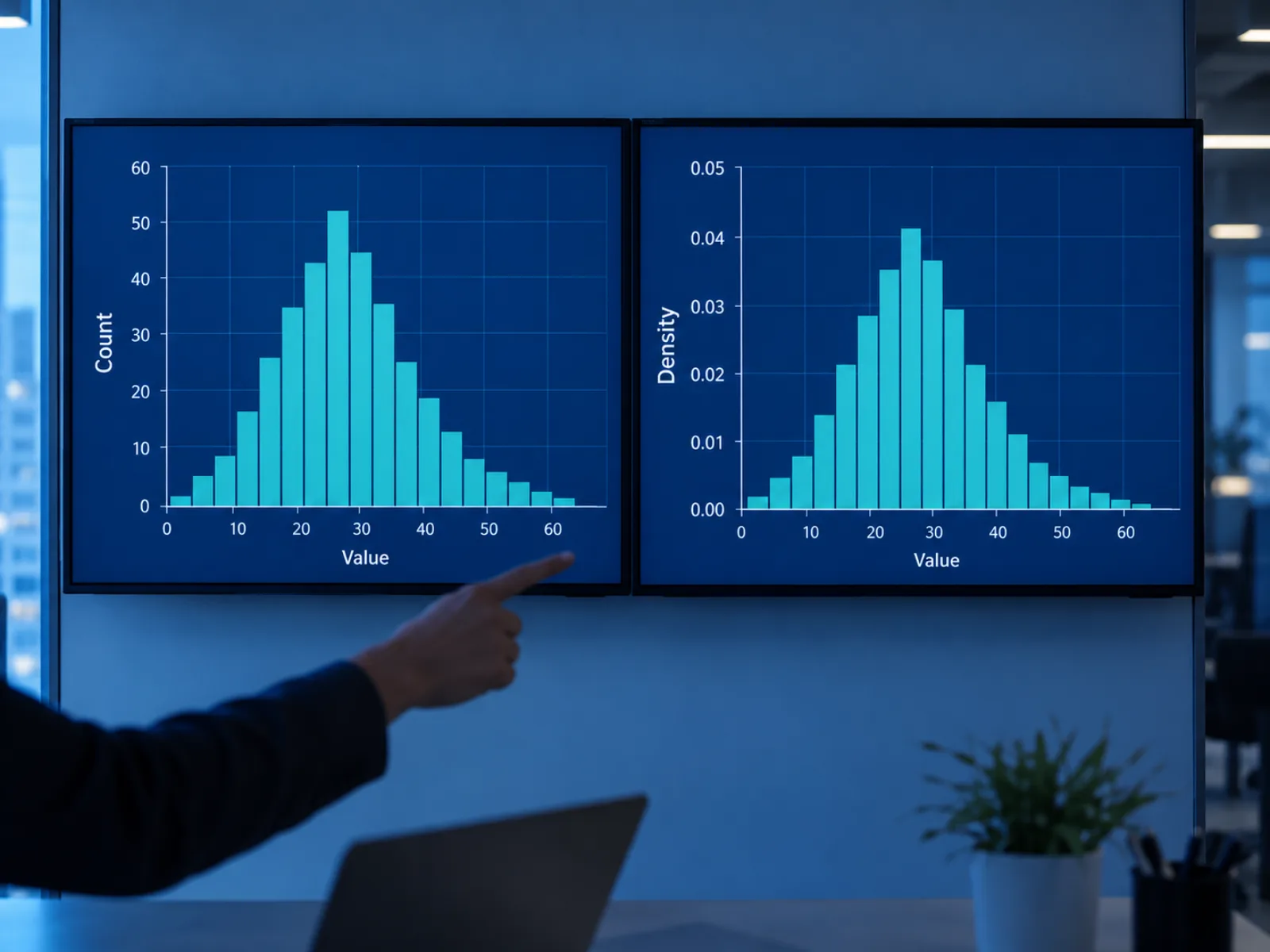
Toggle this histogram generator's y-axis to density and each bar's height becomes its count divided by the sample size and the bin width, so the total area under the histogram sums to one — the convention used to compare a sample against a fitted probability curve, not a simplified percentage scale.
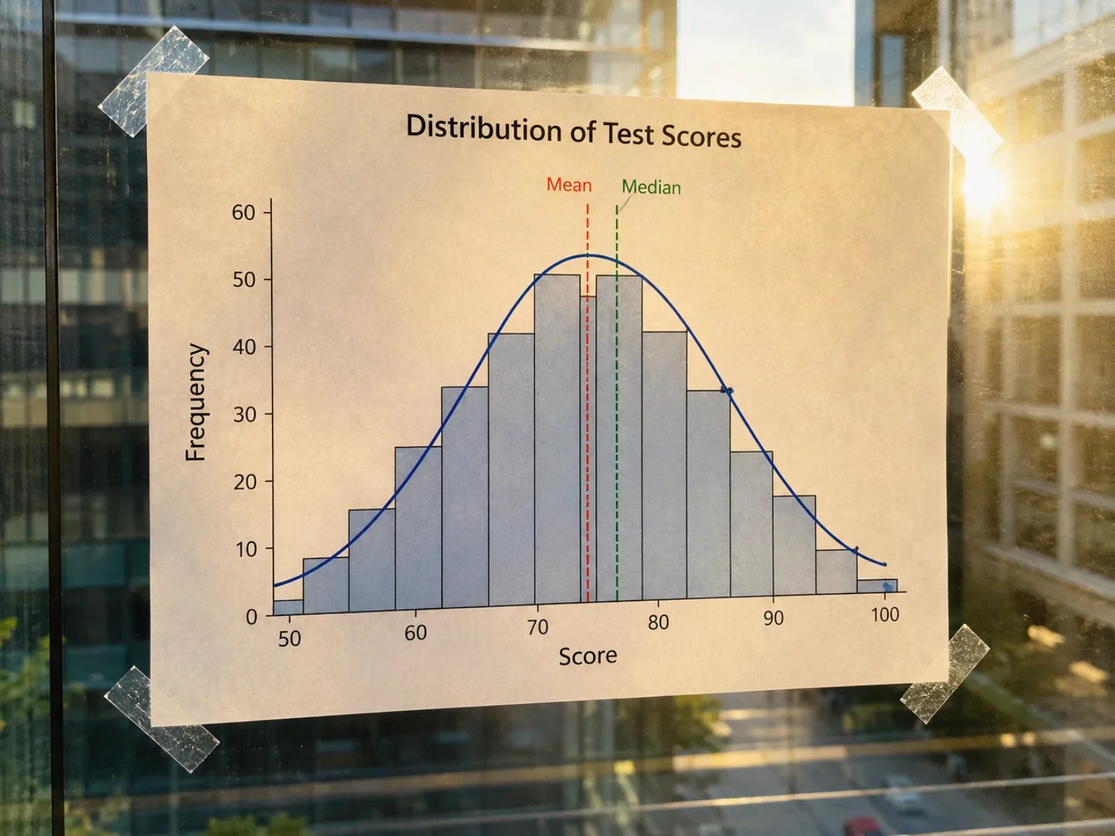
Lay a normal curve over the bars to check how closely your sample matches a bell-shaped distribution, and add mean and median reference lines to see at a glance whether the two summary statistics agree or a skew is pulling them apart.
Both charts are drawn with bars, which is exactly why they get mistaken for each other — but they answer different questions about different kinds of data, and swapping one for the other misrepresents whatever variable is being plotted.
For one continuous numeric variable, binned into intervals.
For discrete, labeled categories — nothing to bin.
The questions people most often ask before and after building their first histogram.
Paste a column of numbers into this histogram maker, adjust the bin width, and download a chart clean enough for a report or a lecture slide.