

Enter a mean and standard deviation — or paste raw data to estimate them — and this bell curve generator draws the normal distribution, shades any interval's exact probability, and exports instantly.
A bell curve is the graph of the normal distribution: one peak at the mean, falling away symmetrically on both sides, with the standard deviation controlling how wide or narrow that fall is. It shows up whenever a measurement is built from many small, independent sources of variation adding together — human height, measurement error, or the average of a large random sample. That mechanism, the central limit theorem, is the real reason a bell-shaped normal distribution graph keeps appearing across so many unrelated fields, not some universal law that all data must obey.
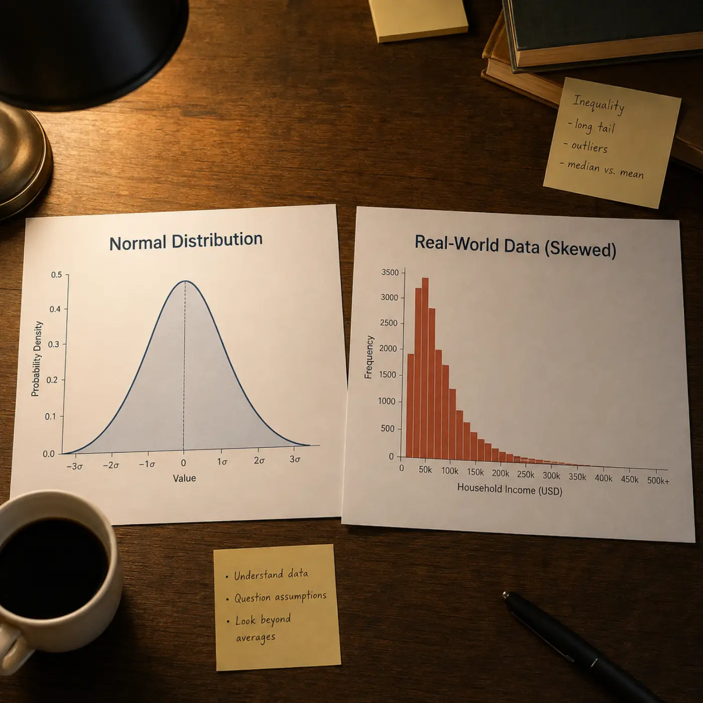
The central limit theorem has real preconditions, and a lot of everyday data quietly violates them. Income, city population, and word frequency are heavily skewed — a long right tail pulls the mean away from where most values actually sit, so a symmetric gaussian curve fits them badly. Counts of rare events, like defects per batch or calls per hour, follow a Poisson-shaped distribution instead, which only starts to look bell-shaped once the average count is fairly large. Percentages bounded between 0 and 100, ratings capped at a scale's ends, and anything mixing two distinct subgroups into one sample (bimodal data) will also resist a single symmetric bell curve, no matter how it's fitted.
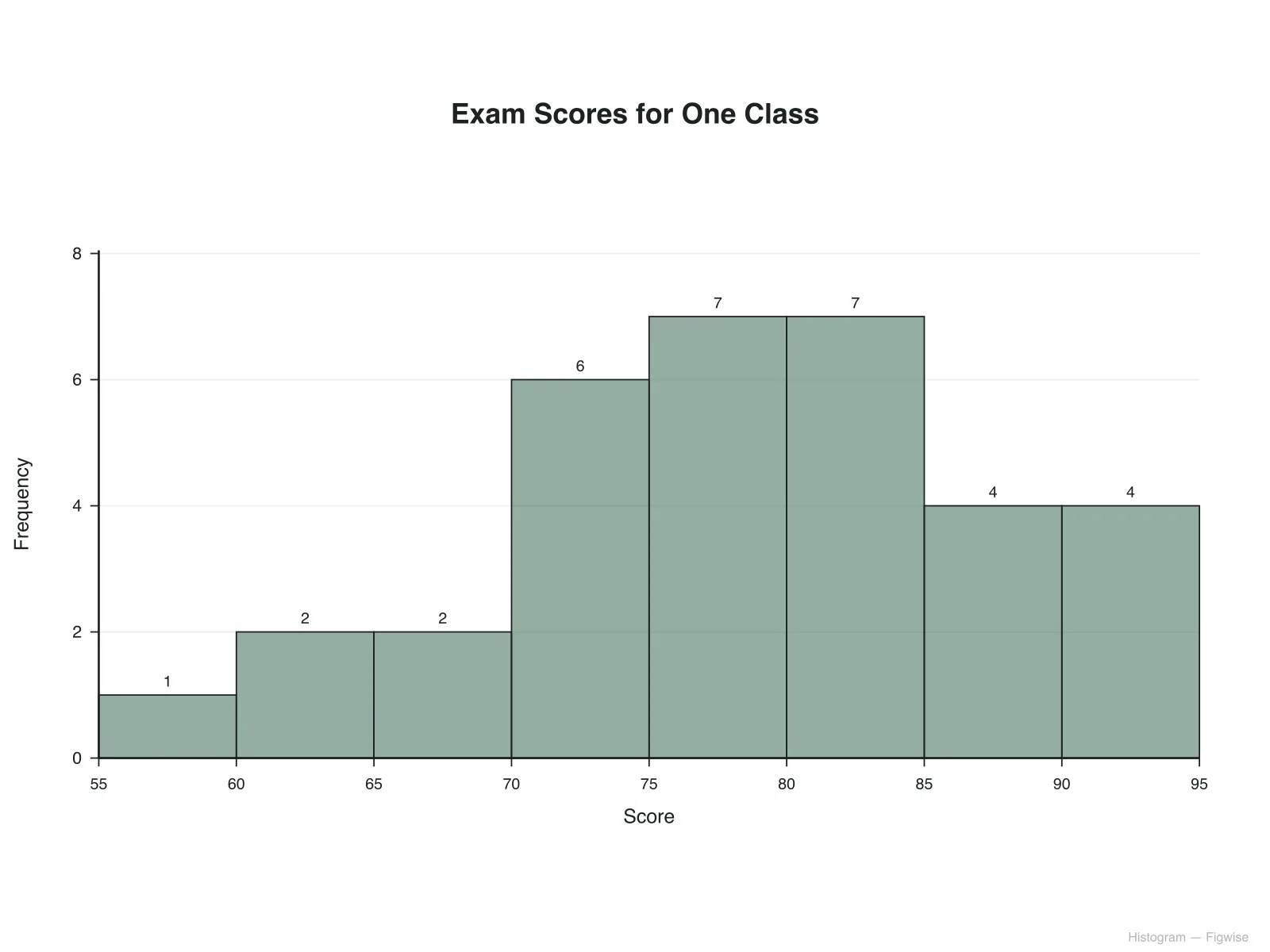
What the standard deviation actually communicates, once a normal fit is reasonable, is how spread out the values are around that peak — a small σ means most observations cluster tightly near the mean, a large σ means the same total probability is spread across a much wider range. That's a description of variability, not a ranking of individual cases against each other. Before reading σ or a percentile off a bell curve, it's worth checking the raw values first: plot a histogram, or switch this bell curve generator to its raw-data mode, and see whether the shape actually looks single-peaked and roughly symmetric.
Four normal distribution graphs built with this generator, from the textbook standard curve to a side-by-side comparison of two spreads.
Mean 0 and standard deviation 1, the reference gaussian curve every z-table and z-score is built from, shown here with its ±1σ/2σ/3σ bands and the 68-95-99.7 percentages labeled directly on the chart — this exact shape is what any other bell curve maker output eventually reduces to.
A class's test scores modeled as a normal distribution graph, with sigma bands marking roughly where the middle 68 and 95 percent of scores sit — a diagnostic view of how tightly a test discriminated scores, not a grading formula.
A manufacturing measurement centered on its target value, with the shaded region marking the tolerance band a part needs to fall inside — the exact percentage inside that band comes from the same erf-based calculation this generator uses for any interval.
The same mean with two different standard deviations plotted together, a quick way to see why a smaller SD produces a taller, narrower gaussian curve while a larger one flattens and spreads the same probability across a wider range.
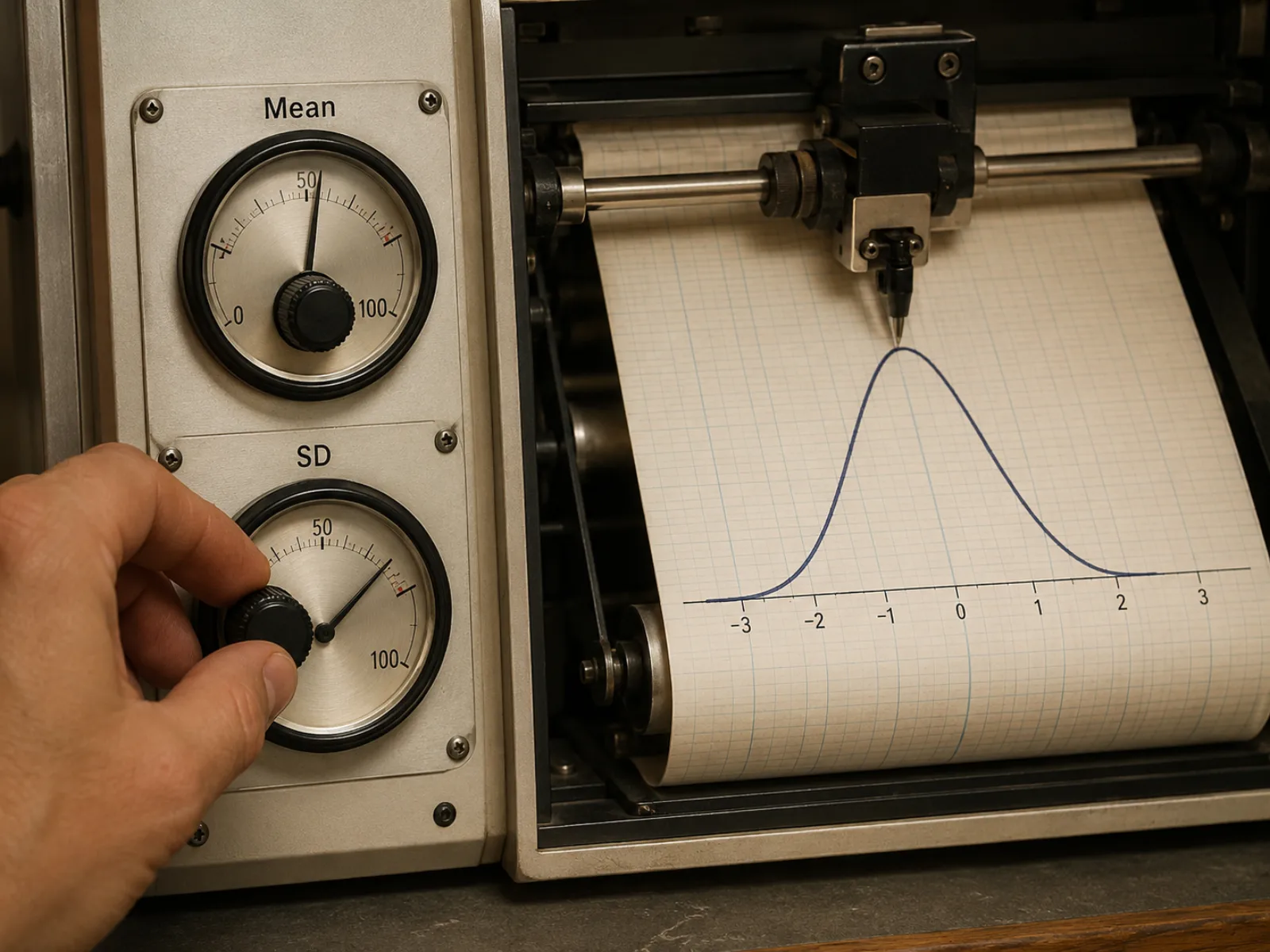
Set the mean and standard deviation directly and this bell curve generator redraws the normal distribution graph in real time — no spreadsheet formulas, no charting software, just two numbers and an instant, publication-ready curve.
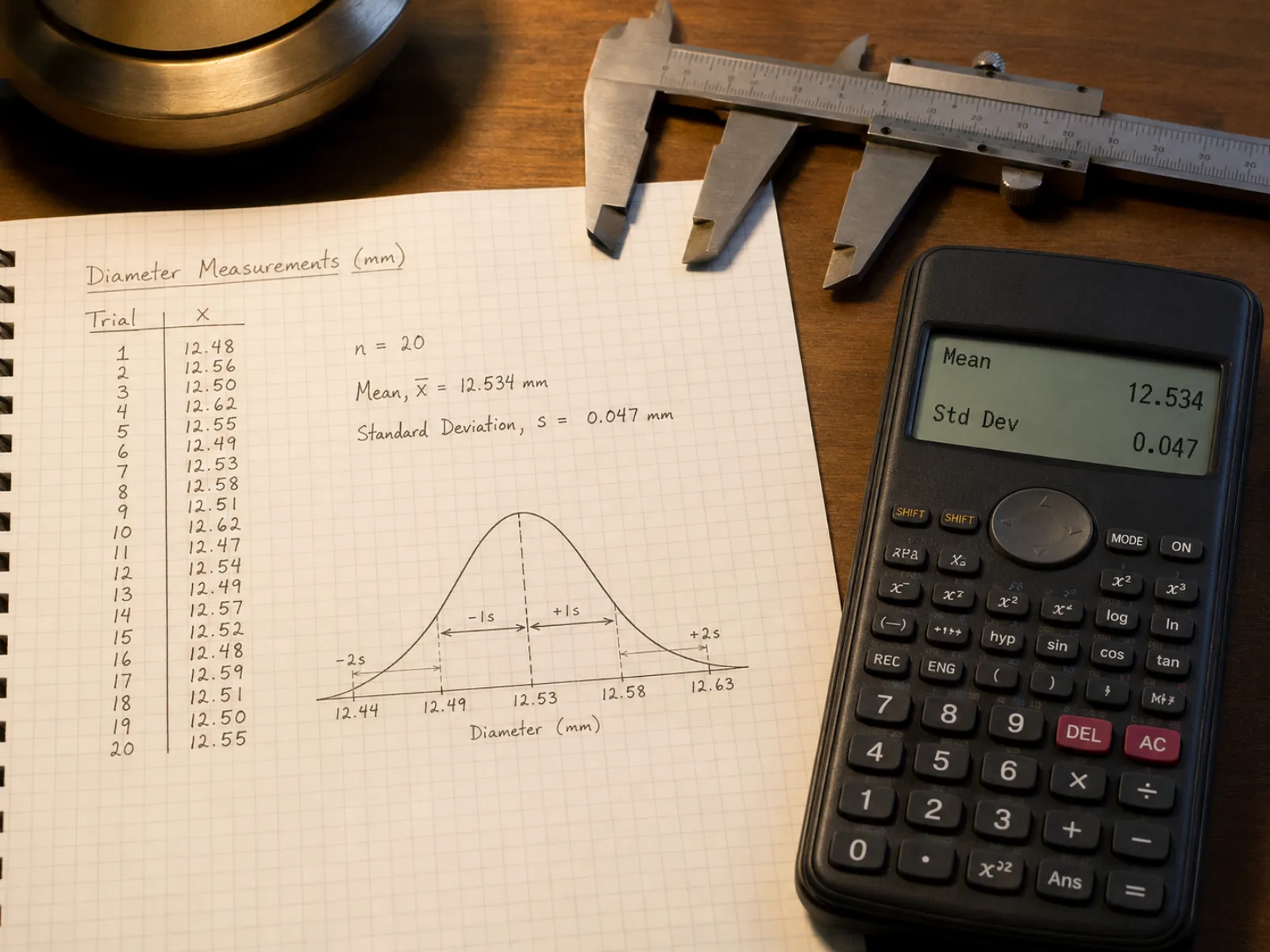
Paste a column of measurements instead of guessing at a mean and standard deviation, and this bell curve maker computes the sample mean and sample standard deviation for you, then draws the matching normal distribution graph over your numbers.
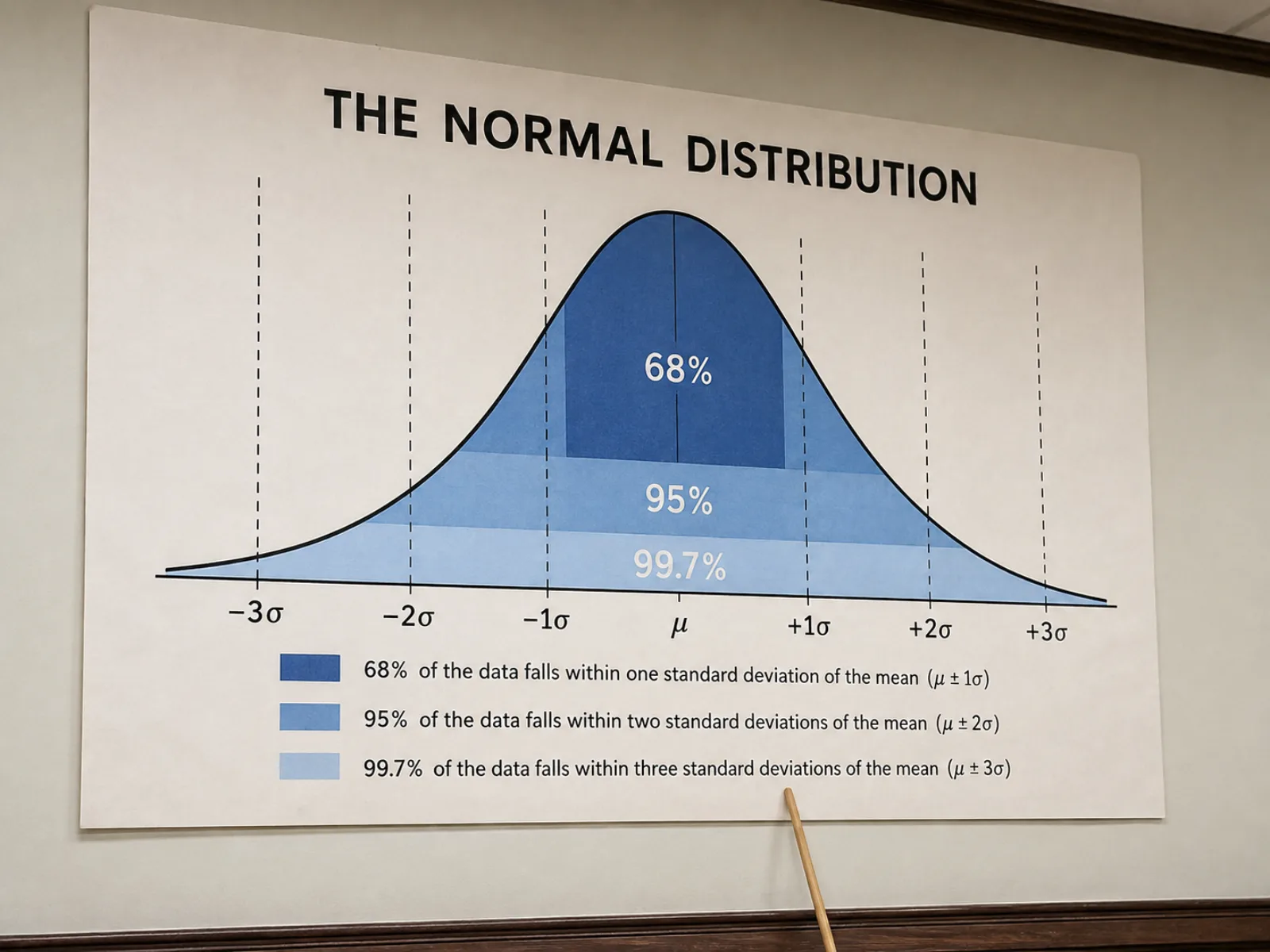
Turn on sigma bands to see exactly where 68, 95, and 99.7 percent of a gaussian curve falls, shaded directly on the normal distribution graph — the empirical rule made visible instead of memorized from a textbook page.
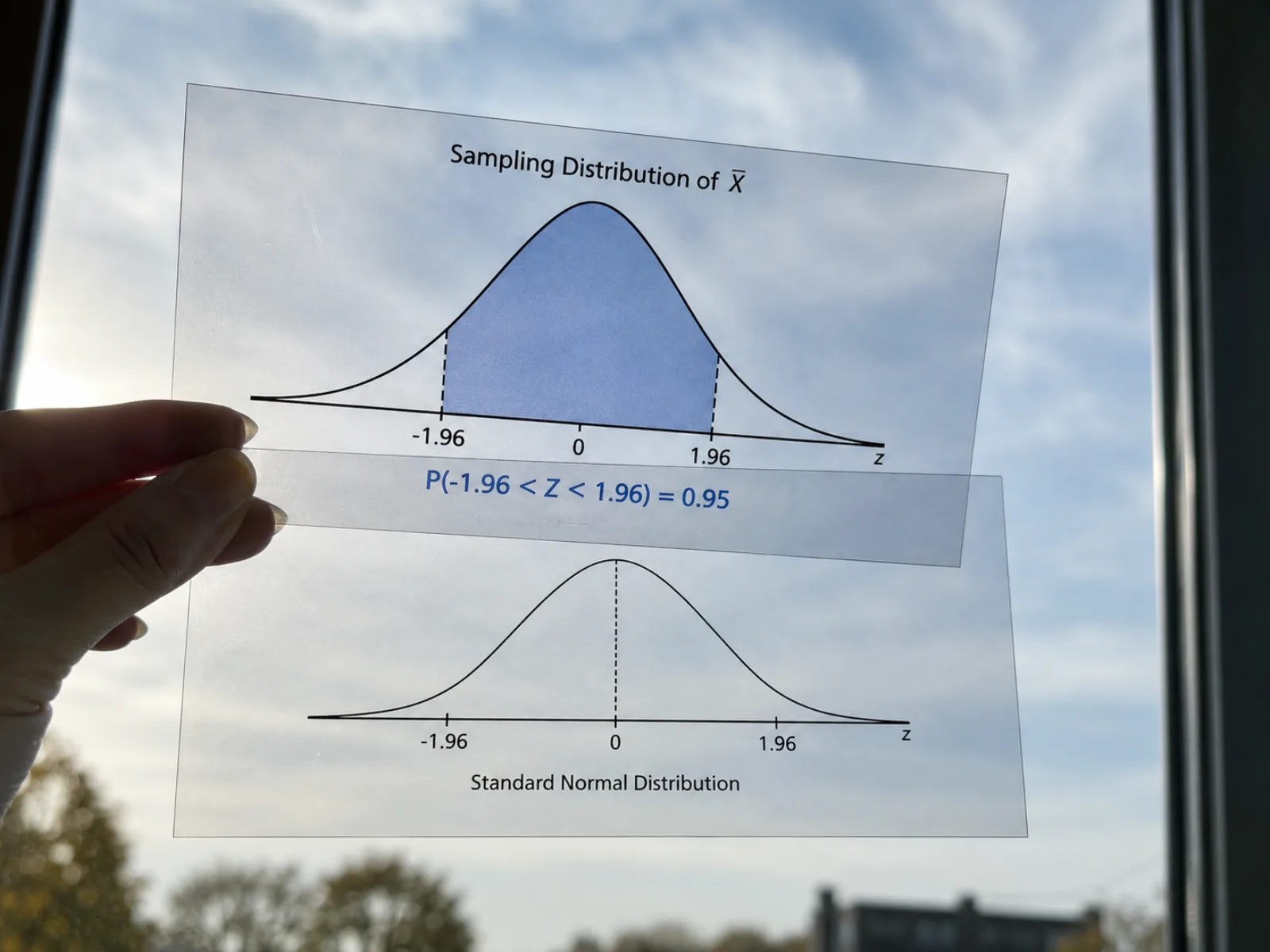
Set a custom lower and upper bound and this generator shades that region and prints the exact probability underneath it, calculated with the error function rather than a rounded lookup table — add a z-score axis or a second curve for comparison when one bell curve isn't enough.
Four steps take two numbers — or a column of raw data — through this bell curve generator to an exported normal distribution graph.
Type a mean and standard deviation directly, or switch to data mode and paste a column of raw measurements — this bell curve generator computes the sample mean and SD for you and redraws the curve.
Switch on the ±1σ/2σ/3σ bands to see the 68-95-99.7 breakdown, or set your own lower and upper bound to shade a specific range and read its exact probability.
Layer on a z-score axis, mark where a given percentile falls, or plot a second mean and standard deviation alongside the first to compare two distributions on one chart.
The curve, shading, and labels redraw as you type, so this bell curve maker doubles as its own live preview. Once it reads correctly, download it as SVG for further editing or PNG for a slide or report.
Straight answers about reading, building, and trusting a normal distribution graph.
Enter your numbers or paste raw data, shade the interval you need, and download a normal distribution graph ready for a report or slide — free, no signup.