

Plot effect size against standard error to check for publication bias in your meta-analysis — free, browser-based, and ready to export in minutes.
A funnel plot is a scatter plot used in meta-analysis to visualize potential publication bias across a set of studies. Each point represents one study, plotted by its effect size on the x-axis and a measure of precision — usually the standard error — on the y-axis, inverted so that larger, more precise studies sit near the top.
When no publication bias is present, a funnel plot should look like a roughly symmetrical, inverted funnel: small studies with large standard errors scatter widely near the bottom, while larger studies cluster tightly around the pooled effect near the top. Funnel plot asymmetry — points skewed to one side — is the classic visual signal of publication bias, though genuine heterogeneity or chance can also produce it.
Funnel plot interpretation is more reliable when paired with a formal test, such as Egger's test or Begg's test, rather than visual inspection alone, since asymmetry can be subtle with fewer than about ten studies. Contour-enhanced funnel plots make this easier by shading regions of statistical significance directly on the plot.

See how a funnel plot looks with a symmetrical evidence base, with asymmetry from publication bias, and with contour-enhanced significance shading.
Studies scatter evenly on both sides of the pooled effect — no visual sign of publication bias.
Small studies cluster on one side only, a classic signature of publication bias or small-study effects.
Shaded p < 0.01, p < 0.05, and p < 0.10 regions show whether asymmetry is driven by statistical significance.
Two confidence funnels make it easy to see which studies fall outside the expected spread.
Go from raw study data to a publication-ready funnel plot in four steps.
Paste each study's name, effect size, and standard error (or variance) as a simple table.
Let the tool compute the fixed-effect weighted average automatically, or enter your own pooled estimate.
Turn on 95% CI lines, add a 99% funnel, or enable contour-enhanced shading to flag significance regions.
Download the finished funnel plot as SVG or PNG and drop it straight into your meta-analysis write-up.

Paste your study effect sizes and standard errors, and the funnel plot renders instantly with the pooled effect and confidence funnel already drawn in.
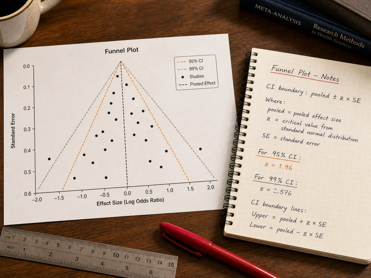
Toggle pseudo-confidence interval boundaries at two levels to see exactly which studies fall outside the expected spread.

Switch on significance contours to shade the p < 0.01, p < 0.05, and p < 0.10 regions, so asymmetry tied to statistical significance stands out at a glance.
Common questions about building and reading a funnel plot for meta-analysis.
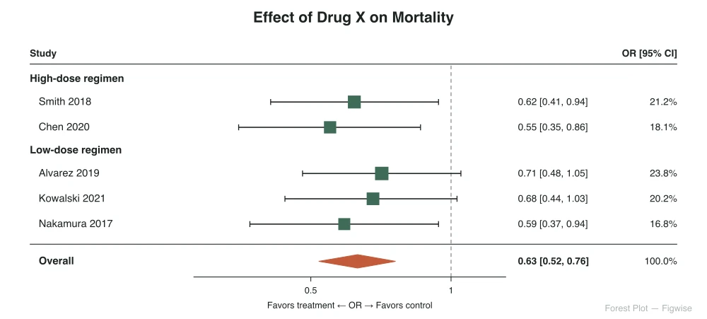
Both are core meta-analysis charts, but they answer different questions.
Detects publication bias across the evidence base
Summarizes each study's effect size and confidence interval
Paste your study data and get a publication-ready funnel plot in minutes — free, no sign-up required.