

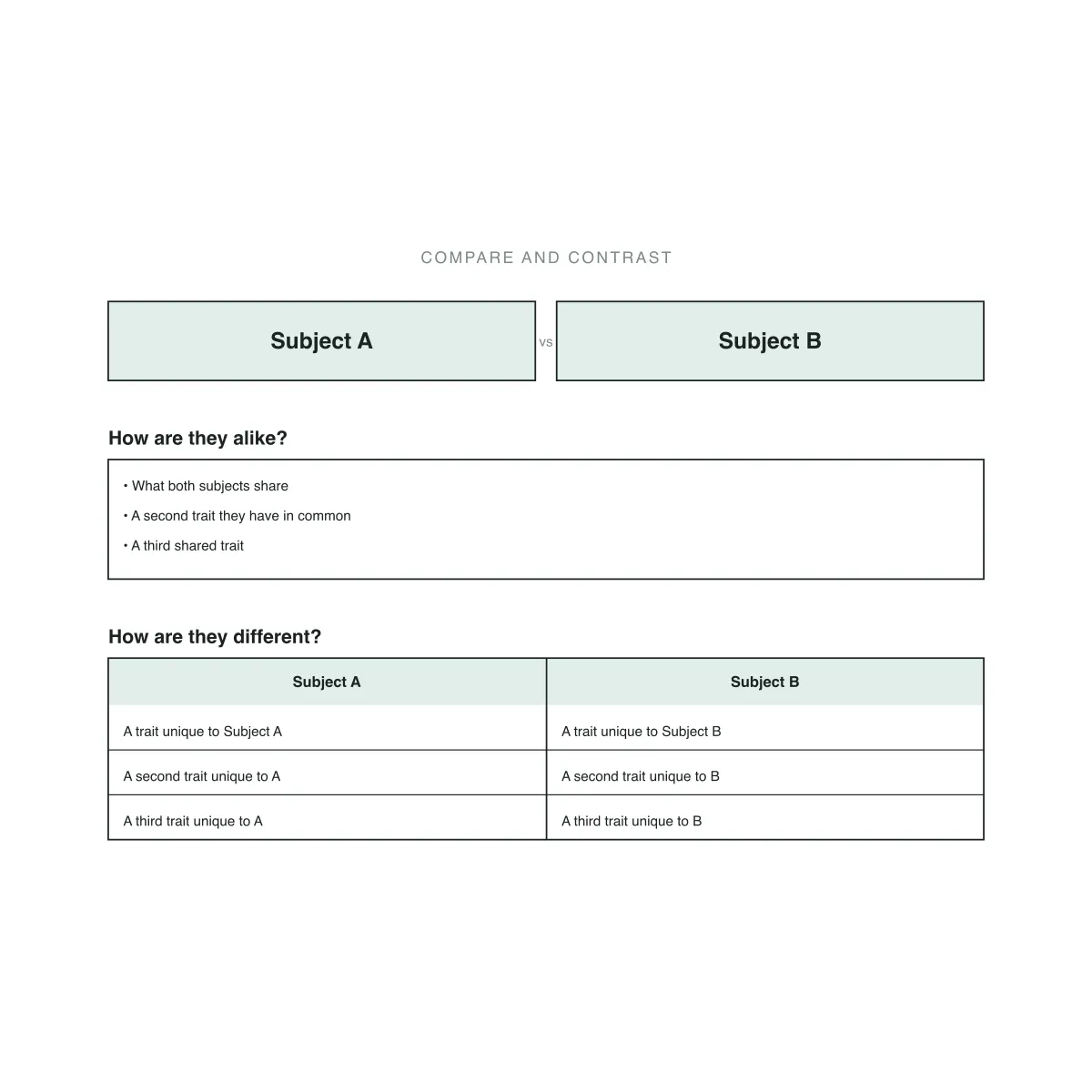
Name two subjects, fill in what they share once, then line up their differences row by row — a compare and contrast chart built for one-to-one comparison.
A compare and contrast graphic organizer is a visual template that lines up two subjects side by side so a reader can see how they match and differ without re-reading a paragraph twice. It goes by several names — compare and contrast chart, T-chart, comparison chart, compare and contrast matrix — but the structure stays the same: one block for what the subjects share, and a second block, split into two matching columns, for what sets them apart. Teachers use it as a pre-writing step before a comparison essay; students use it to study two characters, events, or processes side by side.
The organizer works because it forces a one-to-one comparison instead of a loose list. The alike section sits above the differences and spans the full width, so shared traits get recorded once instead of twice — under each subject, which is where a plain two-column list falls short. Below it, the differences run in two columns that line up row by row: whatever appears in row one for Subject A should answer the same question as row one for Subject B, whether that's appearance, habitat, or method. That alignment separates a graphic organizer from a bare comparison table — the rows carry meaning, not just position.
This layout isn't tied to any one subject or grade band. Elementary teachers use it to compare two animals or two characters in a story; a history class lines up two events or leaders; a math class sets two solution methods side by side to show where they agree and diverge. The same structure shows up under different names across teaching systems and languages — some call it a T-chart, others a comparison matrix, and in Spanish-language classrooms it's often a cuadro comparativo. Whatever the label, the goal stays the same: one chart that reads as a single comparison.
Four subjects this chart handles well, from a science comparison to two math solution methods.
A life-science worksheet that puts frogs and toads side by side, with shared traits in the alike row and skin, legs, and habitat lined up as differences.
An English class worksheet that sets two characters from the same novel side by side, tracking shared motivations and contrasting choices or arcs row by row.
A history worksheet that compares Athens and Sparta across the same set of categories — government, education, economy, and military — one row per category so students see how each city-state handled the same area of life.
A math worksheet that lines up fractions and decimals on the same set of attributes — how each is written, added, and converted — one row per attribute so students see where the two notations agree and where they don't.
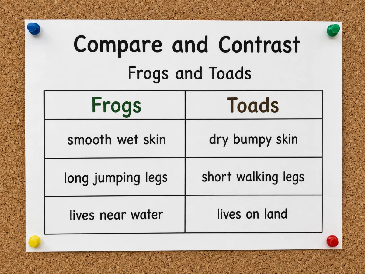
Each row in the differences section pairs one Subject A entry with its Subject B counterpart, so row three always answers the same question on both sides. Add a row and the chart grows to fit it, stretching the row height when one side's wording runs longer.
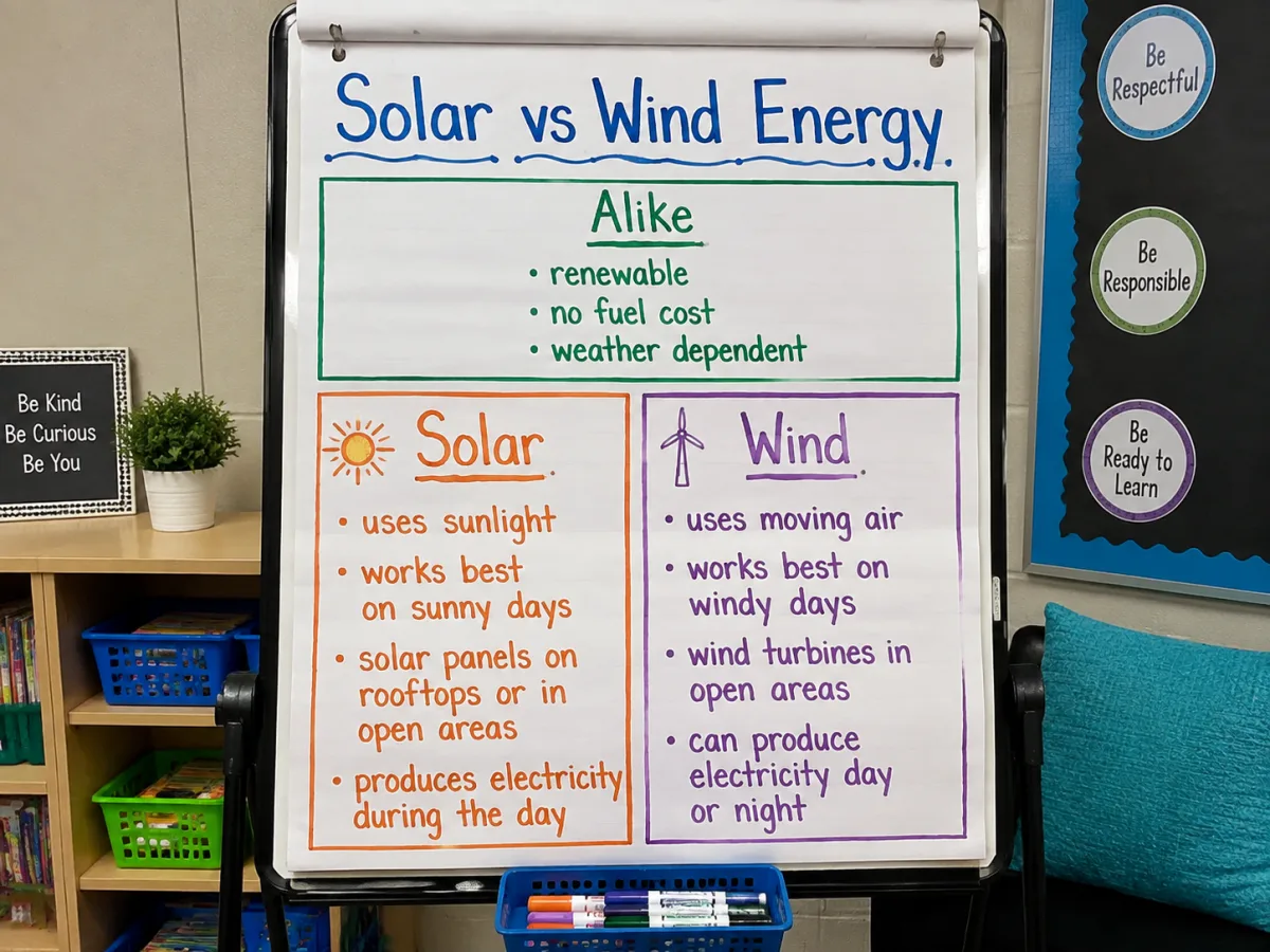
Shared traits go in one block spanning the full width above the differences, so a trait both subjects have gets written once instead of copied under each one — the default mistake a plain two-column table makes.
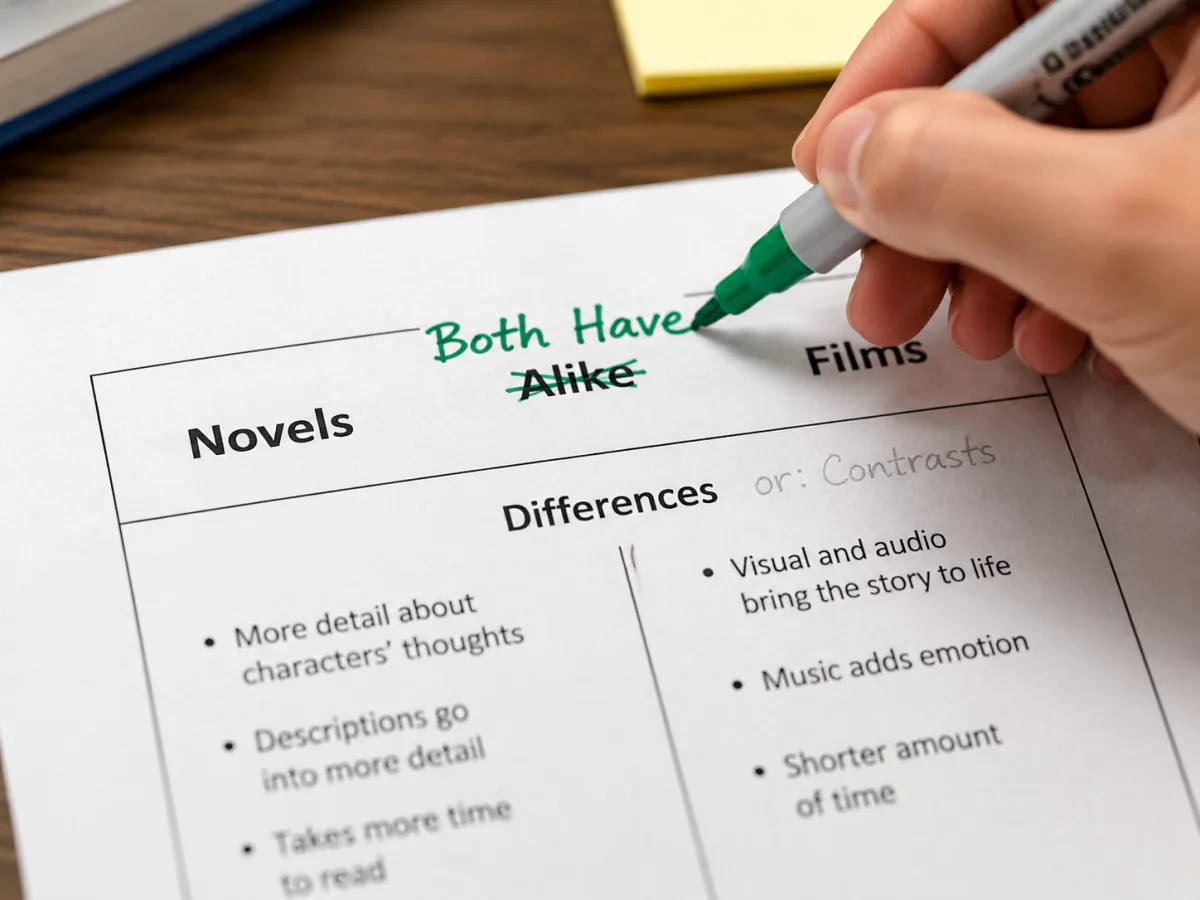
"How are they alike?" and "How are they different?" are editable text, not fixed labels — rename them to match a textbook's wording or another curriculum's term for the same layout, like comparison matrix or T-chart.
How this generator turns two subjects into a finished compare and contrast chart.
Type each subject into its box at the top of the chart. Both titles update in the preview immediately and carry through to the columns below.
Fill in the full-width alike section with the traits both subjects share, one line per trait. This box isn't split by subject, so nothing gets typed twice.
Type a difference for Subject A, then its counterpart for Subject B on the same line so the two stay paired. Add more lines to lengthen either column; the chart's height adjusts on its own.
Download the chart as SVG for further editing or PNG for pasting straight into a worksheet, slide, or study guide.
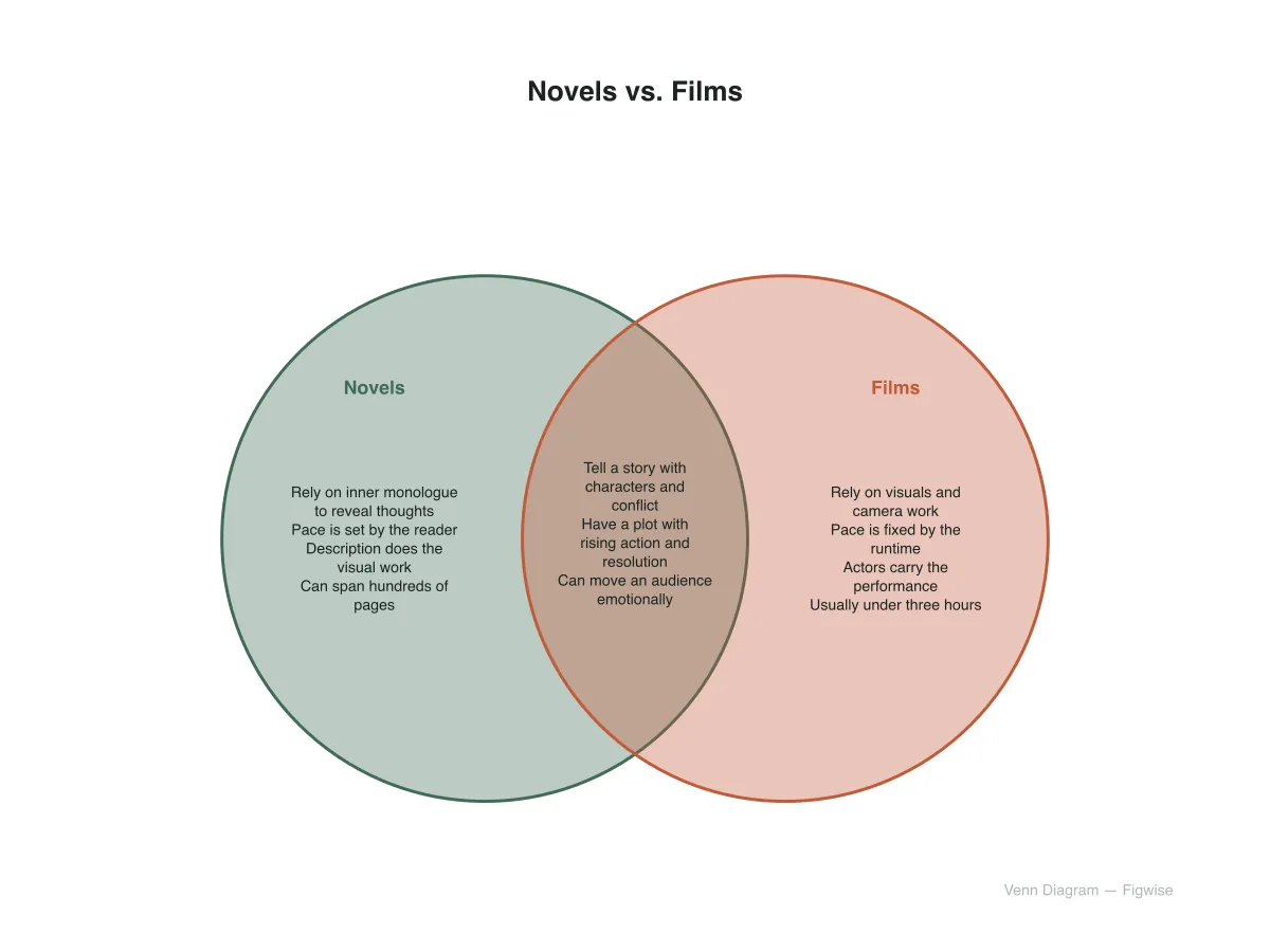
Both organize the same thinking, but they read differently — pick based on how the comparison gets used next.
Alike and different as separate, listed sections
Alike and different shown as one overlapping shape
Answers to the questions people most often ask about this chart and comparing two subjects in general.
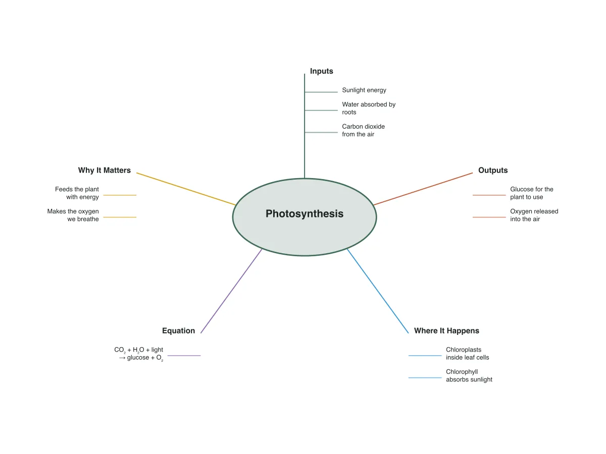
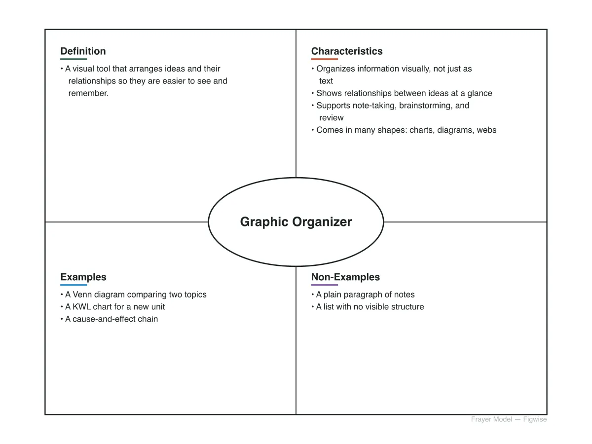
Other free graphic organizers built on the same tool set.
Name two subjects, fill in what's alike, and match the differences row by row — the chart updates as you type and exports as a printable PNG or SVG.