


 Figwise Team
A volcano plot puts every gene from one differential expression test on a single panel. The x-axis is the log2 fold change. The y-axis is −log10 of the adjusted p-value. Genes far from the center and high up are your candidates.
The plot takes ten lines of code. Reading it correctly takes more care. The two dashed lines most people copy, |log2FC| ≥ 1 and padj < 0.05, are a display habit, not a rule — and the edgeR user's guide says that using that pair to pick genes will "destroy the control of FDR in general" (section 2.14).
This post covers what each axis means, which cutoff to draw and why, how to read each region of the cloud, and working R and Python code. If you just need the figure, our volcano plot generator takes a results table and returns a labeled plot.
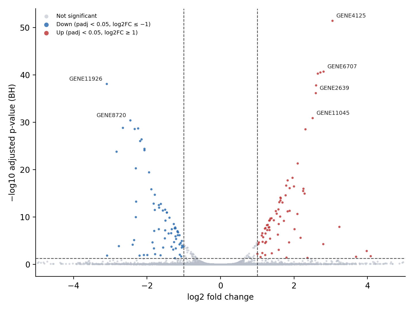
Volcano plot from simulated data (12,000 genes, 5% with a true effect). Made with matplotlib; the code that generated the data is in the Python section below, and the full plotting script sits next to this image in the repository.
The two axes, and why both are logged
Both axes are logged for the same reason: the raw scales hide the part you care about.
Fold change on a raw scale is lopsided. A gene that doubles gets 2.0 and a gene that halves gets 0.5, so up has room to infinity while down is squeezed under 1. Log2 fixes that: doubling becomes +1, halving becomes −1, and the two sides of the plot are mirror images.
P-values are the opposite problem. They pile up near zero, where all the interesting ones live. Taking −log10 spreads that pile out, and the minus sign puts the strongest evidence at the top.
| padj | −log10(padj) | Where it lands |
|---|---|---|
| 0.05 | 1.3 | the usual dashed line |
| 0.01 | 2.0 | just above it |
| 1e-10 | 10 | clearly in the cone |
| 1e-50 | 50 | near the ceiling |
Two facts follow from that table. A point at y = 4 has a padj a hundred times smaller than a point at y = 2. And the y-axis has no upper bound, so one gene with a tiny p-value can stretch the whole plot.
Put padj on the y-axis, not the raw p-value
Raw p-values on the y-axis will hand you hundreds of false hits. Bulk RNA-seq tests every gene, so a run with 15,000 tested genes and no real effect still gives about 750 genes at p < 0.05.
The fix is a false discovery rate correction. The Benjamini-Hochberg method rescales p-values so that a 0.05 cutoff means "about 5% of the genes I keep are false", not "5% of all tests". R does it in p.adjust with method = "BH", after Benjamini and Hochberg (1995).
Both main tools give you the corrected column already:
- DESeq2 (vignette):
log2FoldChange,pvalue,padj. Thepadjcolumn is BH by default, sinceresults()runs withpAdjustMethod = "BH". - edgeR (user's guide):
topTags()returnslogFC,logCPM, a test statistic column (ForLR),PValue, andFDR.FDRis the column you want.
Two DESeq2 details bite people here. First, results() uses alpha = 0.1 by default, and its independent filtering step is tuned to that value. If your dashed line is at 0.05, call results(dds, alpha = 0.05) so the filtering matches the line you drew.
Second, some genes come back with padj = NA. That is independent filtering and outlier removal doing their job, per the vignette's "Why are some p values set to NA?" section. Drop those rows before plotting. Never turn NA into 1 or 0.
Where to draw the cutoff lines
There is no standard cutoff pair, only common ones. Here is where the popular numbers actually come from:
| Cutoff pair | Source | Fits when |
|---|---|---|
| padj < 0.05, |log2FC| ≥ 1 (2-fold) | convention, no primary source | many DE genes, good replication |
| FDR < 0.01, |log2FC| ≥ 0.58 (1.5-fold) | Galaxy training tutorial | strong signal, tighter on p than on size |
FDR < 0.05, fold change above 1.2, tested with glmTreat |
edgeR user's guide, section 4.4 | thousands of hits to narrow down |
| padj < 0.1, no fold change line | DESeq2's own default alpha |
small n, exploratory screen |
Pick by how much signal you have, not by habit. If 6,000 genes pass, the list is useless and a higher fold change bar helps. If nine genes pass, drop the fold change line and rank by padj instead.
The edgeR guide has the best one-line rule for the x cutoff. Read it as "the fold-change below which we are definitely not interested in the gene", not the change above which a gene becomes interesting.
The cutoff trap worth knowing
Filtering by p and then by fold change is not a valid test. The edgeR guide is blunt about it: such combinations "are both ad hoc and do not give meaningful p-values for testing differential expressions relative to a fold-change threshold". They "favour lowly expressed but highly variable genes" and "destroy the control of FDR in general".
If the fold change bar matters to your claim, test against it instead of filtering after the fact:
# DESeq2: test whether |log2FC| is above 1, not just above 0
res <- results(dds, lfcThreshold = 1, altHypothesis = "greaterAbs", alpha = 0.05)

# edgeR: same idea, via the TREAT method
fit <- glmQLFit(y, design)
tr  <- glmTreat(fit, coef = 2, lfc = 1)
Now padj already accounts for the size cutoff, and the vertical lines describe the test you ran. Both options are documented: see tests of log2 fold change above a threshold in DESeq2 and the TREAT paper behind glmTreat.
How to read the plot, region by region
Read the cloud before you read the labels. The shape says more about the experiment than any single gene does.
| Region | What it means | What to do |
|---|---|---|
| Top right, top left | Big change, strong evidence | your candidate list |
| Top middle (high y, |log2FC| < 0.3) | Small change, measured very well | check what the gene is |
| Bottom edges (|log2FC| > 2, y near 0) | Big ratio, weak evidence | do not chase |
| Wide flat band, nothing above the line | Little or no signal | go back to QC |
Top middle is the region people misread. Those genes are usually high-count genes, where the standard error is small, so even a 15% change clears the p cutoff. The change is real, but whether a 15% change matters is a biology question, not a statistics one. One warning sign: if housekeeping or ribosomal genes sit up there, suspect a normalization or library composition problem, not biology.
Bottom edges are the mirror image. A gene with 4 counts in one group and 30 in the other gives a huge log2 fold change and almost no evidence. These points make the x-axis wide and the story exciting, and they rarely replicate. Shrunken fold changes fix the display: lfcShrink(dds, coef = 2, type = "apeglm") pulls poorly measured genes toward zero and leaves well-measured ones alone.
Two shape checks close the read:
- Symmetry. A lopsided cloud, say 900 up and 40 down, can be real activation. It can also come from a composition shift that normalization did not absorb. Look at the MA plot and the size factors before you write the sentence.
- Width of the V. The gap around x = 0 with points climbing on both flanks is expected, since bigger changes clear the p cutoff more easily. A solid vertical spike at x = 0 instead usually means you plotted raw p-values.
Plot it in R from DESeq2 results
This runs on a DESeqDataSet called dds and needs ggplot2, ggrepel, and dplyr.
library(DESeq2)
library(ggplot2)
library(ggrepel)
library(dplyr)

lfc_cut  <- 1
padj_cut <- 0.05

# keep alpha equal to the line you draw, or filtering optimises for 0.1
res <- results(dds, alpha = padj_cut)

df <- as.data.frame(res)
df$gene <- rownames(df)
df <- df[!is.na(df$padj), ]
df$padj <- pmax(df$padj, .Machine$double.xmin)  # padj can underflow to 0

df$class <- "Not significant"
df$class[df$padj < padj_cut & df$log2FoldChange >=  lfc_cut] <- "Up"
df$class[df$padj < padj_cut & df$log2FoldChange <= -lfc_cut] <- "Down"

top <- df %>%
  filter(class != "Not significant") %>%
  arrange(padj) %>%
  slice_head(n = 10)

ggplot(df, aes(x = log2FoldChange, y = -log10(padj), colour = class)) +
  geom_point(size = 1, alpha = 0.7) +
  geom_hline(yintercept = -log10(padj_cut), linetype = "dashed") +
  geom_vline(xintercept = c(-lfc_cut, lfc_cut), linetype = "dashed") +
  geom_text_repel(
    data = top, aes(label = gene),
    colour = "black", size = 3, max.overlaps = Inf, show.legend = FALSE
  ) +
  scale_colour_manual(values = c(
    "Up" = "#c23b3b", "Down" = "#2f6fb2", "Not significant" = "#b8bec9"
  )) +
  coord_cartesian(xlim = c(-5, 5)) +
  labs(x = "log2 fold change", y = "-log10 padj", colour = NULL) +
  theme_classic()
Coming from edgeR, rename two columns and the rest of the script works:
df <- topTags(qlf, n = Inf)$table
df$log2FoldChange <- df$logFC
df$padj <- df$FDR
For a fully styled version with connectors and shaded cutoff boxes, the EnhancedVolcano vignette is worth a read.
Plot it in Python from a pandas DataFrame
Export the DESeq2 table to CSV, then run this. It uses pandas, numpy, and matplotlib only.
import numpy as np
import pandas as pd
import matplotlib.pyplot as plt

# first column is the gene name; needs DESeq2's log2FoldChange and padj
df = pd.read_csv("deseq2_results.csv", index_col=0)
df = df.dropna(subset=["padj", "log2FoldChange"]).copy()

lfc_cut, padj_cut = 1.0, 0.05

# padj can underflow to 0, which makes -log10 infinite; clip it first
df["y"] = -np.log10(df["padj"].clip(lower=np.finfo(float).tiny))
df["cls"] = "not significant"
df.loc[(df["padj"] < padj_cut) & (df["log2FoldChange"] >= lfc_cut), "cls"] = "up"
df.loc[(df["padj"] < padj_cut) & (df["log2FoldChange"] <= -lfc_cut), "cls"] = "down"

colours = {"not significant": "#b8bec9", "down": "#2f6fb2", "up": "#c23b3b"}
fig, ax = plt.subplots(figsize=(7, 5), dpi=200)
for name, grp in df.groupby("cls"):
    ax.scatter(grp["log2FoldChange"], grp["y"], s=6, c=colours[name],
               label=name, alpha=0.7, linewidths=0)

ax.axhline(-np.log10(padj_cut), ls="--", lw=0.9, c="#444444")
for v in (-lfc_cut, lfc_cut):
    ax.axvline(v, ls="--", lw=0.9, c="#444444")

top = df[df["cls"] != "not significant"].nsmallest(10, "padj")
for gene, row in top.iterrows():
    ax.annotate(gene, (row["log2FoldChange"], row["y"]), xytext=(4, 4),
                textcoords="offset points", fontsize=7)

ax.set_xlabel("log2 fold change")
ax.set_ylabel("-log10 padj")
ax.set_xlim(-5, 5)
ax.legend(frameon=False, markerscale=2)
fig.tight_layout()
fig.savefig("volcano.png")
Working from edgeR output in Python, rename logFC to log2FoldChange and FDR to padj first.
The code behind the figure above
The example figure uses simulated data, not a real dataset. The model is deliberately simple: base means spread over four orders of magnitude, 5% of genes carry a true effect, and the standard error grows as the base mean drops. That last part is what creates the low-evidence points at the far edges.
import numpy as np
from math import erfc

rng = np.random.default_rng(11)
n = 12000

base_mean = 10 ** rng.uniform(0, 4.2, n)
true_lfc = np.where(rng.random(n) < 0.05, rng.normal(0, 1.1, n), 0.0)
se = np.sqrt(0.035 + 9.0 / base_mean)        # low-count genes get a larger standard error
lfc = true_lfc + rng.normal(0, se)
pval = np.array([erfc(abs(s) / np.sqrt(2)) for s in lfc / se])

# Benjamini-Hochberg, same as R's p.adjust(method = "BH")
order = np.argsort(pval)
ranked = pval[order] * n / np.arange(1, n + 1)
padj = np.empty(n)
padj[order] = np.clip(np.minimum.accumulate(ranked[::-1])[::-1], 0, 1)
padj[base_mean < 1.5] = np.nan                # stand-in for independent filtering
Five mistakes that make a volcano plot misleading
- Raw p-values on the y-axis. Hundreds of genes cross the line by chance. Use
padjorFDR, and say which one in the axis label. - Treating the fold change line as biological meaning. A 2-fold change in a transcription factor and in a structural protein are not comparable claims. The line is a filter, not evidence.
- Letting outliers stretch the axes. One gene at log2FC = 12 flattens everything else. Clip the view with
coord_cartesian()orset_xlim(), and mark the clipped points with triangles at the edge instead of dropping them. - Coloring by fold change alone. Red for every gene past x = 1 marks noisy low-count genes as hits. Color needs both conditions: past the fold change line and past the padj line.
- No dashed lines at all. Without them the reader cannot tell your cutoff from the plot. Draw both, and put the numbers in the caption or legend.
FAQ
Is a volcano plot the same as an MA plot?
No, and they answer different questions. An MA plot puts mean expression on the x-axis and log2 fold change on the y-axis, so it shows whether your big changes come from low-count genes. A volcano plot drops expression level and shows evidence instead. Make both while you work, publish the volcano.
What do I do when padj is exactly 0?
That is floating point underflow, not a p-value of zero. -log10(0) gives infinity and the point disappears or breaks the axis. Clip padj at the smallest positive double before the log, as in the Python code above, and report the gene as padj < 1e-300 in text.
How many genes should I label?
Ten to twenty is readable, more is a mess. Rank by padj among the genes that also pass the fold change line, then label a fixed number. Use ggrepel in R or nudged annotate calls in Python so the text does not sit on the points. Label any gene you name in the abstract, even if it is not in the top ten.
Can a volcano plot go straight into a paper?
Yes, if it is exported as vector art or at the resolution the journal asks for, and if the underlying analysis is reproducible. Publishers treat data figures differently from illustrations, and the rules matter before you submit — see our guide to journal policies on AI-generated figures. For the summary panel of a paper, a graphical abstract maker covers the schematic part, while the volcano stays a plot of your own numbers.