


 Figwise Team
Short answer: Results. The CONSORT 2025 checklist puts participant flow under Results, as item 22a. Its row is even labelled "Participant flow, including flow diagram." Methods says how you planned to randomise and analyse. The diagram reports what happened.
One caveat before you paste it in: your target journal's own rules win. Some want it as Figure 1, some want it in the supplement. Read the author guide before you fix the layout.
The rest of this page covers what goes in each box, the totals that have to match, and what CONSORT 2025 changed.
Why it belongs in Results, not Methods
The checklist settles it. CONSORT 2025's Results section opens with:
"22a For each group, the numbers of participants who were randomly assigned, received intended intervention, and were analysed for the primary outcome"
"22b For each group, losses and exclusions after randomisation, together with reasons"
Both are Results items, and the checklist's own row label for them reads "Participant flow, including flow diagram."
The matching Methods item does a different job. Item 21b asks for the "[d]efinition of who is included in each analysis (e.g., all randomised participants), and in which group."
So the rule you can act on: Methods defines your analysis populations. Results counts them.
What CONSORT 2025 changed
The 2025 update is big for the checklist and mild for the diagram. The statement says the authors "added seven new checklist items, revised three items, deleted one item," and restructured the checklist with a new open-science section.
The flow diagram came through with its four phases intact. The 2025 figure caption describes "the progress through the phases of a randomised trial of two groups (i.e., enrolment, intervention allocation, follow-up, and data analysis)" — the same four bands as 2010.
So: four bands unchanged, three box labels reworded. If you know the 2010 diagram you know the shape. But copy the 2025 wording — for primary outcome on the follow-up and analysis boxes, and Allocated to intervention on both arms.
Box by box
The standard diagram covers a two-arm parallel trial in four bands.
Enrolment
- Assessed for eligibility (n). Everyone you screened, including those who never entered the trial.
- Excluded (n), with reasons. The template splits these three ways: not meeting criteria, declined to take part, other reasons. Each gets its own count.
The reasons are not decoration. They tell a reader whether your sample looks like their own patients.
Allocation
- Randomised (n). The key number in the figure. It equals assessed minus excluded.
- Allocated to intervention (n), once per arm. The 2025 template uses the same label on both sides rather than intervention-and-comparator. The two must sum to the randomised total.
- Received allocated intervention (n) / did not receive it (n), with reasons. People who were randomised but never got the drug still count in your analysis if you go by intention to treat.
Follow-up
The 2025 template puts discontinuation first, and one line gained a qualifier:
- Discontinued intervention (give reasons) (n). Stopping treatment is not the same as being lost to follow-up, and mixing them hides information.
- Lost to follow-up for primary outcome (give reasons) (n). The words for primary outcome are part of the official 2025 wording. Copy them.
Keep the two arms side by side. A reader compares them, and heavy dropout in one arm only is a signal that reviewers ask about.
Analysis
- Analysed for primary outcome (n). Again, for primary outcome is the 2025 wording. Under strict intention to treat this equals the number allocated — but only if you imputed the missing outcomes and said so, which item 21c covers. If you did not impute, your analysis set is the people with data, and the count is smaller.
- Excluded from analysis (n), with reasons. If this is not zero, the reasons matter more than the count.
This is where the Methods link pays off. Say item 21b promised "all randomised participants." If your Analysed row is then smaller than your Allocated row, and you do not say why, the two sections contradict each other.
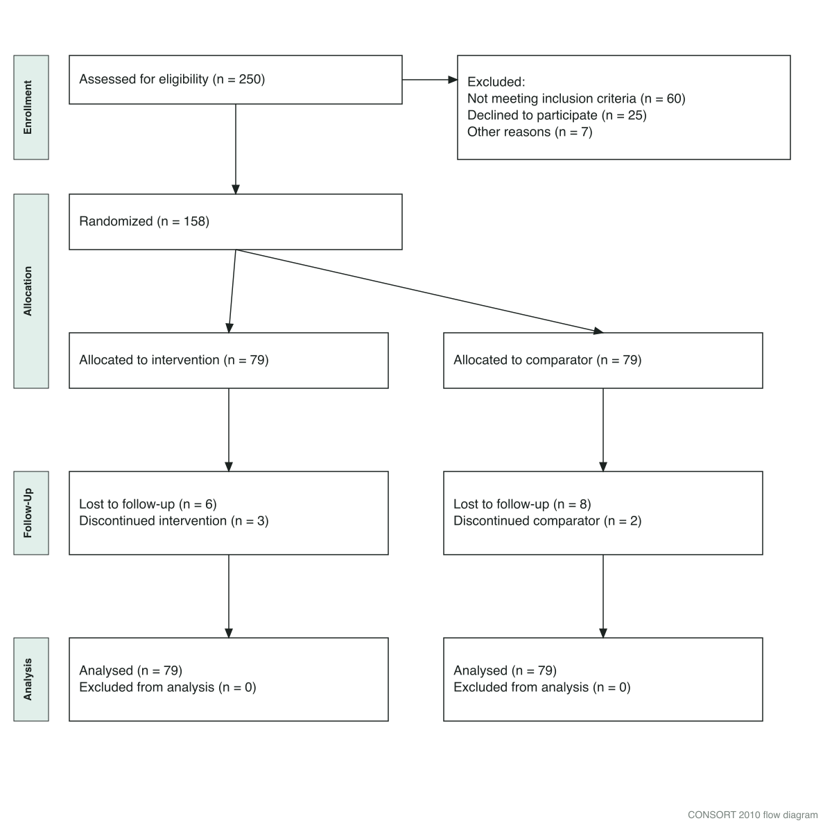
A worked example rendered with the FigWise CONSORT generator. Numbers are ours, chosen so every total balances. Note that the tool still prints the 2010 labels and footer — the arithmetic is what this figure is here to show.
The totals that must match
Four checks. Run all four before you export.
- Assessed for eligibility − excluded = randomised
- Excluded = not meeting criteria + declined + other reasons
- Randomised = allocated to arm 1 + allocated to arm 2
- Per arm: allocated = received + did not receive
- Per arm: allocated = analysed + excluded from analysis
Check 1 only applies if you recorded the screened count. CONSORT's own explanation says that number is not always known, and that it speaks to external validity rather than internal validity. A blank there is legitimate.
Trace the example above. Take 250 assessed, subtract 60 + 25 + 7 excluded, and 158 are randomised. The two arms of 79 sum back to 158.
Each arm then loses some people to follow-up and discontinuation, yet 79 are analysed in each arm. This example analyses by intention to treat, so dropouts stay in the denominator.
That last point catches people out. Losses in the follow-up band do not have to reduce the analysed count. Whether they do follows from your analysis population, and the figure has to agree with what your Methods promised.
Three mistakes reviewers catch
- Arms that do not balance, with no explanation. If one arm loses 20 participants and the other loses 3, say why. The figure shows the asymmetry whether or not you address it.
- "Other reasons" with no breakdown. A big "other" bucket in the exclusion box reads as bookkeeping you skipped. Break it down, or explain it in the text.
- Per-protocol exclusions hidden in the follow-up band. If you dropped people who did not stick to the protocol, that belongs in "excluded from analysis" with a reason, not buried as a discontinuation.
Where to get the diagram
The official template is on consort-statement.org. The 2025 statement is open access in PLOS Medicine, and the longer explanation paper is on PMC.
Our CONSORT flow diagram generator draws the standard two-arm diagram in the browser from your counts, and exports SVG or PNG. It is a template renderer rather than an AI tool: the layout is fixed and the numbers are yours, so nothing about it is model-generated. For systematic reviews, the same approach applies in our PRISMA flow diagram generator.
Four limits worth knowing before you rely on it:
- It draws the standard two-arm parallel layout. Cluster, crossover and multi-arm trials need the official template.
- Its boxes hold the counts you type. It does not run the four checks above for you.
- It has no fields for "received allocated intervention" or "did not receive", which item 22a asks for. Add those two lines by hand, or use the official template.
- Its labels and footer still follow the 2010 wording. The export says
CONSORT 2010 flow diagramand omitsfor primary outcome. Edit the SVG text, or start from the official 2025 file.
If any part of your figure set came out of an AI tool, check the rules first — they vary sharply by publisher, and flow charts are not treated like data images. We compared six publishers in our guide to AI figures and journal policies.
FAQ
Is the CONSORT flow diagram mandatory?
For journals that endorse CONSORT, in effect yes. Participant flow is item 22a, and that row names the diagram. Journals that ask for the checklist will look for it.
Does the diagram go in the Results section or as Figure 1?
Both, usually. It sits in Results, and in most trial papers it is numbered Figure 1 because it comes first. The numbering follows your journal's figure conventions.
Can I use the CONSORT 2010 diagram?
The four phases are unchanged in 2025, so a 2010-style diagram is not wrong in shape. Use the current template anyway: the box wording changed, and a reviewer checking against CONSORT 2025 will expect it.
What if my trial has three arms?
Add a column per arm and keep every balance check per arm. There is no multi-arm official file to find: the official template is the two-group one, and CONSORT's explanation paper says no format is prescribed and the diagram may be adapted to a trial's features. So adapt the two-group template.
Do participants lost to follow-up come out of the analysed count?
Only if your analysis population excludes them. Under intention to treat they stay in, and the analysed count equals the allocated count. Whatever you choose, the figure must match the definition you gave in Methods.