


 Figwiseチーム
The official PRISMA site gives you the template. It does not tell you what to put in each box, or why your numbers refuse to add up. This guide does both.
Here is the short version. Every box in the PRISMA 2020 flow diagram holds one count from your screening records. At each stage, the number going in must equal the number moving on plus the number removed. And since 2020, the final boxes count studies and reports separately — the single change that trips up the most authors.
Below you'll find:
- What each box means and where its number comes from
- The eight arithmetic rules that must hold, as a self-check list
- A full worked example, plus a published diagram that gets it wrong
- The official template, the R package, and a free PRISMA flow diagram generator that draws the figure from your counts
First, pick the right template
There are four official templates, not one. New reviews and updated reviews each get their own version. Each comes with or without an extra column for sources beyond databases and registers.
| Template | Use it when |
|---|---|
| New review, databases and registers only | Most systematic reviews. You searched databases like PubMed or Embase, maybe trial registers. |
| New review, plus other sources | You also found records via websites, organisations, or citation searching. Adds a second column. |
| Updated review, databases and registers only | You are updating a published review and must show old and new studies. |
| Updated review, plus other sources | Both of the above. |
All four are free Word files on the official PRISMA flow diagram page, licensed CC BY 4.0. The rest of this guide walks through the standard version: new review, databases and registers only. The "other methods" column follows the same logic with one twist, covered below.
The official template download page at prisma-statement.org, captured August 23, 2026.
Box by box: what number goes where
Three words carry the whole diagram, and the PRISMA 2020 statement defines them tightly:
- A record is "the title or abstract (or both) of a report indexed in a database or website." Two records pointing at the same report are duplicates; records pointing at merely similar reports are not.
- A report is one document: an article, a preprint, a thesis.
- A study is one investigation, which may be described by several reports.
The top of the diagram counts records. The middle counts reports. The bottom counts studies and reports.
Records identified
Enter the raw count from each search export, before duplicates are removed. Databases (PubMed, Embase, Scopus...) and registers (ClinicalTrials.gov, ICTRP...) get separate lines. Your source is the export file or the "results" count logged on your search date.
The template's own footnote asks for more detail when you can give it:
"Consider, if feasible to do so, reporting the number of records identified from each database or register searched (rather than the total number across all databases/registers)."
So "Databases (n = 644)" is acceptable, but "PubMed (n = 312), Embase (n = 245)..." is better.
Records removed before screening
This box has three sub-lines, and each has a distinct meaning:
- Duplicate records removed — the count your reference manager or screening tool (EndNote, Zotero, Covidence, Rayyan) reports after deduplication.
- Records marked as ineligible by automation tools — records a classifier or filter removed with no human look. Zero for most reviews; write n = 0 rather than deleting the line.
- Records removed for other reasons — anything else removed pre-screening, such as records outside your date limits that slipped through.
Records screened, records excluded
"Records screened" is what survived into title/abstract screening. It must equal records identified minus everything removed before screening. "Records excluded" is what your screeners rejected at this stage. No reasons are required here — reasons become mandatory one level down.
One footnote applies if software helped:
"If automation tools were used, indicate how many records were excluded by a human and how many were excluded by automation tools."
Reports sought for retrieval, reports not retrieved
Here the unit switches from records to reports: you now try to get full texts. "Reports sought for retrieval" equals records screened minus records excluded. "Reports not retrieved" counts full texts you could not get — paywalls with no library access, conference abstracts with no paper, authors who never replied.
Reports assessed for eligibility, reports excluded
Full-text screening. "Reports assessed" equals reports sought minus reports not retrieved. The exclusions box is the one place where reasons are required, and each reason needs its own count:
- wrong population (n = ...)
- wrong intervention (n = ...)
- wrong study design (n = ...)
The reason counts must sum to the total excluded.
Studies included in review, reports of included studies
The final box holds two numbers, and this is the headline change from PRISMA 2009. The old diagram ended with one count of "studies". PRISMA 2020 makes you separate them, because one trial often yields several papers. If 24 studies reached inclusion and 5 of them had a second linked paper, you write: Studies included in review (n = 24); Reports of included studies (n = 29).
The "other methods" column, if you need it
Template version 2 adds a second column on the right for records found via websites, organisations, or citation searching. It has its own "sought", "not retrieved" and "assessed" boxes, plus a full Reports excluded box with its own reason lines. What it does not have is a screening stage: there is no Records screened or Records excluded on that side. The two columns merge only at the final included box.
Make the numbers add up: the conservation rules
The diagram is a series of balance checks. Run all eight before you export anything:
- Databases + registers = the identification total you subtract from
- Duplicates + automation removals + other removals = everything removed before screening
- Records identified − records removed before screening = records screened
- Records screened − records excluded = reports sought for retrieval
- Reports sought − reports not retrieved = reports assessed for eligibility
- Reports assessed − reports excluded = reports of included studies
- Sum of the itemised exclusion reasons = total reports excluded
- Reports of included studies ≥ studies included in review
Checks 1 and 2 exist because the official template has no total boxes: the top holds separate Databases and Registers lines, and the removal box holds three sub-lines. You add them up yourself, which is where the first mistakes appear.
When a check fails, the cause is usually one of three things.
- A duplicate-count mismatch. EndNote and Covidence count duplicates in different ways, so take every number from one tool's log, not a mix.
- A records-versus-reports slip. A "record excluded" at abstract stage and a "report excluded" at full-text stage are different events. Moving one between levels breaks two checks at once.
- Companion papers. If you merged three papers into one study during extraction, the studies count drops but the reports count must not.
A worked example with the numbers filled in
The figure below is a worked example, not a real review — the numbers are ours, chosen to show every rule holding. We drew it with our own PRISMA flow diagram generator. You type 13 numbers, it draws the standard databases-and-registers diagram, and you export SVG or PNG. It is free and runs in the browser with no login.
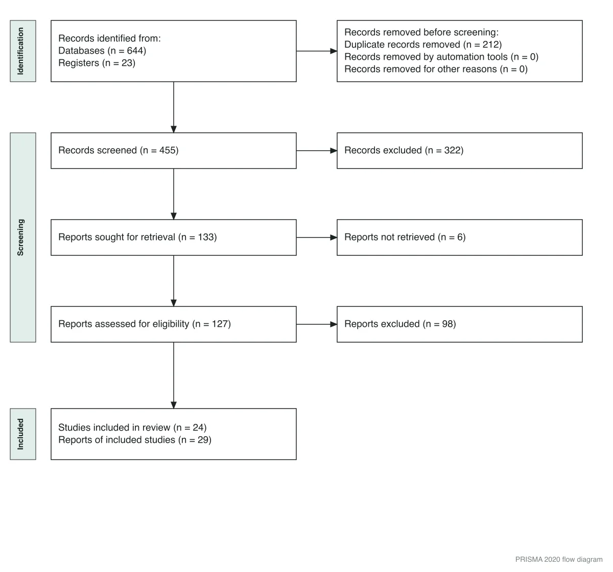
A worked example rendered with the FigWise PRISMA generator. Every level balances: 667 − 212 = 455; 455 − 322 = 133; 133 − 6 = 127; 127 − 98 = 29 reports of 24 studies.
Trace it once: 644 database records plus 23 register records is 667. Remove 212 duplicates and 455 remain for screening. Screeners exclude 322, so 133 full texts are sought; 6 cannot be retrieved, leaving 127 assessed. Full-text review excludes 98, leaving 29 reports that describe 24 studies.
Three honesty notes on the tool:
- It covers the standard new-review template only. There is no "other methods" column and no updated-review version; use the official Word file for those.
- Its wording is close to the official template but not identical — the automation line reads "Records removed by automation tools" where the template says "Records marked as ineligible by automation tools" — and it prints neither the column header nor the two starred footnotes quoted above. If your journal checks the figure against the template, edit the exported SVG text.
- Its exclusions box holds one total. The exported SVG has real, editable text, but the box is a fixed height with no wrapping — adding three or four reason lines will overflow the border unless you enlarge the box too. For an itemised exclusions box, the official Word template is less work.
Even published diagrams get this wrong
Balance checks are not academic. A 2026 systematic review in Frontiers in Dental Medicine (DOI: 10.3389/fdmed.2026.1720637) shows how easily a peer-reviewed figure drifts from its own text.
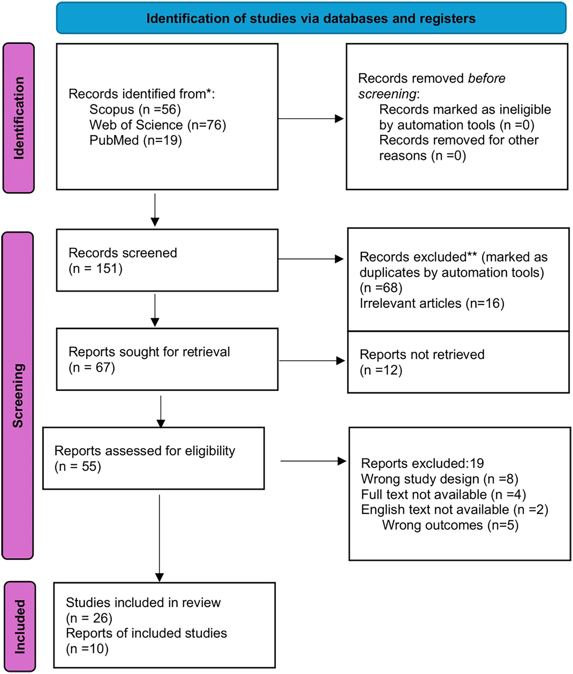
Figure 1 of Harikrishna et al., Frontiers in Dental Medicine, 2026, reproduced unmodified under CC BY 4.0. Compare its counts against the article text and the balance checks above.
Three mismatches are visible:
- The figure labels the raw total of 151 as "Records screened". It then moves duplicate removal down into the screening-stage exclusion box, where the template puts topic-based exclusions.
- The figure's removal counts are 68 duplicates and 16 irrelevant; the text says "65 duplicates were removed by automation tools and 19 records were excluded as clearly irrelevant." Both add to 84, and 151 − 84 = 67 matches the next box in each version — so the totals reconcile and only the split disagrees.
- The
Records removed before screeningbox lists automation (n = 0) and other reasons (n = 0), with theDuplicate records removedline deleted rather than set to a number. That is the checklist item three lines below, in the wild. - The final box reads 26 studies from 10 reports, while the text reports that "36 studies fulfilled the eligibility criteria." Reports of included studies can never be fewer than studies. The text explains where 26 and 10 come from: "10 CFD studies provided extractable, needle-specific wall shear stress data… The remaining 26 included studies contributed contextual information." So the two boxes hold a split of the 36 by data type, not a study-and-report count.
None of this changes the review's findings. It shows that the diagram is checkable, and reviewers do check.
Common mistakes: a final checklist
Before submission, confirm each line:
- Top boxes hold raw, pre-deduplication export counts
- Registers are on their own line, not folded into databases
- Every empty sub-line says n = 0 instead of being deleted
- Duplicates sit in "removed before screening", not in screening exclusions
- Full-text exclusion reasons are itemised and sum to the total
- Reports of included studies ≥ studies included in review
- All eight balance checks pass
- Figure numbers match the numbers in your abstract and results text
Tools: template, R package, Shiny app, and this site
Four options cover most situations:
- Official Word templates — the reference wording, best when your journal wants an editable file or you need the other-methods or updated-review layouts.
- PRISMA2020 R package — best for reproducible pipelines; the diagram rebuilds from a data file when counts change. Source is on GitHub, and the method is described in an open-access paper by Haddaway and colleagues.
- The Shiny app — the same engine with a form interface, no R required. It runs on shinyapps.io's free tier, which carries no availability guarantee; the local package is the fallback.
- FigWise PRISMA flow diagram generator — quickest for the standard diagram: type 13 numbers, watch the live preview, export SVG or PNG. For randomised trial reporting, the same approach applies in our CONSORT flow diagram generator.
If any other figure in your manuscript came out of an AI tool, check what the publishers actually allow — the rules differ sharply, and flow diagrams are not treated like data images.
FAQ
Do I still need the diagram if my search found very few studies?
Yes, in practice. Item 16a asks you to "[d]escribe the results of the search and selection process, from the number of records identified in the search to the number of studies included in the review, ideally using a flow diagram." Note ideally — the item can be satisfied in prose. But journals that endorse PRISMA expect the figure, whether you screened 90 records or 9,000.
What counts as a register, and what if I didn't search one?
Registers are prospective study registries such as ClinicalTrials.gov or the WHO ICTRP. If you searched none, write Registers (n = 0) or remove that line — but say so in your methods, since many journals expect a register search for reviews of trials.
Can I use the PRISMA 2009 diagram instead?
No. The PRISMA 2020 statement says it "replaces the PRISMA 2009 statement, which should no longer be used." The old diagram also ends with one "studies included" count, so it cannot show the split between studies and reports.
Where do the exclusion reasons come from?
From your full-text screening log. Tools like Covidence and Rayyan export a reason per report. Collapse them into a short list — wrong population, wrong intervention, wrong design, wrong outcome — and keep the counts summing to the total.